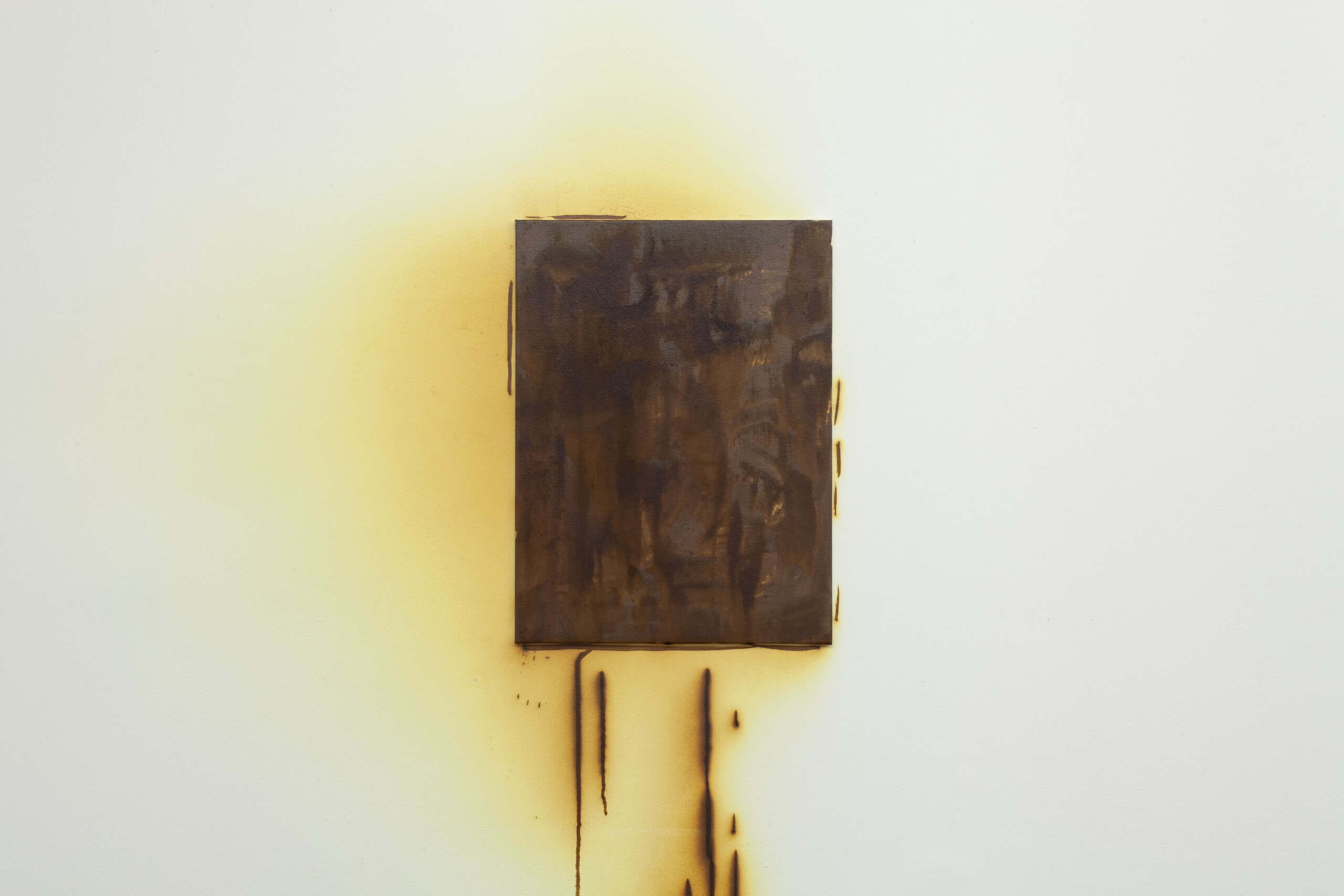


An adjective and artistic movement, minimalism has had a profound impact on art history and culture globally. Its influence has waxed and waned over time, but it remains a twentieth-century archetype and symbol of modernity. Unsurprisingly, minimalism seems to be having a revival in our uncertain times. It is in one sense nostalgic, but today it is also taking on a new form.
Minimalism has always been inherently global despite its American-centric art history. Other Primary Structures, an exhibition at New York’s Jewish Museum in 1966, demonstrates the extent of its influence. The exhibition included canonical figures like Donald Judd and Walter de Maria alongside their non-Western peers such as Jirō Takamatsu and Lygia Pape. Melbourne, too, has its own flavour and specific variation of minimalism, influenced as much by itself as by internationalism. Minimalism has always been here, but even a few years ago it was scarcely a topic of the conversations that shape artistic consciousness. Now a noticeable group of young artists is joining established practitioners working in the genre to revitalise its aesthetic for a new era. I have heard people call it nihilistic, reactionary, anti-conceptual, boring, bourgeois. Maybe they’re just talking about the Melbourne art world. One thing is for certain: it’s back, but different.
Recently closed Rosanna-based gallery Guzzler has undoubtedly had an impact on this revival, exposing a younger crowd of art graduates to artists from prior generations and spaces lost to the annals of local art history, such as Pinacotheca or Store 5. Rose Nolan and Stephen Bram, both of whom have been influential in recent Melbourne art, appeared anew among young artists via their respective 2022 solo exhibitions White Trash Constructed Work (1995) and Unstable Painting (1991) in Guzzler’s backyard shed space. Bram’s show re-staged an exhibition from Store 5 itself, an important art space that Nolan and Bram were involved in together in Melbourne in the early 1990s.
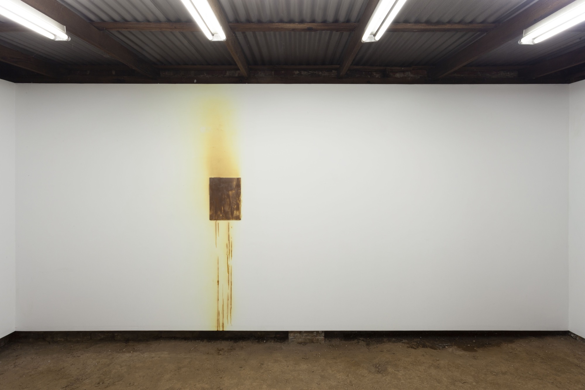
In March this year, Nolan held two simultaneous exhibitions: Working Models at Anna Schwartz Gallery and Light Weight / Light Well at Hyacinth. A month later, “address on request” gallery Sydney Sydney held a self-titled solo exhibition by Bram and in June one by Nolan, Coloured Constructed Work (1993). In July, both were included in Asbestos’s Menagerie fundraiser: an exhibition featuring almost 170 works for sale and just about as many artists. A sure sign of artworld relevance is contextual mobility between artist spaces and institutions. This has always been a characteristic of minimalism, and it remains true of artists working in the genre today; its formal “uninflection” (the absence of expressive or stylistic embellishments) gives the work interpretative adaptability and agility across different exhibition contexts.
Nolan’s Working Models is more reminiscent of the 1960s British revival of constructivism than its original form, which emerged in Russia in the early twentieth century. I think mostly of the group’s pacesetter, Mary Martin, whose intricate, small-scale wooden and plaster reliefs use light to accentuate form, akin to Nolan. A key difference, however, is the material and content in Working Models. Nolan uses used packaging from iPhones, champagne, tea, Camembert, luxury goods—all tasteful. Presented on a large, double-decker shelving unit in the centre of the gallery, the objects appear as if for sale, or on display in a showroom. An unusual show, it is somehow glamorous and mundane at the same time.
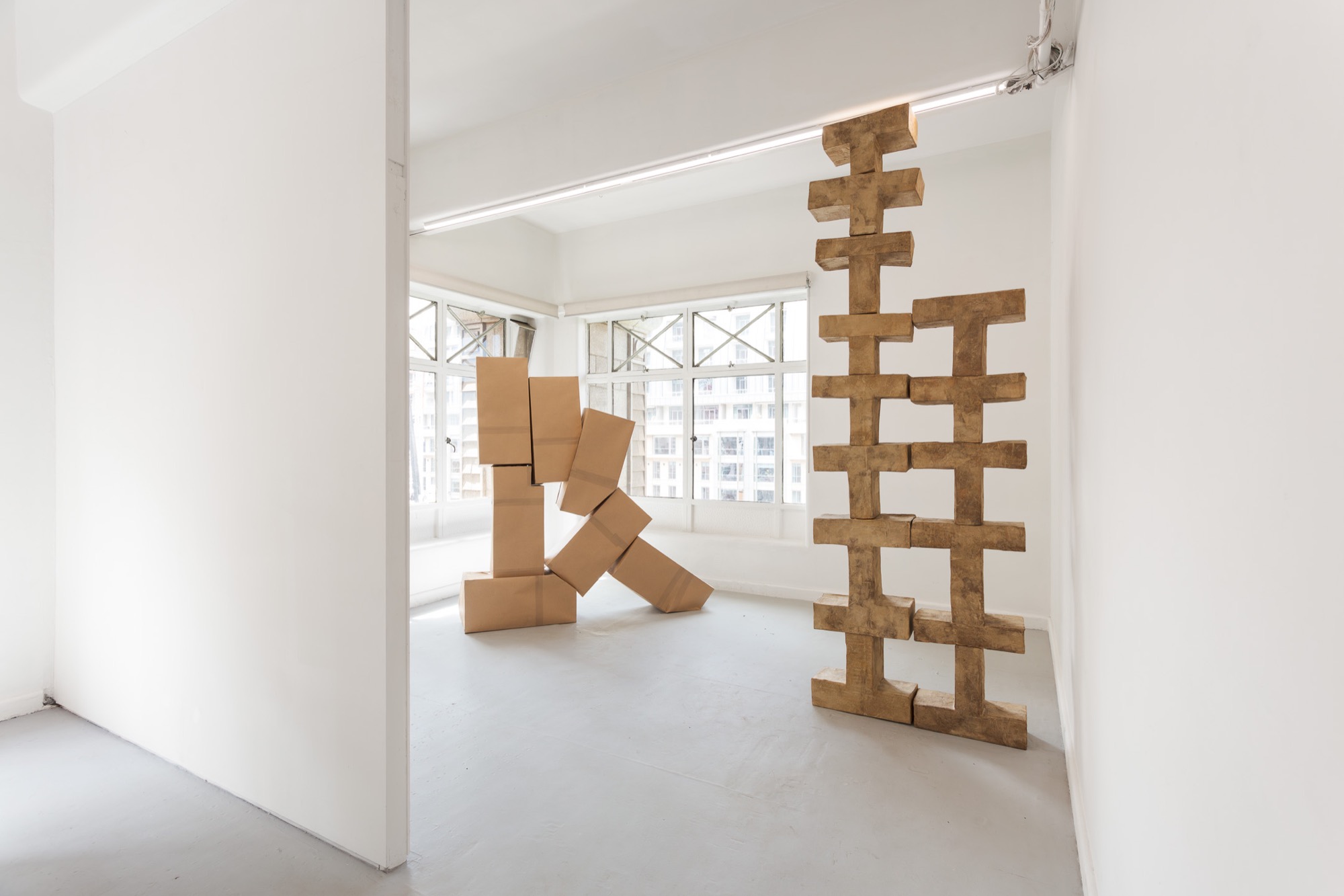
Last month, Augusta Vinall-Richardson’s exhibition TEMPLATE / SKETCH at Caves immediately brought to mind Nolan’s recent show. Both exhibitions featured cardboard as the main material. The work was constructivist, but naive and haphazard: cardboard assemblages, or bronze disguised as cardboard in cardboard brown. This gave the pieces a childlike playfulness, which seemed to counterpose or offset their austere and brutal forms. My suspicions of artistic collusion were confirmed when, upon requesting a room sheet, I was handed a publication containing an interview between Nolan and Vinall-Richardson. In their conversation, they discuss where their processes converge and diverge. Nolan’s edges are hard and neat; Vinall-Richardson’s are organic and soft. Like the forms themselves, Vinall-Richardson’s walk a tightrope between playful and severe, organic and harsh.
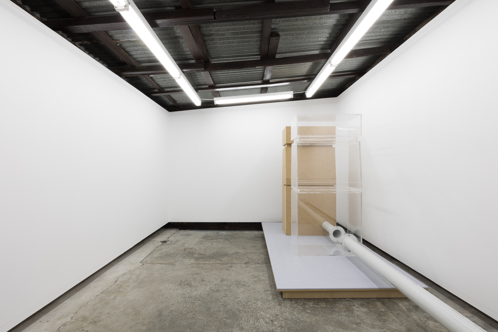
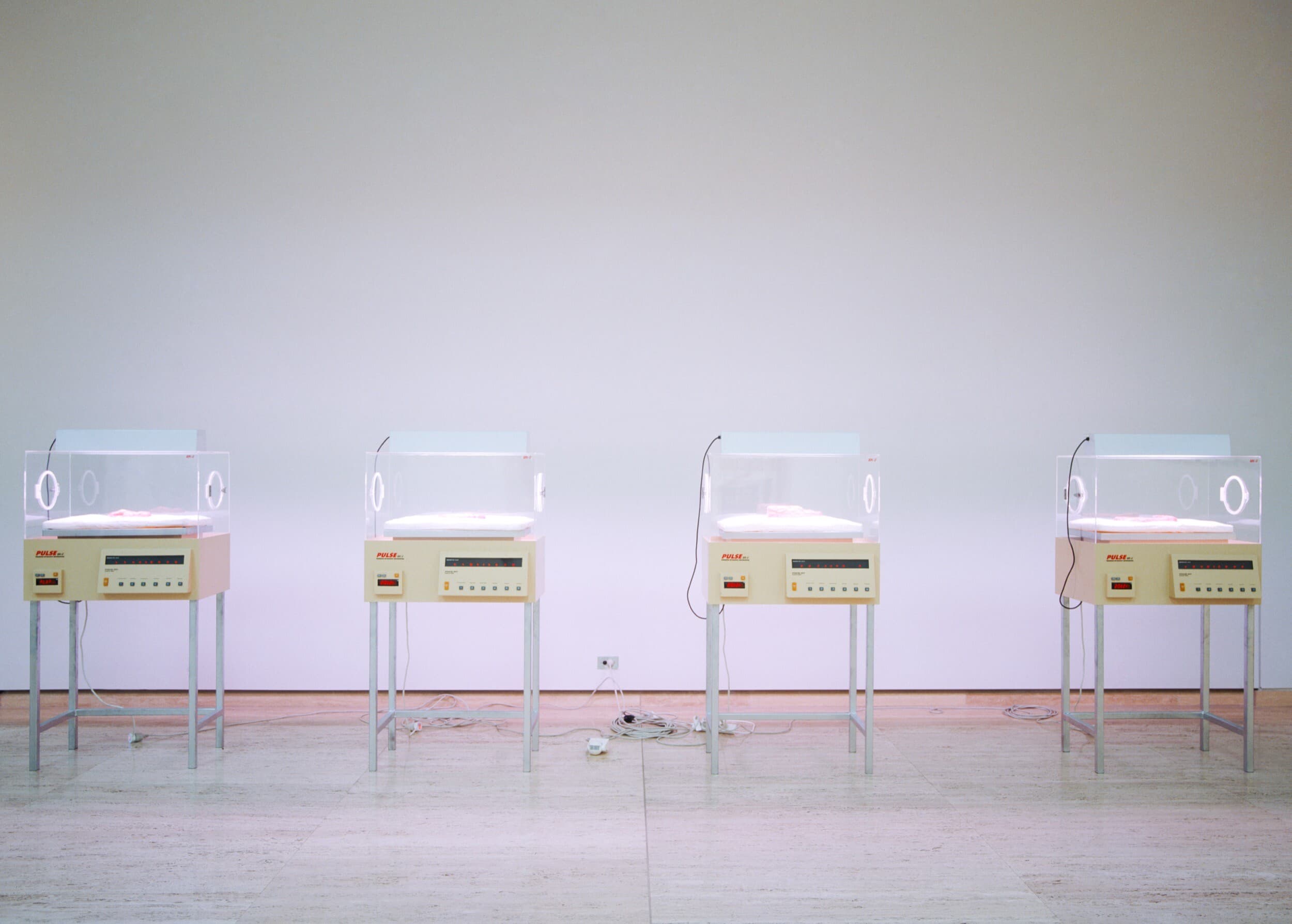
An unquestionably important moment for Melbourne’s minimalist comeback was Hugo Blomley’s solo exhibition at Asbestos in August, Humility Circuit. Blomley’s work comprised two petrol bowsers: one made of MDF and the other of clear acrylic, each demonstrating quality workmanship. Both were attached to a running air compressor. The entire gallery rattled with sound.
Mildura Atrocity Exhibition, a group show curated by Helen Hughes at NAP Contemporary in Mildura in March, placed established artists Janet Burchill and Jennifer McCamley alongside 2022 honours graduate Alexandra Peters. Taking place in a former Volkswagen showroom, the exhibition title references a chapter in the compilation of the same name by English author J. G. Ballard. The chapter, titled “Crash!,” developed into his iconic, eponymously titled novel.
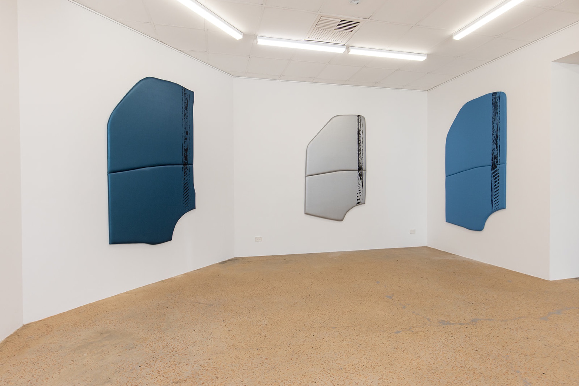
Like Blomley, Peters replicates a form from the outside world. Both artists take an existing object and transform it into something that resembles a minimalist sculpture, alluding to two things at once. Initially, one encounters the objects as artworks, before then understanding the source forms. The fact that the sculptures were car doors, or bowsers, came to me after appreciating the shapes and decoding their style.
In contrast, Burchill and McCamley’s work operates in the opposite manner. The works are immediately recognisable objects which slowly reveal their relationship to art. One sees immediately a car seat, a graph; one links them through their graphic stripes, reminiscent of hard-edge painting. I think of the German abstract painter Blinky Palermo.
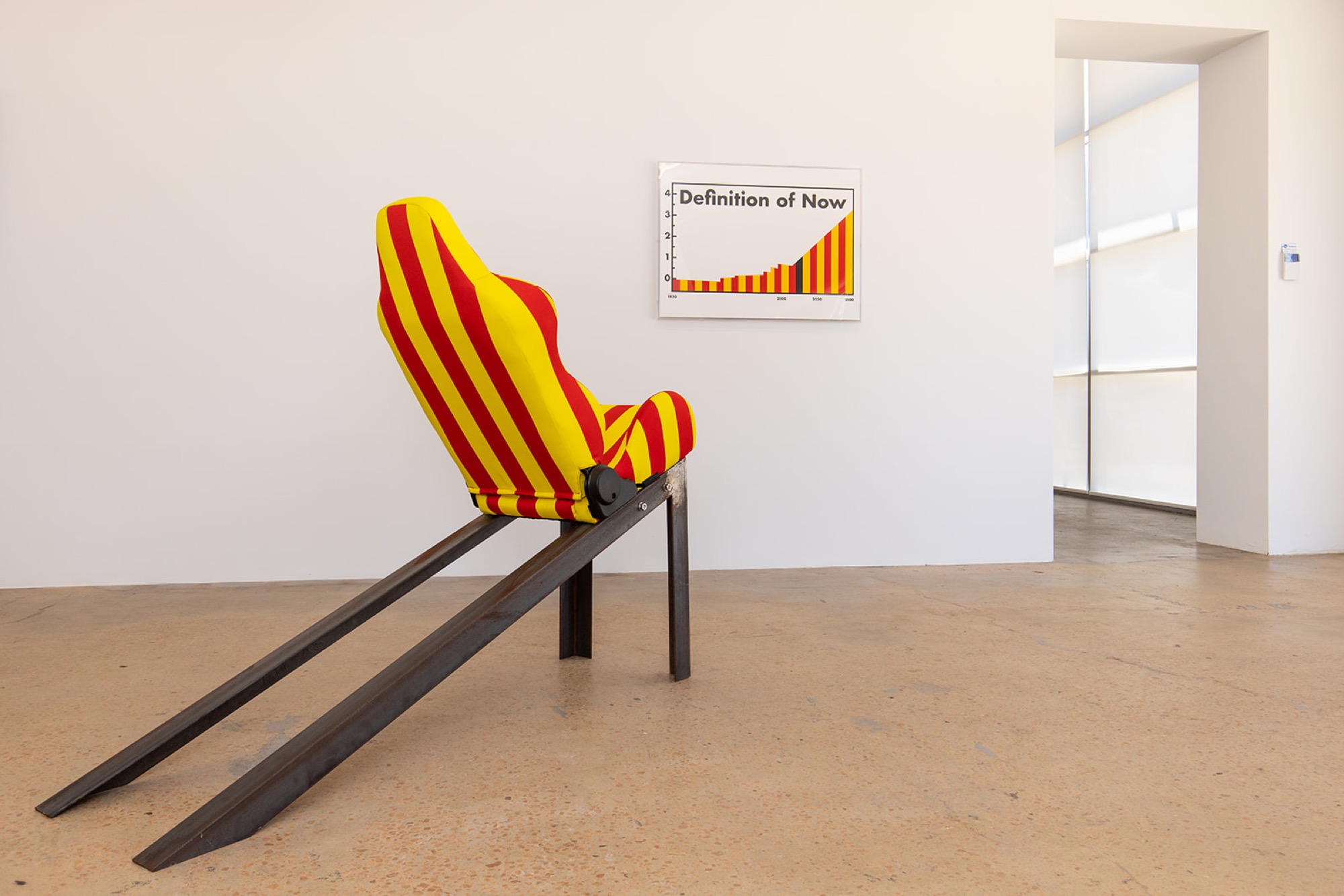
Common to Blomley, Burchill and McCamley, and Peters is car culture. A bowser. A seat. A car door. The car is a symbol of modernity; its destruction a symbol of modernity’s end. As with the cultists in Ballard’s novel, is this what constitutes the fetish, the interest of this approach, embracing something that conjures its own death?
On the topic of fetish. John Meade’s show Round World last month at Sutton Gallery fits this category, although it offers a different pool of references. Humility Circuit and Mildura Atrocity Exhibition draw inspiration from a variety of historical figures and predominantly echo East Coast American minimalism. Round World, however, differs from this style and builds on the flamboyant West Coast analogue, known appropriately as “finish fetish,” which favours florescent colours and smooth edges. Consisting of four small sculptures on plinths in the middle of the Sutton’s front gallery, the works are arranged as if an award podium, presenting trophies in different categories. The forms of Round World remind me of car prototyping fairs: a suite of models of small, imaginary, mutated vehicles. Moreover, in true finish-fetish style, the works are sprayed with automotive lacquer paint to achieve a flawless surface finish.
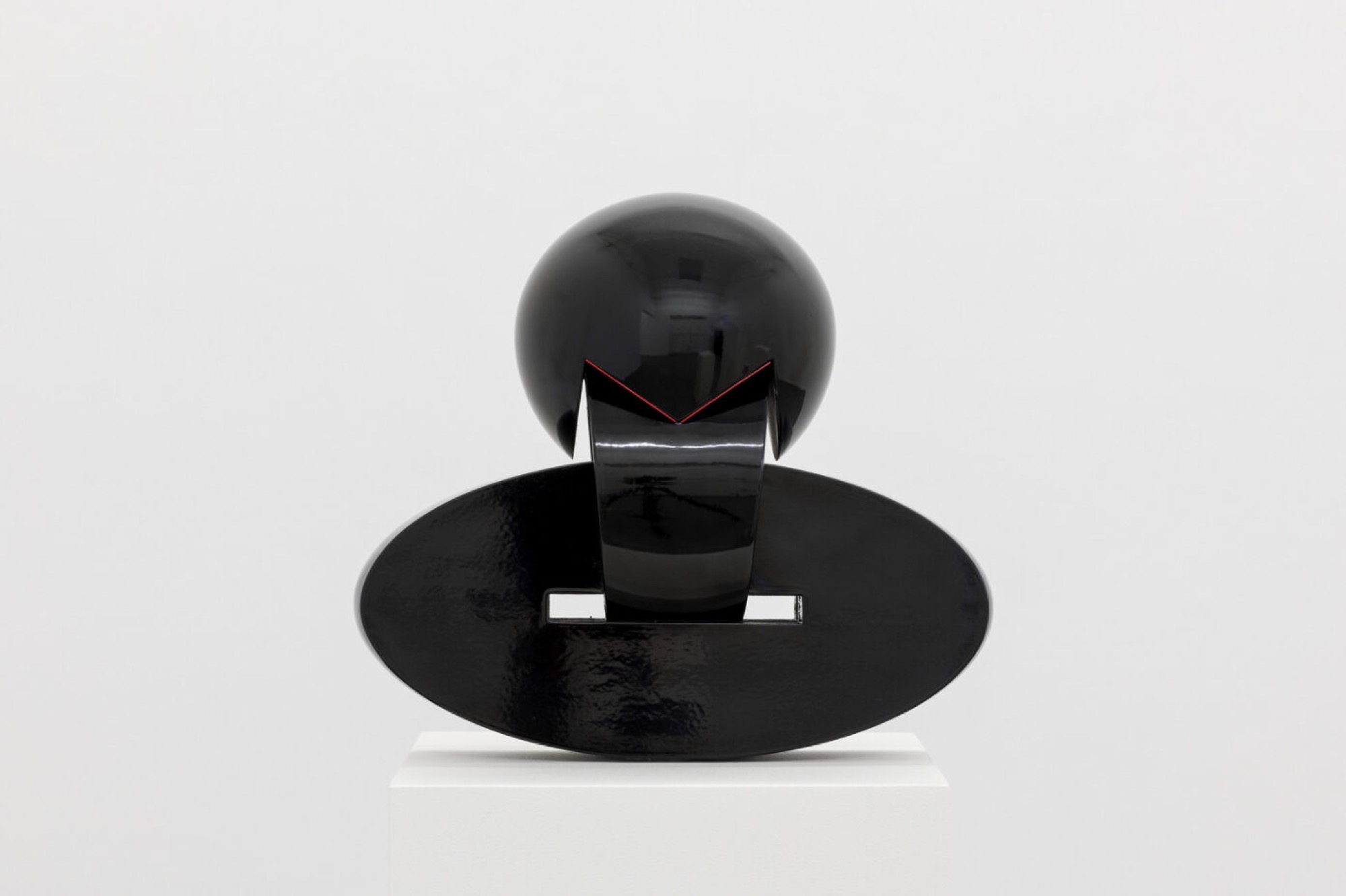
Jim Roche, like Meade, utilises finish fetish as a launching pad for his exhibition Van Der Zande at ReadingRoom in August. The exhibition title, which translates from Dutch to “in the sand,” is both appropriate and autobiographical, given the artist is from the Gold Coast, a surfer, and of Dutch heritage. Scott Redford comes to mind, Gold Coast’s card-holding finish fetishist, known for his ironic take on American cultural tropes imported to beachside Australia. The commonality is unmistakable, although the narrative and senses of humour differ. Van Der Zande reads as sincere in place of Redford’s sharpness.
Meade’s exhibition reminded me of cars, and Roche’s work would usually remind me of the other quintessential Californian vehicle: the surfboard. However, in a departure from his usual style, Roche presents a series of large clogs—traditional Dutch wooden shoes. These works are sleek and glossy, their surfaces smooth, with colourful, fluorescent touches accentuating the thin, aerodynamic forms. The essence of surfing and smoothness, speed, and gloss, remains on this anachronistic footwear.
Meade and Roche draw on a shared interest in the language of smoothness and speed. Nodding to the finish fetish movement, this can be considered represents a subgenre of Melbourne’s minimalist revival—a tropical and liberated cousin to the severity of the other variants.
A group exhibition that opened at 1301SW on 11 November, Palermo was thinking of Monk, I was thinking of J. P. Melville in a thicket, also fits the bill. Featuring Janet Burchill, Don Driver, Hilarie Mais, Robert Moreland, and Nick Selenitsch, the exhibition is a meditation on a variety of modernist styles and periods across generations: the gridded intricacy of Mais; the clean, neat minimalist forms of Moreland; the rounded, patterned chalk mural by Selenitsch; and Burchill’s stark concrete poetry on a textured bed of black paint.
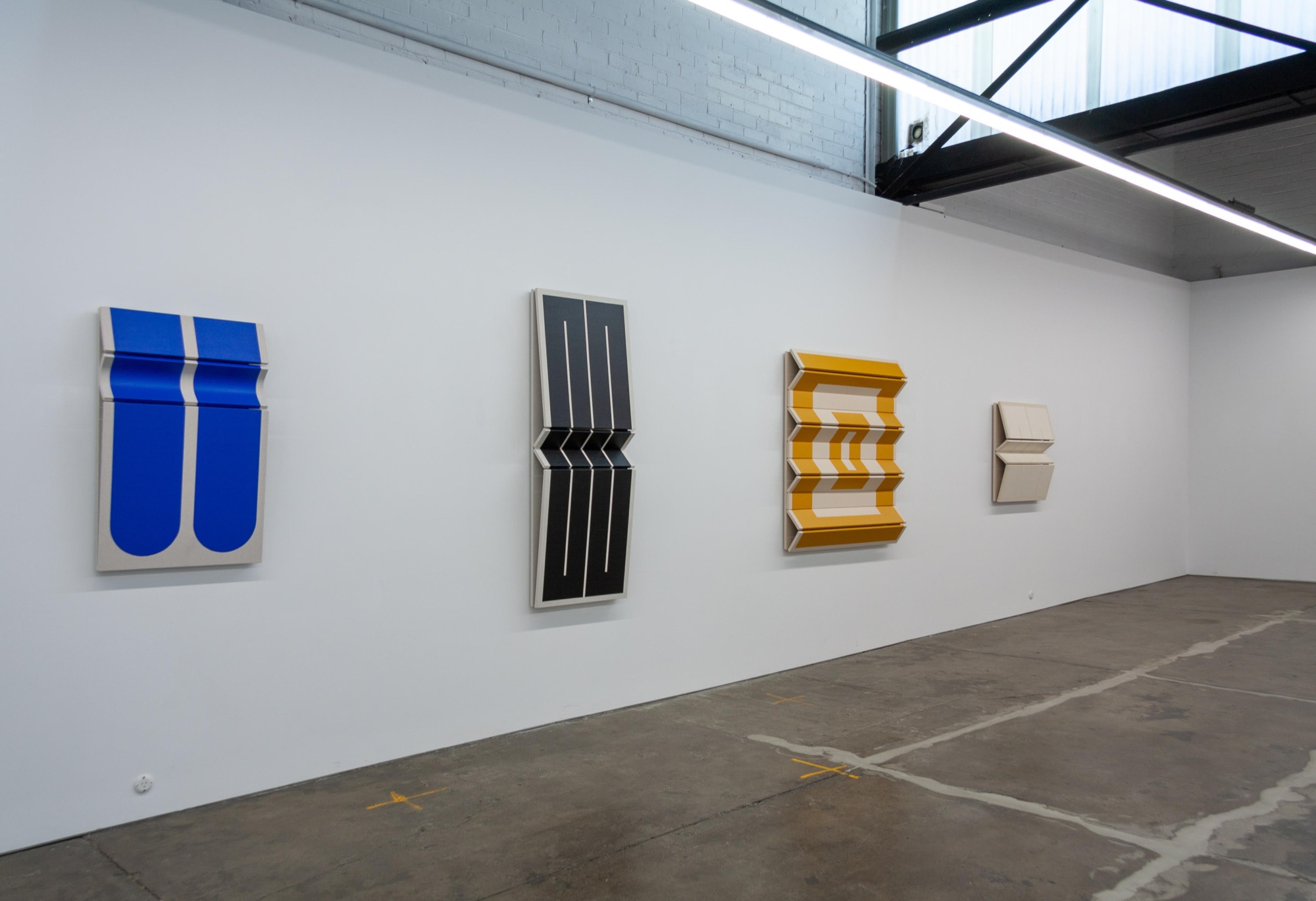
The exhibition’s title is a reference to Palermo’s work Untitled (Dedicated: Thelonious Monk). Cologne-based Palermo was a pivotal figure in German hard-edged painting. The influence is evidence in Moreland’s work, which closely mirror the forms used by Palermo in his paintings. His orderly and folded canvases, however, bring the image out of the picture plane and into the gallery. In contrast to Palermo’s primary colours, Moreland opts for a palette of soft, pastel hues.
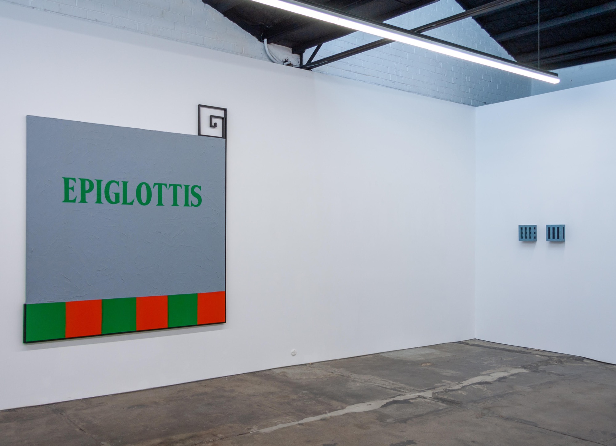
Hilarie Mais, who has recently enjoyed solo exhibitions in Sydney, Canberra, and New York at both commercial and institutional venues, also employs the ambiguous space between painting and sculpture. Her gridded wall works, despite their modest scale, command presence. The larger work leaning against the back wall dazzles through repetitious patterns. Her colours too are soft, all tones of blue.
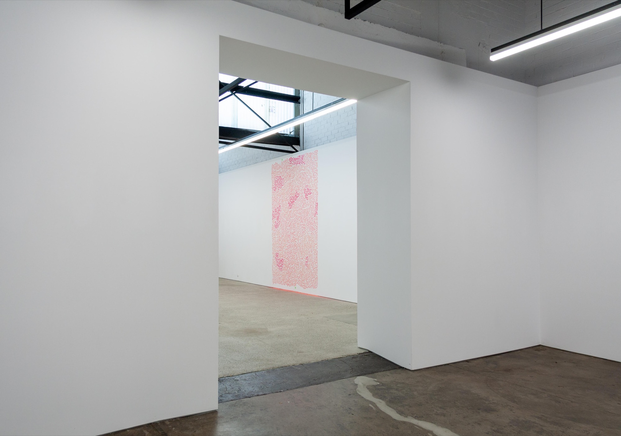
Exchange, influence, and difference have always been implicitly understood and practiced; however, they are explicitly the central premise of this exhibition. The webs woven between artists of different generations in Palermo was thinking of Monk continues the eternal self–other reference. The room sheet, discussing various music genres and cocktail variations, metaphorically articulates the exhibition’s focus on the art of combination.
Previously renowned for its internationalism, transcending geographical boundaries and cultural divides, minimalism is now demonstrating its capacity for intergenerational connectivity, bridging times. The sheer density of exhibitions in recent months is noteworthy. This surge in activity highlights the genre’s ability to engage with and reinterpret local histories through intergenerational exchanges. The active engagement with local histories provides insight into how this twentieth-century movement time travels and warps, evolving and adapting rather than merely repeating itself. Fashion may be cyclical, but revivals are never replicas.
Jasper Jordan-Lang is an artist and writer based in Naarm/Melbourne.
