
Lili Ward, In Time (left) and Meditate and Destroy (right), 2025, chalk pastel, pencil, acrylic paint on canvas, plywood, varnish and oil-based stain, metal hinges and metal screws, 60 x 75 cm. Photo: Conners Conners
Followed by Whirring
Cameron Hurst
In the beginning, there was pacing. Then shuffling. Then, a sharp turn. A thud. And now: whirring. No, this is not a description of you drunkenly stumbling home from an opening, falling over, then turning the fan on. These are the onomatopoeic sounds and movements made by groups of emerging artists. They proceed year-by-year through Conners Conners, the gallery lurking in two grey-carpeted rooms behind the proud neoclassical facade of the Fitzroy Town Hall. Followed by Whirring is the fifth edition of the Conners Conners’ annual group show of work by “some of the most active and engaging early career artists in Naarm/Melbourne and beyond.” This year the show was curated by artist Ry Haskings, who runs Conners Conners alongside artist Narelle Desmond, and art historian Vincent Alessi. Looking back at past years’ editions, Then Sharply Turns, And Shuffling, Sounds of Pacing, and Before a Thud, I can recall memorable and less memorable works: an explosive protrusion of brightly wrapped presents; a series of looping, lyrical, smudged charcoal lines punctuated by facial-piercing-like orbs; a crusty black painting; a crusty black painting; another crusty black painting. Perhaps, each year, by focussing on just a few artworks, it is possible to divine some themes and inclinations that give us an idea of the zeitgeist. Or, at least, a zeitgeist—if such a thing is possible—of a very specific milieu.
Followed by Whirring includes work by Bella Besen, Caesar Florence-Howard, Jieun Ha, Nicholas Mahady, Aden Miller, Aliza Nickle, Madeleine Peters, Charlie Robert, Lilly Skipper, Lili Ward, Olivia Wood, and Joon Youn. These artists are all Doing Things. They are involved in the running of small galleries such as Strawberry (Florence-Howard), Asbestos (Miller; gallery now defunct), Peep Show (Wood), and No Offence (Skipper). They are exhibiting in small galleries such as Cathedral Cabinet (Peters), MOM (Robert), Bus Projects (Youn), TCB (Ha), or Photo Access (Mahady). They are running events like the screening series Hit List (Besen), the reading series Roundtable Readings (Ward), and a bead-making workshop in the Pilbara (Nickle). No single media or approach unites them.
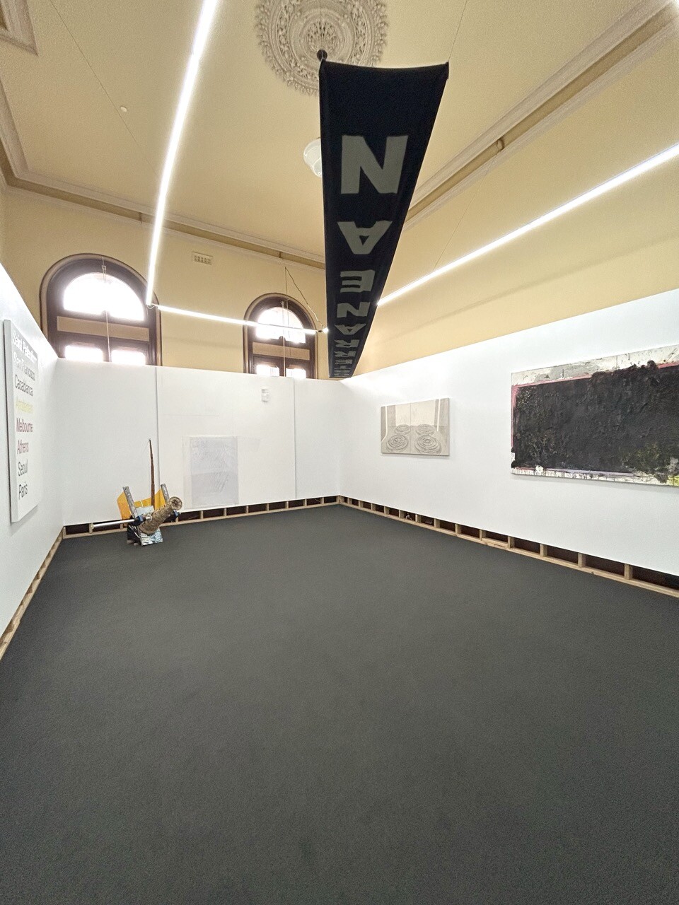
Installation view of Followed by Whirring, 2025. Photo: Conners Conners
However, it would be remiss of me not to mention that all but two have spent time at the Victorian College of the Arts (VCA), with a quarter undertaking the vogueish route of a VCA undergraduate degree followed by Honours at Monash University. This exhibition is, on the one hand, testament to a rich and thriving local artistic scene fostered by the local art school ecosystem. On the other hand, it feels a bit Melbourne myopic. It’s evidence of the outsized role these institutions play in fostering interpersonal networks and shaping shared aesthetic languages—perhaps regardless of their legibility to wider audiences. (This institutional power is all the more discomfiting when you consider how artistic activities can be abruptly canceled by universities today, as in Monash’s dastardly “postponement” of a MUMA exhibition including Khaled Sabsabi—but that’s a subject for another piece of writing.)
What characterises the 2025 edition of the Conners Conners grad show? A familiarity with Southbank. Yes, but what else? The fashion writer Biz Sherbert wrote recently about the horseshoe theory effect she sees driving a trend wherein people who previously would have taken pride in dressing “weird” have started to incorporate Disney motifs and other normie references in their self-presentation. “Alternative culture,” Sherbert contends, “has become so consumable that difference can only be found through being like everyone else, or how you imagine everyone else to be (but always with little subtextual cues to let people know you know you’re in on it).” I think this tendency—a disengagement with the idea of alternative culture, sometimes manifesting in ironic or even post-ironic identification with the imagined interests and sensibilities of “normal people”—appears in Followed by Whirring too. Sincerity is cool, again. It’s hip to be square. Or, as Cupboard Magazine puts it in their latest issue, “punk is twee.”
Take, for example, Miller’s Untitled work. It is a navy cotton linen blend fabric banner strung up high and diagonally across the gallery’s inner room, painted with a blocky white all-capitals sans serif font text. Looking at the banner from the doorway, it is impossible to read the single word spelled out across its length. It’s upside down. I have to walk to the other corner of the gallery, where it becomes legible, albeit with the final letters distorted: “SUBTERRANEAN.” Subterranean means beneath the earth (literally) but also underground (metaphorically), little-known, secret, hidden, mysterious. Subversive, even. The word and its associations are diametrically opposed to the function of a banner in general: to make public proclamations, to symbolically pledge courtly or political allegiances, to provide ceremonial pomp and circumstance. The subterranean is also anathema to the display of this specific banner, which hangs above our heads. What is supposedly underground is emblazoned in bright white for all to see, where it changes or even loses meaning entirely.
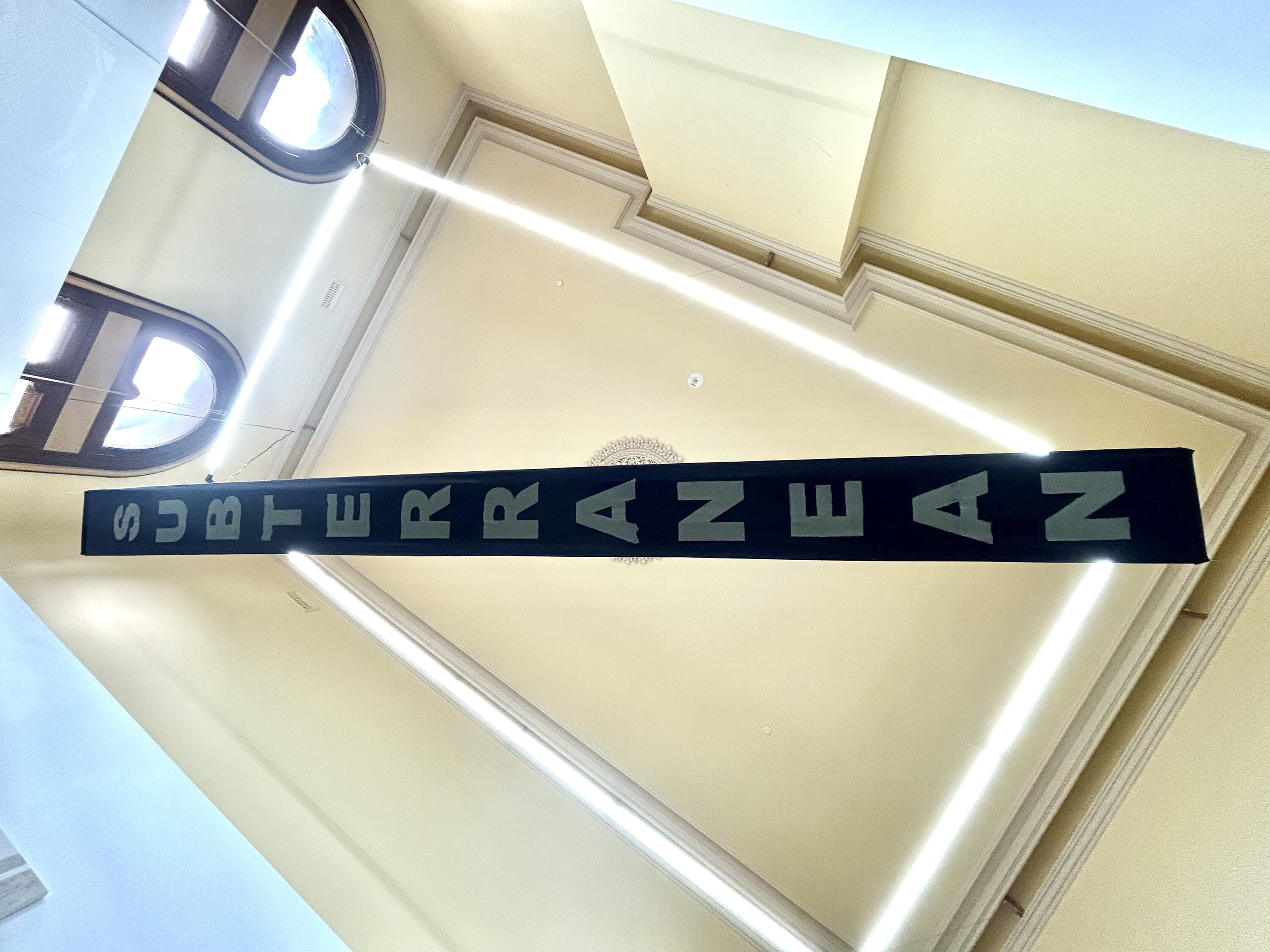
Installation view of Aden Miller, Untitled, 2025, synthetic polymer paint on cotton linen blend, 490 x 38 cm. Photo: Conners Conners
Travelling elsewhere: Olivia Wood’s Global Cities (Dandy Painting) is a near human-scale painting (it is 140 x 115cm) that presents a vertical list of major, mostly Western, metropolises in a flat, italicised sans serif font text in varied colours. My eye moves down from pale blue Saint Petersburg to yellow Amsterdam to red Melbourne to pink Athens. It looks like the kind of kitsch, landmark-based mass-produced print that you would see in an op shop or real estate website listing for a unit on the 96 tram line. Wood’s list is pegged to the figure of the “dandy,” a nineteenth-century archetype of a man with a highly refined, generally queer sensibility and an even higher inherited bank balance. Count Robert de Montesquiou, one of the most notorious original dandies, was rumoured to have kept a pet tortoise with a shell lacquered with gold and studded with precious gemstones. Global Cities seems less aligned with the world of camp turtles and more aligned with a twenty-first century archetype: the “tourist.” The painting signals, to me anyway, a knowingly basic desire to take the roads most travelled. It appears to lean into the extractive bliss of tourism, instead of seeking out the deluded identity of the intrepid adventurer sourcing hidden, “authentic” experiences, or that of the elite, metropole-hopping dandy.
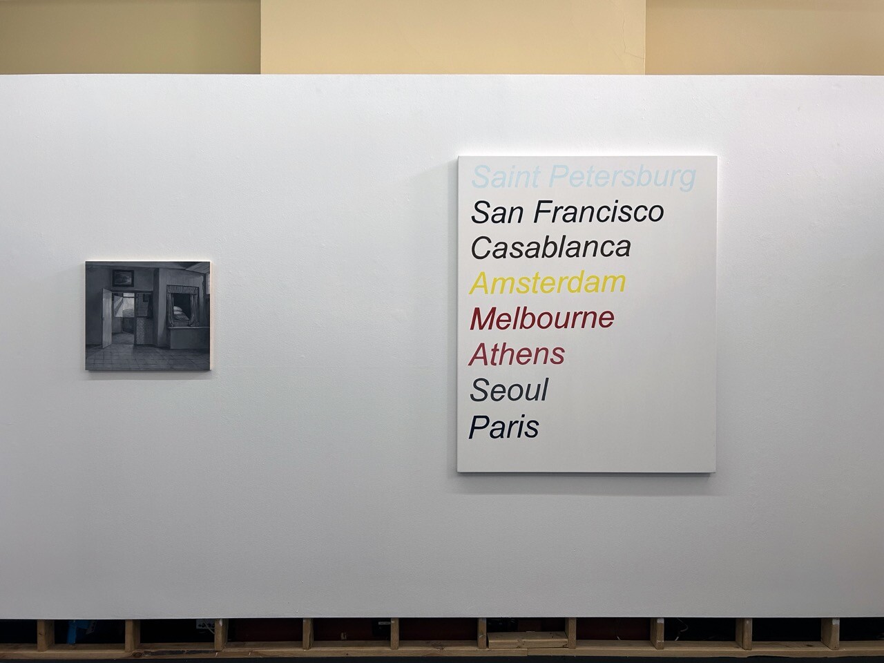
Installation view of Madeleine Peters, Adjusted View From A Mother’s Duty (After De Hooch), 2025, oil on board, 48 x 55 cm (left) and Olivia Wood, Global Cities (dandy painting), 2025, oil on canvas, 140 x 115 cm (right). Photo: Conners Conners
The subterranean banner and Global Cities fit into what seems to be a broader penchant for plainly presented, oversized sans serif font text amongst many artists today. This style is often accompanied by an element of fronting bluster. James Brett asks “does my practice look big in this?” Marcus Payne advises loyalty and integrity: “Don't eat with people you wouldnt (sic) starve with.” In Conners Conners, Bella Besen’s work, titled I Love to Feel Something, features white text printed on a clear sticker affixed to a white support. Getting up close, a ghostly phrase becomes legible: “It felt really beautiful even if it always wasn’t. It was Prosecco on ice.” It is apolitical and affectless, like Barbara Kruger and Jenny Holzer for a generation raised on the text posts of Facebook, Tumblr, TikTok, Reddit, and Instagram. Artmaking is just another form of Create Mode.
It’s not all words. Several works in Followed by Whirring zoom in on domestic spaces. One half of Aliza Nickle’s Temple and Temple diptych shows a gleaming kitchen sink formed from tiny hand-rolled coloured balls pressed carefully into wax. Jieun Ha’s Toy Stove shows burner coils rendered from a distorting low angle in washed-out grey on unprimed canvas. In a nod to art-historical domesticity, Madeleine Peter’s grisaille oil painting of a still, quiet series of rooms is titled Adjusted View From A Mother’s Duty (After De Hooch). Pieter de Hooch is a quintessential Dutch Golden Age artist. Peter’s (not to be confused with Pieter’s) work appropriates a painting of De Hooch’s in the collection of the Rijksmuseum: a quotidian interior scene wherein a mother plucks lice from her child’s hair while a dog looks out a window. In the Conners Conners’ version, all figures and colour are removed, leaving only an empty room. It becomes an austere formal exercise in depicting space: the flat, shadowy interplay of the planes of the walls and doorways; the light streaming in through the windows. The caring maternal nitpicking is gone. Perhaps there is a tension acknowledged here by this erasure, between a desire for mastery of a medium and the grosser aspects of “a mother’s duty”?
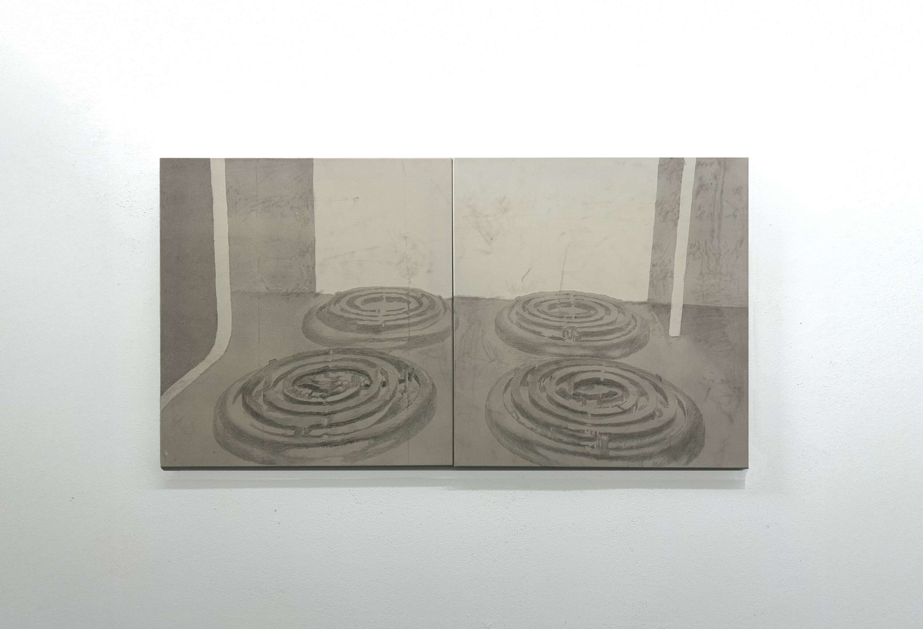
Jieun Ha, Toy Stove, 2024, acrylic and graphite on canvas, 82 x 153 cm. Photo: Conners Conners
One of Lili Ward’s two offerings also makes an oblique address to maternity. In Time is a varnished brown wooden case-like structure with a slatted lid carved with a treble clef. This opens onto a canvas with three distinct, painted images layered on top of one another. In the background, there is the silhouette of a slender woman with wispy hair. She looks down to where her hands cradle her lower belly, as if she is pregnant. Atop this image is a bright red apple with a bite taken out of the flesh, which is in turn topped by an instructional cartoon of a child with an androgynous bob making the diagrammed sign of the cross. (Peter Tyndall would surely love it.) It’s not surprising to hear that Ward grew up in a family of Jehovah’s Witnesses. Of all the works in Followed by Whirring, this is my favourite. I like its glyphic esotericism, its devotional form and its strange symbols, which incite the urge to decode. It honours the process of mediation that was essential to past dialogues about art and aesthetics (reanimated recently in Anna Kornbluh’s Hegel-via-Adorno-via-van Gogh yoga book, Immediacy, or the Style of Too Late Capitalism). In Ward’s artwork, the bitten apple’s inner flesh is yellowing, the child prays to an unknown interlocutor, and the title invokes the passage of time. Looking at it, I wonder what could be less alternative than thinking ambiguously about motherhood and fertility. Maybe joining the Catholic Church? Even if you leave, the spirit is hard to shake off entirely. Ward approaches these tropes of normality at a slant, making familiar iconography weird and beautiful.
The point of a show like Followed by Whirring is to function as a localised, time-stamped survey of an informal cohort’s activities. It’s essentially a “what are the kids up to these days?” exercise, with Conners Conners performing a civic function befitting its municipal location. The shortfall of the genre is that there aren’t necessarily going to be substantial shared interests, styles, or approaches linking a group brought together primarily by youth and proximity. There are plays with conformity throughout, but it’s hard to be sincere in public these days, and that angle doesn’t cover everything. Consequently, this review has bypassed some artworks worthy of further discussion, such as Lilly Skipper’s work, two translucent acrylic panels patterned with a tadpole-egg-like composition created from ovoid vinyl forms, and Nicholas Mahady’s, an elegant, crisply-printed photograph of a series of pressure gauges in an industrial setting. Also missing is Charlie Robert’s men’s garden shed assemblage, with its fishing rod and woven cannon, which seems to point directly at Caesar Florence-Howard’s coagulated canvas. Finally, there are Joon Youn’s drawings on a whiteboard. One side shows a hand holding a phone with the screen displaying crooner lyrics: “That’s life (That’s life), I tell ya.” I imagine the whiteboard being wiped clean again, made into a blank slate like a gallery emptied between installs—ready for the next round.
Cameron Hurst is a contributing editor of Memo Review.


