
Installation view of Chelsea Young, Campbell Pretty, 2025, acrylic and oil on canvas, 214.0 x 200.2 cm. Photo: Nick Mahady.
Campbell Pretty and Kit Johnston & afra küllü
Hugh Magnus
Krystyna Campbell-Pretty gazes out onto Swanston Street with a vacant look, made up in a face RuPaul might be proud of. I wish I could write that I was out with her for mini martinis and small plates at Cathedral, but unfortunately Campbell-Pretty has not graced me with her person. Instead, I’m here for Chelsea Young’s exhibition at Cathedral Cabinet, the gallery run from the wine bar’s window. Campbell Pretty is a show featuring a single portrait of the same name of the famously glamorous philanthropist. The doyenne of NGV donors, Campbell-Pretty has made headlines over the last decade for almost single-handedly developing the state gallery’s fashion collection. The NGV held an exhibition of garments donated by Campbell-Pretty in 2019. More recently, the gallery was the recipient of more than fifty works by Alexander McQueen as a contribution to their 2022-3 survey. There is little at the NGV that doesn’t attract the support of Campbell-Pretty. Since 2019 she has been on the gallery’s council, and regularly appears atop lists of esteemed donors.
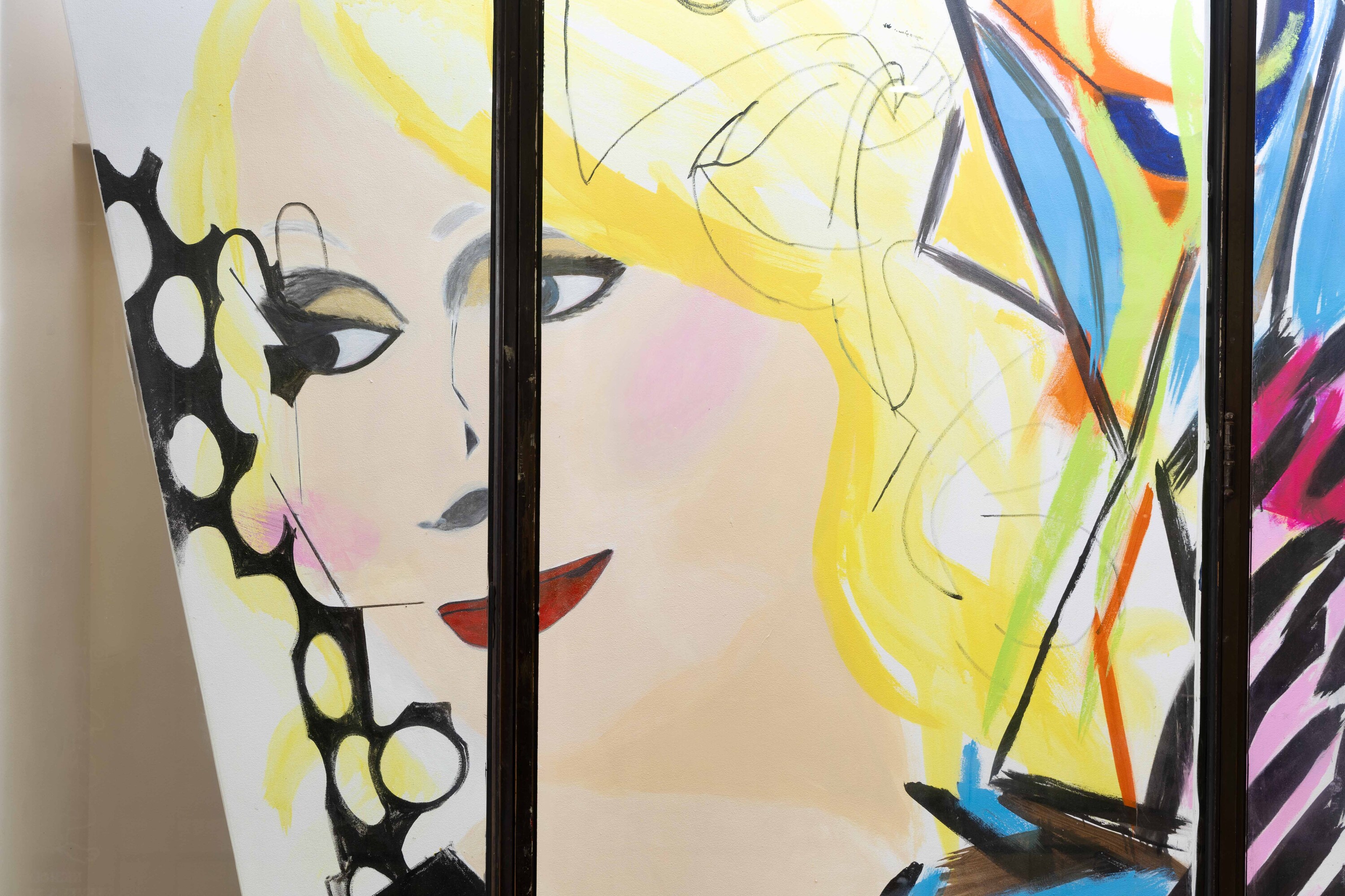
Young’s painting is massive, wedged askew in the window like it wouldn’t fit in any other way. At first glance, I assume Young has upped the glam on Campbell-Pretty’s painted visage. I’m almost certain she’s going to hop out of the window and start declaring “shantay, you stay” or “sashay away” to unsuspecting patrons. I would be wrong, however. It’s impossible to find a photo anywhere of Campbell-Pretty with a hair out of place, cheeks without copious blush and eyes without a sinister quantity of mascara. Campbell Pretty is actually quite accurate. But what’s with the choice of subject?
Since her graduate show at VCA in 2021, Young has proven herself as a darling of the cooler-than-thou establishments that dot the artistic fringe. Resin-ed rags, a cheap Warhol repro tucked in a steel cage, and garish acrylics smeared across canvases have all appeared in the artist’s handful of shows over the last four years. Young’s work is grungy, repellent, and voguish, oscillating between chic abstraction and naive figuration. There’s something about this post-VCA anti-aesthetic (the Centre d’Editions style, perhaps) that has become a mainstay on the ARI circuit, but I’m not complaining. With Young’s apparent interest in icons and rags it’s no surprise that Krystyna has come under the lens.
Detail view of Chelsea Young, Campbell Pretty, 2025, acrylic and oil on canvas, 214.0 x 200.2 cm. Photo: Nick Mahady.
While it may be flattering in a sense, Campbell Pretty also exudes a curiously repulsive quality—one that extends to the show itself. Young’s portrait is gaudy, yet strangely compelling—vulgar, campy, and unapologetically in-your-face. Rendered in oils and acrylics, magenta, cyan, and yellow collide in the painting’s formless background, interwoven with streaks of black, orange, and a putrid green. Campbell-Pretty herself appears airbrushed smooth, her trademark blushed cheeks and heavy lids unmistakable. There’s a mischievousness to it—a cheerful bras d’honneur to the art world establishment in its irreverent treatment of the philanthropist’s iconic look. The work’s brashness wouldn’t be out of place among the Archibald finalists of 1990—think Juan Davila and Davida Allen. Yet, there’s something more here than just a strangely ’90s portrait of the grandest dame on the scene.
Young’s work leans heavily into the cult of diva worship, perhaps attempting to find a place for Campbell-Pretty in some alternative pantheon of Australian art world stars. Diva worship is well understood as a relational practice through which social and para-social connection is forged and communities built. It doesn’t really matter whether it’s idolising Lady Gaga or Beyoncé, or gossiping about gallerists (I can think of a few who would fit the divascription). In elevating Campbell-Pretty to diva status (and so she must be, in the eyes of RMIT fashion first-years!), Young transforms her subject into an in-joke amongst the disenfranchised arts workers upon whom the burden of funding smaller organisations falls. The show’s text also leans into this absurdist humour, linking Campbell-Pretty’s very name to Warhol’s soup cans and, in a coup de grace of brainrot linguistics, ‘camp’ plus ‘belle’ plus ‘pretty’. Ultimately, Campbell Pretty offers a space for anyone to queen out, even if you’re not quite around the portrait’s unsettling gaze or artworld lore.
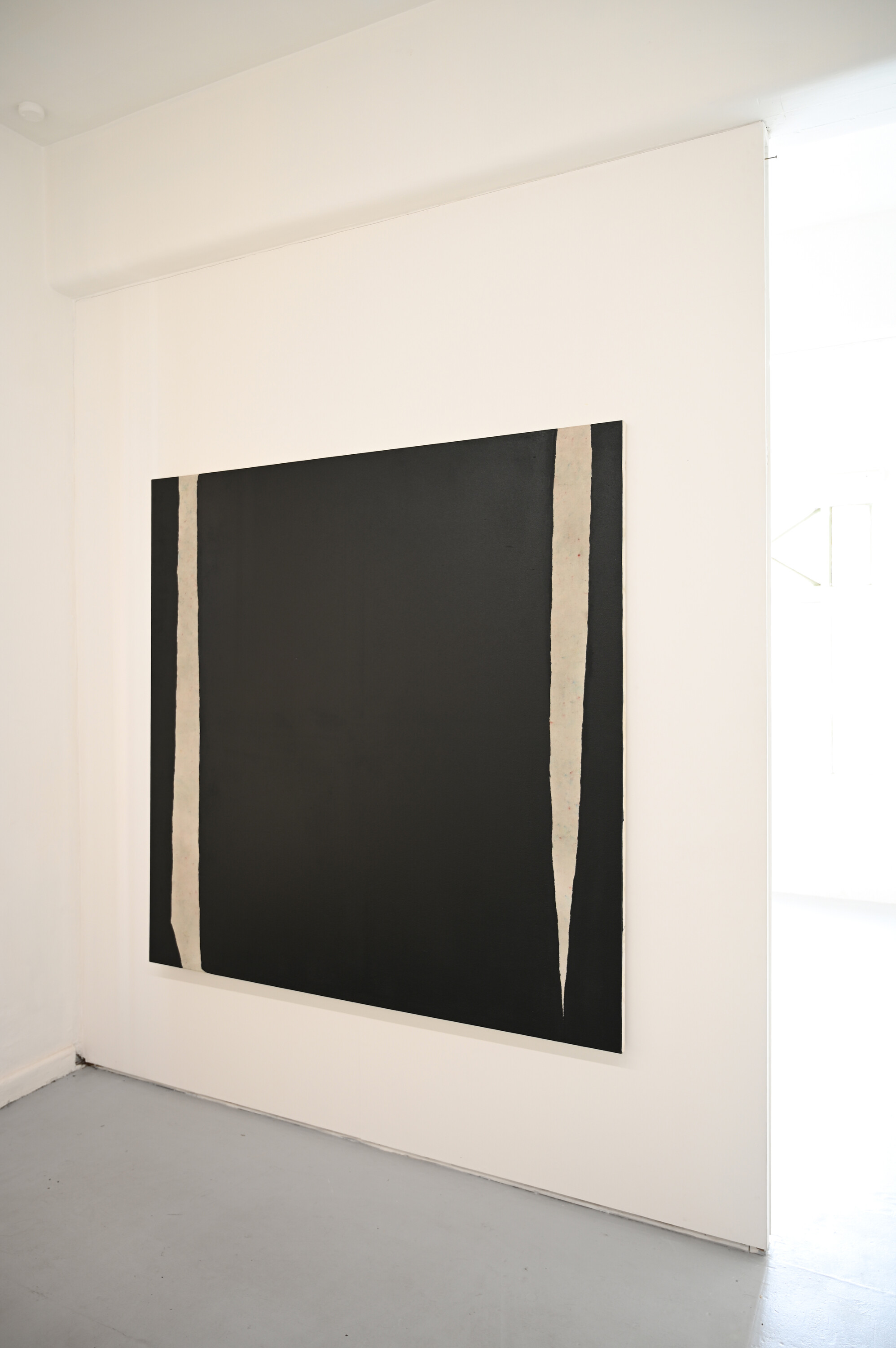
Kit Johnston, untitled, 2025, Tar, bleach, coloured pencil on canvas. 167 x 167cm. Photo: Storm Gold.
Wrenching myself away from Campbell Pretty, I head upstairs to CAVES for a break from thoughts of divas (painted and real). If Young’s work revels in excess, the show upstairs at CAVES offers a stark contrast—one rooted in restraint. I’m met with the work of two graduates of the 2024 class, Kit Johnston (VCA) and afra küllü (Monash). This is a show has materiality at its core, however hackneyed the term is in contemporary-artspeak.
Johnston’s practice begins with the desecration of a canvas, bleaching, aging, and lightly tinting with the colours of studio refuse, paint chips and pencil shavings. Working over January using the gallery space as a makeshift studio, Johnston’s four paintings and sculpture presented in this show are a distinct evolution from Untitled (2024), which the artist presented at last year’s VCA Grad Show. The faint colours that complement the austere blocks of tar and house-paint are shy in demeanour, emerging always faintly but resolutely. The dialogue that emerges from these brief encounters between mediums on Johnston’s canvas is sensitive and unhurried, a meditation on touch and intimacy that resonates beyond the works’ stretchers.
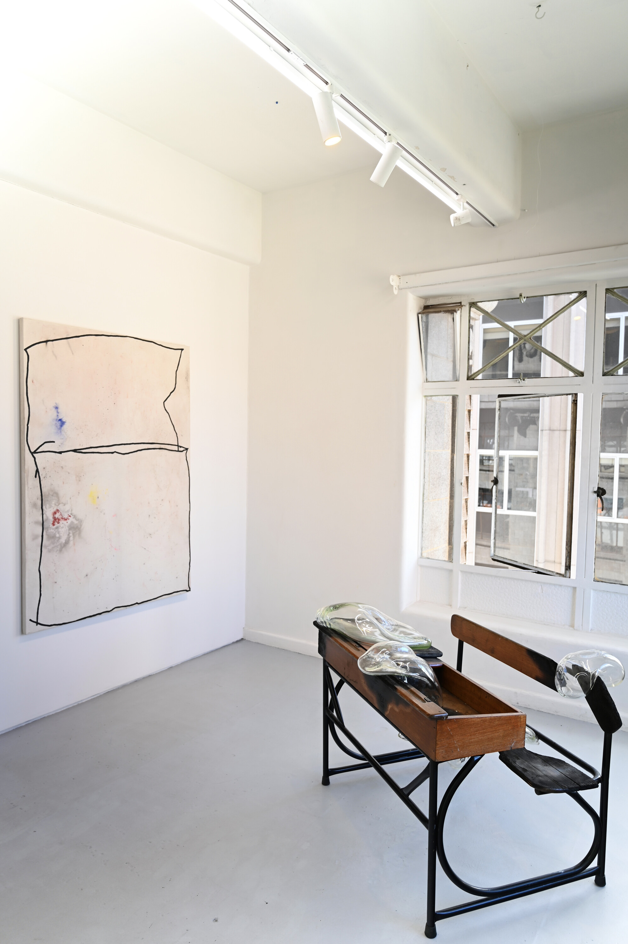
Installation view of Kit Johnston, Combine of touching squares, 2025, powdered pigment, tar cement, bleach and oil on canvas.167 x 120cm, and afra küllü, Go Educate Yourself, 2024, Children’s school desk, blown glass. Dimensions variable. Photo: Storm Gold.
There is no doubt Johnston’s Combine of touching squares (2025) is the star of this show—an impressive and captivating work. The title and form of the painting are drawn from a two-year old’s sketch collected by the pioneering researcher and collector of children’s art Rhoda Kellogg. Over her career, Kellogg amassed over two million drawings by young children, classifying them into a framework that demonstrated the universal evolution of the drawn form from birth to adolescence. There is much to be said about the practice of borrowing from the basal sketches of children, especially in considering abstract painting movements of last century. While not denying that this is the tradition from which Johnston’s practice emerges, it feels like a cheap shot to draw such a direct genealogy. Rather, the paintings in this show feel more like they have emerged out of an ardent and inquisitive approach to the specific materials used within the works, especially the artist’s complementary uses of tar (muddying) and bleach (cleansing). Without straying too far from the painting at hand, it’s undeniable that in viewing its form, one is drawn in close to a primal, fundamental organisation of shapes and textures. To paraphrase Herbert Read, it’s an organic connection with the very origin of the marked symbol.
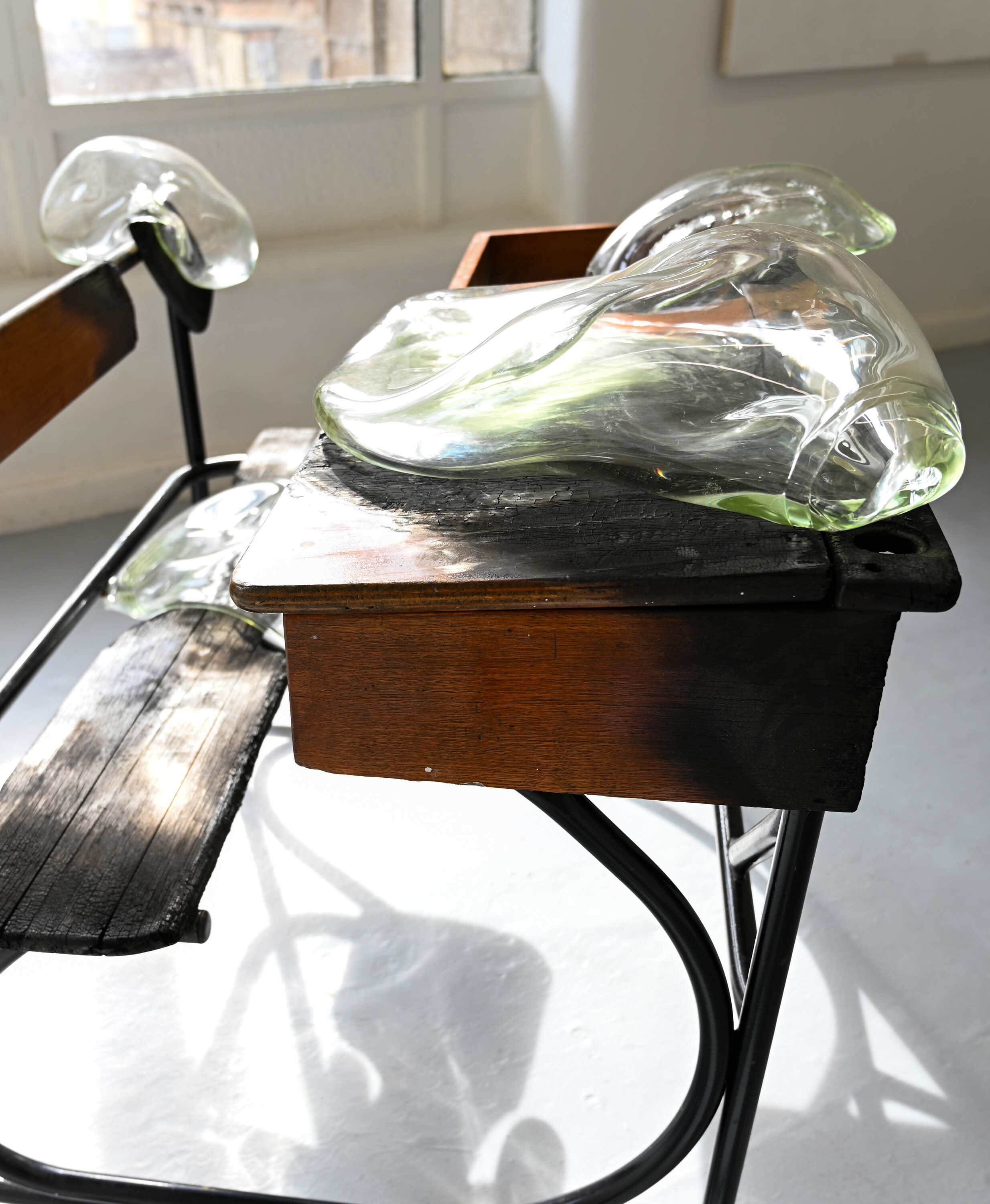
Detail view of afra küllü, Go Educate Yourself, 2024, Children’s school desk, blown glass. Dimensions variable. Photo: Storm Gold.
This is not to overlook küllü’s contribution. Ovate blown-glass forms rest upon a burnt-out desk like dismembered lungs—simultaneously brutal and pristine. The starkness recalls Yhonnie Scarce’s blown-glass yams, a haunting response to the British nuclear tests at Maralinga. Like Scarce, küllü grapples with catastrophe—specifically, the ongoing scholasticide in Gaza. The desk’s ruins mirror the skeletal remains of Palestinian schools and hospitals. It would have been refreshing to see new work from küllü, as Go Educate Yourself was first shown in her graduate exhibition last year. Yet its placement among Johnston’s canvases remains striking—a reminder that the crises it addresses persist beyond a single work or exhibition.
Young’s show is the first for Cathedral Cabinet’s eighth year: no mean feat for a literal hole-in-the-wall patronised predominantly by VCA vagabonds and assorted Nicholas Building intelligentsia. Similarly, CAVES had its 10th birthday this week: it’s come a long way from its first show organised by Kez Hughes and Storm Gold in 2015. The arts landscape that Campbell-Pretty symbolises is that of fundraising galas, lunches, charity auctions and garden parties. At the other end of arts funding is perhaps a style more recognisable to Memo readers—the humble fundraiser exhibition or ACF drive never quite making target, another year of instability for the organisation in question. As I leave the Nicholas Building, I’m drawn back to the shifting landscape of the ARI scene. While both Cathedral and CAVES are veterans, they still fall victim to the enforced minimalism demanded by a shoestring budget. How nice would it be if luminaries like Campbell-Pretty stepped out beyond the state galleries and attended the fundraisers that sustain the artistic precariat?
Hugh Magnus is a writer based in Narrm/Melbourne


