
Installation view of Adventure, Elves and Gumnuts: Australian Children’s Book Illustrators from the early 20th Century, Gippsland Art Gallery.
Adventure, Elves and Gumnuts: Australian Children’s Book Illustrators from the Early 20th Century
Jarrod Zlatic
However one goes about choosing children’s books, any attempt to impose your own sensibilities onto that of a child’s has a slim chance of success. The inoculation of taste is easily refused, and while parents of a certain fraction attempt aesthetic quarantine, this containment is exceedingly difficult to enforce. A child can be raised on, say, retro Soviet cartoons and experimental animation (as related to me by a friend who nannied for a particularly successful “creative” couple), but only the precocious would prefer Picasso over Paw Patrol.
This traffic is not one way though. There is an equal movement of what is ostensibly children’s pop culture into the adult world through film, television, novelty songs, toys, books, and so on. Critics of this phenomenon are probably right to characterise this as delayed adolescence, newly born from a broken social contract, cost-cutting, and an algorithmic race to appeal the lowest common denominator. But looking through Adventure, Elves and Gumnuts: Australian Children’s Book Illustrators from the early 20th Century at the Gippsland Art Gallery in Sale, children’s illustration has at least long lived a double-life betwixt age groups. The elves, fairies, frogs, rabbits, lizards, puddings, kookaburras, and koalas here have always appealed to both adults and children (even when we consider the show itself, which is pitched at “younger” audiences, one wonders how many young people are happily looking through?) Even May Gibbs’s Snugglepot and Cuddlepie, among the most iconic of Australian children’s characters, had their first success as designs for magazine covers. Gibbs adapted them into children’s books only after their initial popularity with adults. This ambivalent orientation is demonstrated by a rather bleak patriotic postcard included in the show that depicts a Gumnut soldier farewelling his sweetheart as he heads to battle. Similarly, the first editions of Ida Rentoul Outhwaite’s Elves & Fairies (1916), Fairyland (1920), and Norman Lindsey’s The Magic Pudding (1918) were initially published with the collector in mind; they were large, expensive, hand-crafted art-books with high production values. If encountered by children, they were of the “look but don’t touch” variety.
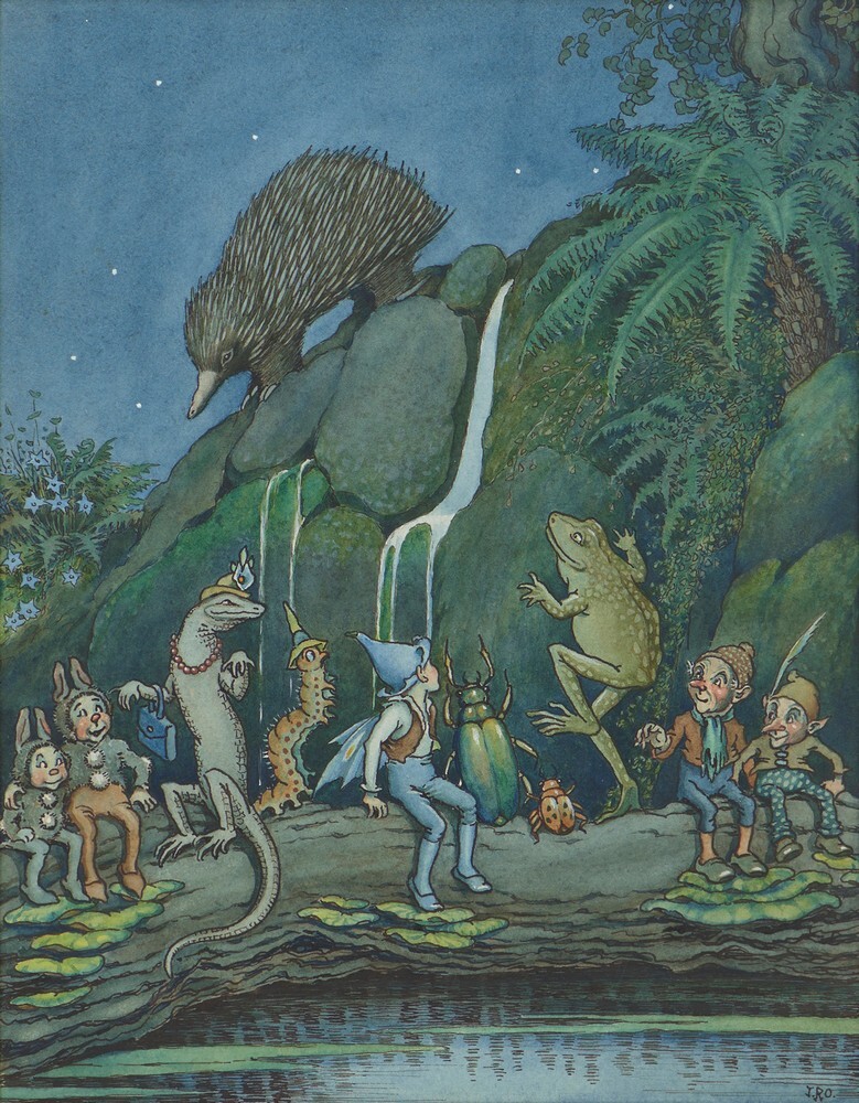
Ida Rentoul Outhwaite, The Echidna Performed, watercolour and ink on paper, 25.5 x 20 cm, private collection.
That children’s books and illustrations from the golden age of children’s illustration equally appealed to young and old was partly a product of the time. The work here is downstream from the principles of the Aesthetic and Arts and Craft Movements, whereby everything was game to be incorporated into a total stylistic outlook; the children’s illustration was equal to any other type of illustration. This is most pronounced in the illustrations and watercolours of the self-trained Outhwaite. Her work has hints of the decadent drawing of Aubrey Beardsley and the fantastic and unnerving watercolours of children’s illustrator Arthur Rackham (whose decision to become an artist incidentally was crystallised after a year sojourn in Australia), although Outhwaite’s vision is highly sweetened. While the watercolours are charming, they can be overly sentimental, and Outhwaite’s strong point is her black and white illustrations. An untitled ink sketch on loan from the NGA of a child boating down the Tigris (c. 1906–20), and The disputed pool (c. 1931)—which depicts a mother and child fairy confronting three frogs domineering a pond—display some of the dynamic patterning and dense linework that animated her best work. This penwork also energises the worlds that her blank little Pre-Raphelitesque dolls, with their flowing blouses, frilly collars and wavy curls, inhabited. Outhwaite’s work is marked by a late nineteenth- century fussiness, but her sense of detail is more concerned with rhythm than retentive precision. In contrast, Gibbs favoured clean, cartoon-like lines, with shaded gradients and soft washes filling out space. Gibbs’s lettering and borders for her popular Gumnut books support the argument that Art-Nouveau illustration in Australia developed most distinctly within children’s illustration. Gnarled eucalypt and wattle branches merge into spindly and spiderly knots, black-metal-logo-like tendrils of letters.
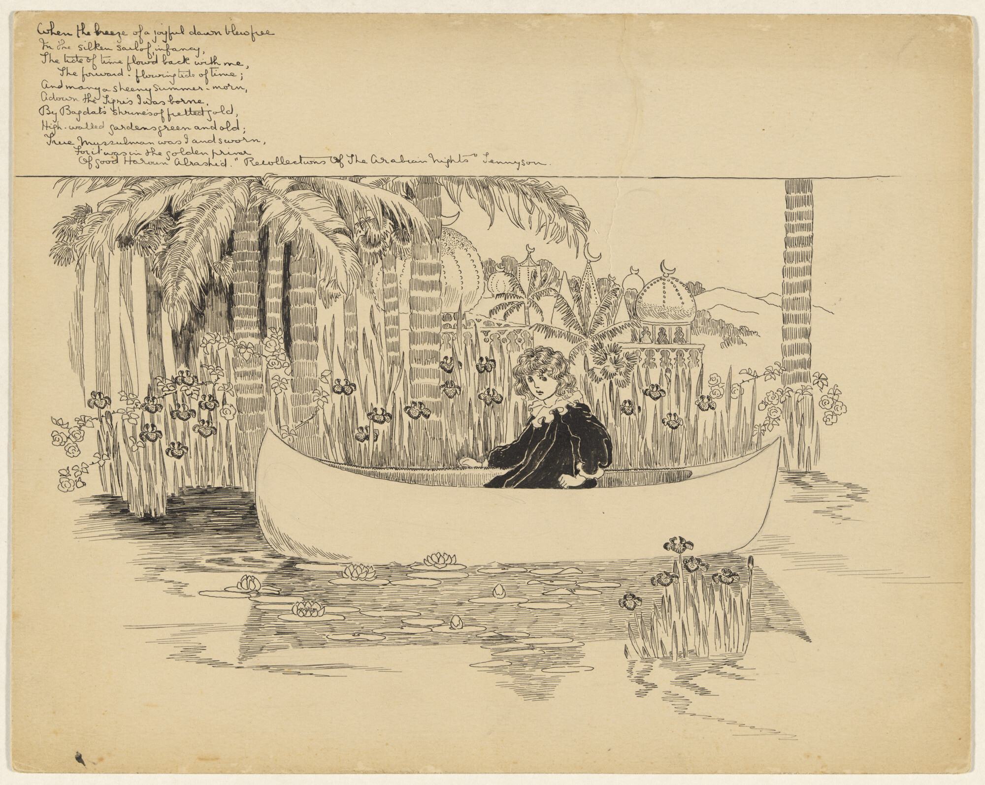
Ida Rentoul Outhwaite, not titled (when the breeze of a joyful dawn blew free…), 1904 -20, black ink on paper, 25.4 h x 32.1 w cm, National Gallery of Australia.
The exhibition’s end point of 1940, as indicated in the wall-text is something of a misnomer, a simple technicality. While there are a few stray late works from Outhwaite, nearly all the work in the show—in date and spirit—is of this early 1900s moment. Indeed, the exhibition ends with a vitrine of World War One ephemera. The curation by GAG’s Associate Curator Andrew Gaynor, his first for the gallery, is exceedingly neat and comment is kept to a minimum. There is brief biographical information, but little more. I was not in town for the curator’s talk. I also left the gallery without loitering in the lobby to read the curator’s article in the gallery’s otherwise ten dollar magazine. So, I’m uncertain about any underlying intent in Gaynor’s selection, which has been widely sourced from the major East coast state galleries as well as numerous works from private collections.
Adventure, Elves and Gumnuts’s arrangement is certainly not arbitrary, with the show neatly split down the middle along a classic Melbourne and Sydney divide. On the Sydney-side we have a picture of enduring success: Gibbs and Lindsay along with the prominent society painter George Lambert. Gibbs and Lindsay’s work is especially marked by an airiness and cynicism that belies their cartoon work in pre-Federation newspapers, which pumped out barbed daily commentary on current affairs. While the Gumnut Babies at first glance resemble chubby, child-like putti, there is nothing mischievous or conniving in their character. Hardly faux-naifs, the joke is on them. They are wide-eyed and credulous, whether in the sketch here of them gathered around Mr. Lizard regaling a story or an ink and wash illustration of them sitting around in horror as they watch their friend Kookaburra eating a pile of worms for dinner. The Melbourne side has a more serious and decidedly feminine energy, with Outhwaite’s fairy work and Ethel Spowers’s cutesy and quite asinine watercolours of children at play. Whereas Outhwaite and Spowers both have a heavily English quality to their landscapes, with mixed or non-descript foliage, the work of Gibbs and Lindsay is briskly “Australian” in subject. This split is also along literary lines; Gibbs and Lindsay remain highly readable (although I suspect the larrikinism of Lindsay’s writing will render the The Magic Pudding ever more incomprehensible). The same cannot be said for the poetry that accompanied Outhwaite and Spowers’s illustrations, which is really only of interest to fairy fanatics or students of Edwardian prose.
If we cannot consider much of the work here strictly for children, then this work seems equally inseparable from the historical mainstream of Australian fine art. This is because most the artists here were first and foremost “fine artists” with children’s illustration a popular side hustle (of the six exhibited illustrators, only Outhwaite was not professionally trained). Take Violet Teague and Geraldine Rede’s wonderfully moody Night Fall in the Ti-Tree (1905), included in the exhibition, which is now considered the first artist’s book produced in Australia. Whether it was even conceived as a children’s book is uncertain, and only after Night Fall in the Ti-Tree was re-published in the UK by Elkin Matthews (the former publisher of The Yellow Book and an early supporter of Ezra Pound) was it marketed as such. In thrall to Japanese ukiyo-e woodblock prints, Teague and Rede hand-printed and -bound the original edition over at least a year after constructing their own press from scratch. Succinct and evocative, the book succeeds as a total work, the text-free double page centre spreads included here provide wide-screen views of animals in the dwindling light. See also Outhwaite’s luxe Elves & Fairies (1916), which was among the earliest full-colour-printed books dedicated to a single artist published in Australia. It is what Lothar Publishing put out immediately after their book on Frederick McCubbin, which was the first full-colour artist’s monograph locally published.
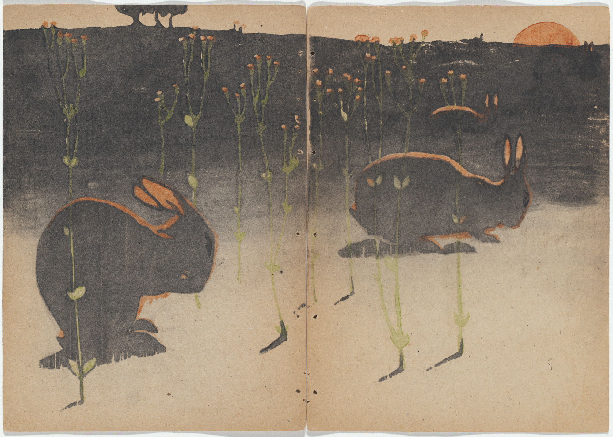
Violet Teague and Geraldine Rede, not titled (four rabbits and grass) from Night fall in the ti-tree, 1905, coloured woodcut on paper, 24.4 h x 17.4 w cm, National Gallery of Australia.
Both Teague and Outhwaite’s twilight work point to a fin de siècle counter-tradition of the nocturne within Australian art , which emerged from under the shadows of the towering gums, shying away from the glass-sharp midday sun. In Teague’s case this link is a direct one. She studied for a time under E. Phillips Fox and Tudor St George Tucker at the Charterisville art colony/school in Eaglemont in the late 1890s from where a post-Whistlerian nocturne emerged as a major motif for Australian artists, best known in David Davies’s Moonrise (1894). The full moon was highly suggestive in this period, when Symbolism and spiritualism were ascendant. The Charterisville nocturnes contributed to a relatively thin strand of atmospheric and fanciful artmaking in Australia, which rejected the strict daytime realism that ossified into academic impressionism from the 1910s onwards.
Although Outhwaite’s twilight scenes were arguably dictated by the fairies themselves, who preferred the light of a full moon to the glare of noon, her work does continue this evocative and imaginative strand in her depictions of a fairy world. Indeed, the mood of her watercolour work is not unlike the contemporaneous theatrical scenes of Blamire Young or the reductive mistiness of J. J. Hilder or R. W. Sturgess. Sturgess was among many artists in the period, more than could fit in this small show, who strikingly illustrated children’s books. It would be easy to think their motives were financial, but it seems the opportunity to produce fantasy was itself the attraction. Put simply, children’s illustration provides a refreshing escape from dominant modes of realist thinking which preoccupied the adult world.
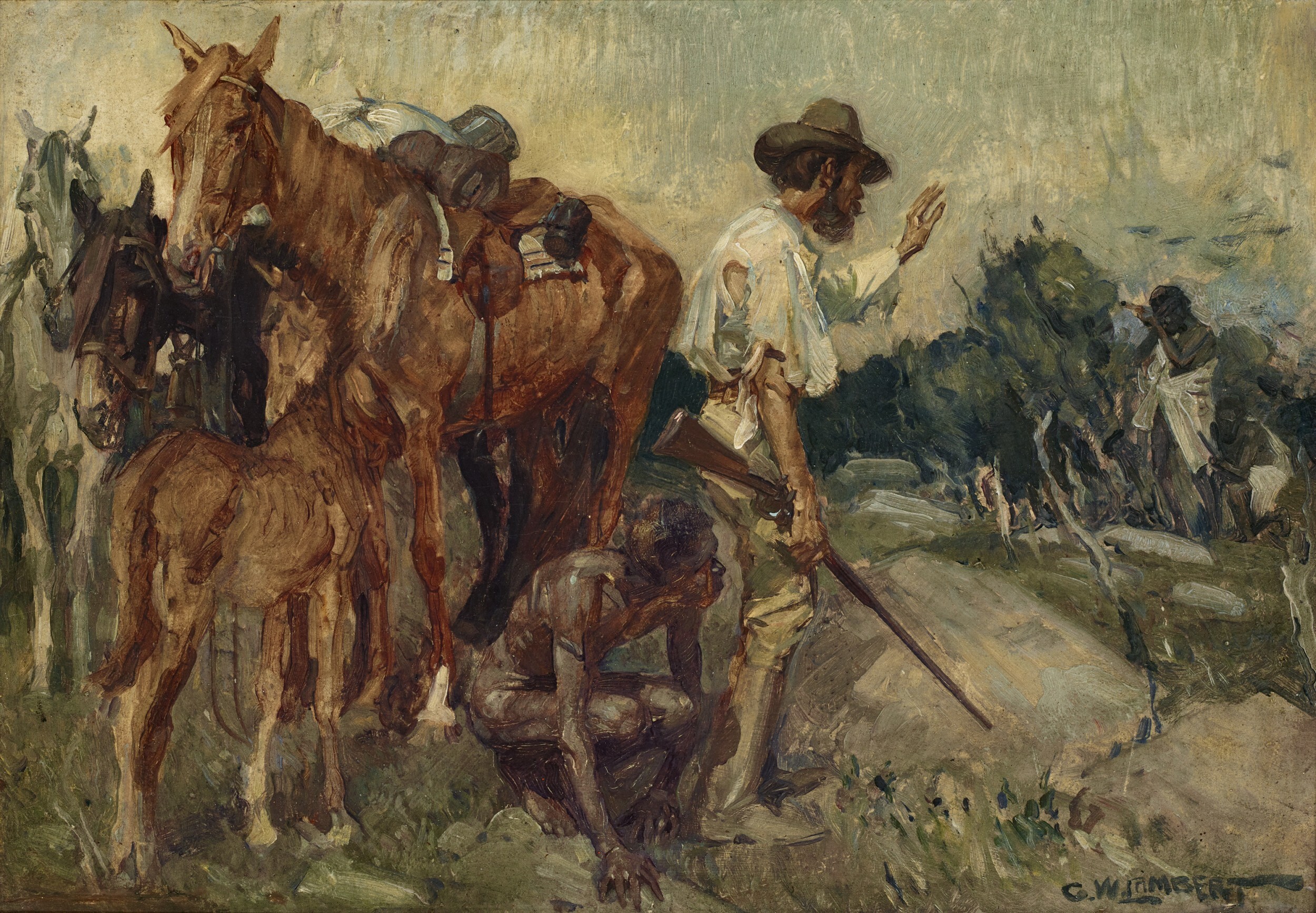
George Lambert, Eyre and Wylie, 1908, oil on wood panel, 26.5 x 38.0 cm, private collection. Photo courtesy of Deutscher and Hackett.
While I much enjoyed the exhibition, it felt at times too neat. The subject almost calls for something more unwieldly and impossible to match the works themselves. There are rough edges: worn out copies of original books, dog-eared and crumpled along with numerous working sketches. But perhaps the problem is that Gaynor’s selection itself begins to fray at the edges with the work of Lambert and Spowers. The inventiveness and imagination that is the hallmark of children’s illustration is sorely lacking in their respective selections. Although Spowers was a fairy artist in the Outhwaite-mode, her watercolours here are of wandering children at play, all preciousness without reprieve. In these late examples of the “golden age” of children’s illustration, it would seem the style had rapidly run out of steam; Spowers’s embrace of modernism in both subject and style was a life-raft for her art. Though I wouldn’t accuse Lambert’s Eyre and Wylie (1908) of being dull, it does stick out here somewhat. While Lambert had drawn illustrations for children’s books, the choice of an oil painting here hedges a bit given the predominance of prints and illustration in the show. As does the subject matter, which is in the “Boys Own Adventure” mode, otherwise unrepresented. Made for an Australian history book for children, the painting depicts the moment the explorer, Eyre and his companion, Noongar man Wylie, cower for mercy in the face of attempted murder as they traversed the desert interior. It is a charged painting. Is it a perverse reversal of the wider historical situation whereby the victor is depicted as victim? Could the figure in the far-right be reclaimed a warrior on the frontlines of the Frontier War? Or is it simply the brutish, mindless violence of kill or be killed? Although a compelling painting, Lambert’s choppy brushwork is somewhat hampered by a stiff composition.
But Spowers and Lambert, more than any other illustrators in the show, suggest a point beyond the “golden age” of children’s illustration when things become complicated. In Spowers’s case, this is not just towards modernism as stylistic succession. Her favoured medium of linocut became intwined with “New Education” and the move from moral to mental hygiene, wherein the healthy child was defined by their inherent individuality. The linocut, cheap and easy, was emblematic as a tool of expression for the child’s incipient self. While the changing styles and fashions in children’s illustration from the nineteenth century onwards were closely connected with changes in printing technology, we could say that the linocut inaugurated the death of the author by elevating the child themselves to equal status as author. Yet it is Lambert’s painting that feels strangely prescient, not looking back to history painting but forward to Cowboys and Indians and on through to Marvel movies. Perhaps the golden age of children’s illustration was simply neat. To focus on this time is to be unconcerned with the emergence of its rivals—the comic and film strip—and the eventual hollowing out of adult forms to child-like imitations. As reading for pleasure increasingly has become outmoded and something only enjoyed briefly during childhood before being abandoned, children’s books are increasingly being set up to become both the first and last books—it is as if Lambert’s worn-out Eyre and Wylie are the figure of literacy itself, facing the threat of being gunned down by the Pure Image.
Jarrod Zlatic is a critic and musician from Melbourne.


