Abstraction 17: A Field of Interest, c. 1968
⬤ Charles Nodrum Gallery 26 Apr - 19 May 2018
What is the art museum for? What is its distinctive function? Is it, as the traditional humanist explanation holds, to preserve the treasures of humanity embodied in art works, collective treasures to which the public has the right of access as a source of ‘ennobling enjoyment’ (as a Parliamentary Commission in 1857 explained the role of London’s National Gallery)? Is it simply the ‘graveyard’ of dead art, as so many avant-gardists have claimed? Or is its function, as Boris Groys argues in a characteristically paradoxical and polemical essay, precisely to ‘kill’ what it collects in order to make ‘life’ possible, by providing in its collection the model of what artists should not do, what their work should not look like if they wish it to appear lively, relevant, and new – thereby becoming a sort of ‘machine that produces and stages the new art of today’?
This question about the purpose of the museum came up at dinner after a visit to the NGV’s current The Field Revisited exhibition. Perhaps, though I didn’t make the connection at the time, it was because in this exhibition the museum does something sightly different from usual, or does something in addition to its usual roles, however these might be defined. In commemorating the 50th anniversary of an important exhibition by attempting to restage it as faithfully as possible, the NGV is clearly not simply providing an opportunity to see the artworks exhibited in the original show, or presenting the work of the Australian non-figurative sculptures and painters of the late 1960s as historically important. It is also commemorating itself, paying tribute to the moment of its supposed entry into international modernism. And with good reason, for as Ian Burn and Nigel Lendon suggested in an essay written in 1984 on the occasion of the first exhibition to look back on The Field, the historical importance of the original exhibition has less to do with the works displayed than with the novelty of ‘institutional sponsorship of an “avant-garde” context for contemporary art in Australia’.
In addition to this historical importance, the boldness of John Stringer’s exhibition design, with its kitschy silver wallpaper, must also have contributed to the decision to recreate The Field, tapping into a contemporary interest in revisiting and restaging notable past exhibitions. (By far the most widely discussed example of this phenomenon is Germano Celant’s 2013 reconstruction of Harald Szeeman’s Live in Your Head: When Attitudes Become Form, originally presented in 1969 at the Kunsthalle Bern). As David Homewood and Paris Lettau point out in an inventive essay included in The Field Revisited catalogue, Stringer’s reflective silver walls and somewhat crowded exhibition layout ‘edged The Field closer to the status of art installation’ and away from the modernist white cube designed to provide a neutral backdrop for a selection of autonomous artworks.
Stringer is of course no superstar curator, but in this focus on recreating the historical exhibition as itself an important cultural artefact, The Field Revisited belongs to the contemporary discourse of the self-legitimation of curators as cultural producers on par with artists (a development already noted and questioned by Daniel Buren, among others, with regard to Harald Szeeman’s 1972 documenta 5). The importance of recreations of historical exhibitions in this discourse is indicated by a telling remark – one is almost tempted to call it a slip – made by Jens Hoffmann in the catalogue for his and Joanna Montoya’s 2014 Other Primary Structures exhibition at the Jewish Museum, New York, which revisited the museum’s 1966 Primary Structures exhibition. The curator, Hoffmann remarks, creates something temporary, ‘unlike a writer, who produces books that endure, or a filmmaker, who makes movies that can be seen again’; a writer or a filmmaker, that is, rather than a publisher or film programmer is comparable to the curator. Important exhibitions from the past become the ‘canon’ of curatorship, and their historical recreation plays an essential role in legitimating the curator as a practitioner of something equivalent to an art form.
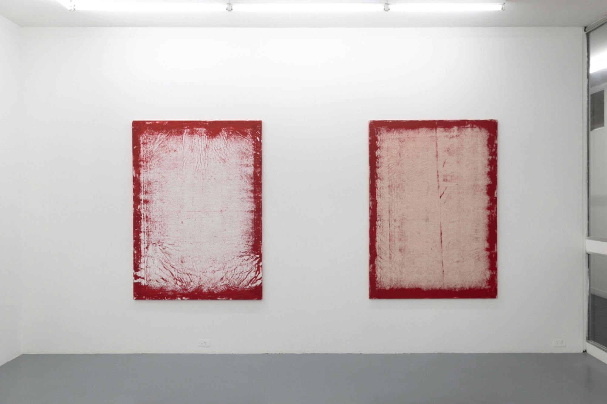
For all of these reasons, the exhibition of work related to The Field currently on display in the homely surrounds of Charles Nodrum Gallery serves as an essential complement to the NGV exhibition, presenting some important pieces from the time in a context where the weight of history impinges a little less forcefully on our enjoyment of the art. Especially given the reservations many have about the selection of pieces made for The Field – Patrick McCaughey, who at the time defended the original exhibition in the pages of The Age and contributed to the exhibition catalogue, remarked in a recent retrospective piece that the exhibition ‘was superficially curated’ – this exhibition at Charles Nodrum Gallery provides a welcome opportunity to see additional work by artist shown in The Field and work by artists overlooked in Stringer’s selection. (The exhibition marginally improves on the The Field’s under-representation of female artists, containing five women, two more than the original exhibition’s three).

Like The Field, the exhibition presents a number of distinct styles, some of them related only – to quote Burn and Lendon again – through their shared contribution to the ‘look of the 1960s’. The main downstairs exhibition space houses an impressive collection of mainly large-scale colour field paintings, including an enormous two-canvas work by Richard Dunn (who was not included in the original exhibition) and a beautiful shaped work by Tony McGillick, which is notable for a particularly dour colour scheme that connects it to the seemingly deliberately off-putting greenish-brown used by Dale Hickey in two works exhibited upstairs. Placed next to the crisp, eye-popping primaries, delicate mauve, and stark black of Margaret Worth’s Genus O No. 1 (1966/67) or the bright pop palette of David Dallwitz’s Dynamo (1969), McGillick and Hickey’s odd colour choices seem like the result of quite a different kind of perception, one that aims at a correspondingly subtle, oddly banal effect on the viewer. Also on display downstairs are two paintings by Ron Robertson-Swann, one a small horizontal-format on unprimed canvas with a soothing colour palette After Matisse (1964) – bearing out Elwyn Lynn’s remark in The Field catalogue that much of this work ‘aims at a Matissian relaxation’ – the other a large vertical work in black and yellow (Pink Alice, 1968), whose stretched format and strong diagonal axis creates the almost woozy sensation of its forms being squeezed in from the sides.

Upstairs, in addition to more large hard-edge pieces, two areas of the exhibition focus on pieces that edge closer toward minimalism and psychedelic art, respectively. Rarely mentioned even the accounts of The Field that stress the diversity of styles displayed in the exhibition, the huge art nouveau-influenced psychedelic pattern works of Vernon Treweeke are both the most evident contradiction to any suggestion that The Field’s participants exemplify a single Greenberg-approved approach to abstraction and the aspect of the original exhibition that, along with Mike Kitching’s kitsch plastic Phoenix II (1966), is most difficult to see as anything more than a period piece. Although smaller and more charming than the enormous works in The Field, the psychedelic works here, one by Treweeke and another James Clifford, are less interesting in themselves than for the interesting light they cast on the other paintings in the show by pointing to the counter-cultural/proto-hippie milieu that some of these artists must have belonged to, or at least had some familiarity with. And this raises interesting questions about the work of these artists, questions that are also relevant to the canonical work of New York painters of the same period. The influence of 60s formalist criticism has encouraged a reading of 1960s abstract painting in terms of its development of the tradition of abstraction and the history of modern painting more broadly. But what of the influence of drugs and psychedelic culture, for example, on these artists? The critique of ‘high modernist’ abstraction by the next generation of artists and critics in the 1970s, wishing to distinguish themselves as engaged with the world outside the gallery in a way that the abstract art of the 1960s was not, has tended to obscure questions (rather than polemical take-downs) about how this work relates to the interests and practices of the broader culture in which it was produced.

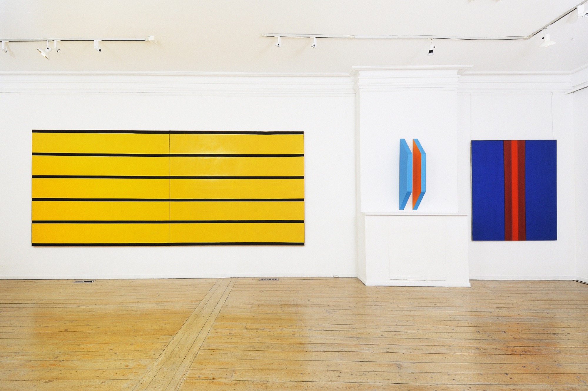
There are several sculptural pieces dotted around the exhibition, all of them more related to the reduced formalist abstraction of Anthony Caro than to full-blown minimalism. While works by Lentonn Parr and Paul Selwood show the direct influence of Caro’s sculptural vocabulary, a brightly painted wooden sculpture by Margaret Worth (Untitled, 1968) achieves one of the characteristic effects of Caro’s work by different means. Caro’s work often produces the sensation, most pronounced in the ‘handles’ that figure into many of his table sculptures, that we are being presented with an object of practical use that has been in some profound sense disabled, an object that seems to draw on the structures and grammar of useful objects without opening itself to any possible use. Worth’s piece, composed of two identical wooden panels hung at a small distance from each other jutting out from the wall, each painted blue except for the most inner surface, painted a bright orange, is like some sort of non-functional furniture, an elegant shelving unit without any shelves, perhaps. Like Caro’s work, it draws the strength of its aesthetic presentation from its quotidian materials, which suggest a practical use that is proposed only to be suspended. It is also, as the catalogue notes for the show point out, a ‘light piece’, as the bright orange paint casts a faint glow on the white wall behind, an effect that only serves to intensify the effect I have been describing, as the purely visual nature of this glow deemphasises the materiality and potential practicality of the wooden sculpture.

More directly aligned with minimalism is a multipart work by Paul Partos (Unspecified lengths, 1969), consisting of a series of small boards covered in aluminium, each framing a vertical rectangle made up several layers of painted nylon. Displayed on the floor in a grid formation, the reference to classic minimalist ideas of seriality and spatial activation is clear, yet the pictorial composition of each individual panel as a rectangle in portrait orientation standing out against a larger rectangle that reads as a neutral border (a form that Partos would use in many of his later paintings and drawings) and the atmospheric colour effects distance the work from the austerity of New York minimalism, giving it more of a ‘west coast’ feel. These are odd and in some ways unsuccessful works, lacking the attractively brooding, Romantic quality possessed by Partos’ large paintings in The Field. The carpeted floor of the gallery is perhaps partly to blame for this underwhelming effect, and one wonders how they might appear differently in a slicker, white cube environment. However, in this, they are the exception to the rule, as the domestic architecture of Charles Nodrum Gallery and its no-frills, almost slightly scrappy interior provides a perfect place to see most of the work displayed. The effect is almost like seeing them in a collector’s home and, as autonomous works on the modernist model, rather than elements within the proto-installation aesthetics of minimalism, this quotidian backdrop actually serves to reinforce the sense of internal formal coherence that the better works in the exhibition possess. Away from the glitter of the silver walls of The Field, and equally distant from the profoundly contemplative, almost religious atmosphere created by the pristine interior of the concurrent Robert Hunter retrospective, the works on display here feel approachable and human, attractively modest in a way that at times brings them surprisingly close to contemporary hipster abstraction. (This is also an effect of the relatively small scale of some of the works on display, most of which avoid the pitfall James Gleeson pointed to in his review of The Field, of attempting to generate ‘authority…from size alone’).
Issue No. 1
Grab a copy of Memo’s first glossy annual magazine issue, featuring an extended artist focus on Archie Moore, the 2024 Venice Biennale Australian Representative, with essays by Rex Butler, Tara Heffernan, Tristen Harwood, and Hilary Thurlow.
Issue 1 features articles by Audrey Schmidt, Philip Brophy, Helen Hughes, The Manhattan Art Review’s Sean Tatol, Cameron Hurst, Chelsea Hopper, among your favourite regular Memo contributors. There are reviews and articles, including on Melbourne design art, French literature’s ageing enfant terrible, Michel Houellebecq, Derek Jarman’s Blue (1993), the celebrated Spike magazine cultural critic, Dean Kissick, the local cult-favourite Jas H. Duke, and much, much more.
Memo Magazine, 256 pages, 16 x 25 cm

Above the stairs hangs a remarkable, singular painting by Dick Watkins (Window Box, 1967), a polychrome surface of messy brush marks that contrast strongly with a series of primarily black rectangles of descending size, which create strong a perspectival effect. From a distance it reads almost as a trompe l’oeil effect, as if the painting were on a carved wooden surface rather than a flat canvas. Far from any doctrinaire notion of abstraction, in this playful illusionism and its resolutely inexpressive use of the gestural paint marks, the work calls up the fleeting paradoxes of Jasper Johns. Certain mid-60s paintings by Johns (Edingsville, 1965, for example) also come to mind in connection to paintings here by Ti Parks, Janet Dawson, and James Doolin, stylistically distinct but all of which sharply divide the canvas into areas of different patterns, which often suggest radically different scales. This creates an interesting effect of compositional arbitrariness, as if a number of separate pictures had been collaged together, and also suggests that some parts of the image are magnified details of other sections, creating a strong link back to techniques of representational painting.

In his text for The Field catalogue, Patrick McCaughey described the ‘severely non-referential quality’ of the work displayed in the show, and it was, of course, the abandonment of the great Australian figurative tradition that outraged many critics in 1968. But one of the most fascinating things about the artists of The Field is the variety of forms (and degrees) of reference one finds in their work to a world outside the painted surface. Most obviously, there are Hickey’s quilt patterns, present both at Nodrum and in The Field, replete with an oddly irregular use of colour gradation to give each individual square a sense of spatial depth and Janet Dawson’s essentially representational Wall II (1968-1969). There are works that use codified forms impossible to disentangle from their semantic function: in The Field, Dick Watkins’ October contains a large star and at Charles Nodrum one of the two remarkable works by the under-recognised painter Margaret Dredge uses three very clearly recognisable arrows (The Huntress, 1969). Doolin, perhaps the most important figure in connecting Australian artists of the 1960s to American hard-edge painting, was open about the influence of street signs and the urban environment on his paintings, which he titled Artificial Landscapes. Doolin even went so far as to include photographic slides of Melbourne streets and street signs alongside the paintings in his first solo exhibition at Melbourne’s Gallery A in 1966.

It would be easy to read these works anachronistically, as some kind of critique of the dogmas of formalist abstraction, asserting the impossibility of a true break with representation. Alternatively, considering there is really no evidence for this interpretation and no reason to believe that the ideas of Greenberg’s formalist criticism already appeared to these artists as dogmatic and limited, we can also read the referential structures of the paintings as resulting from provincial misunderstanding of what happening in New York at the time and a misreading of the relevant texts. This latter interpretation certainly has some weight, but I would like to suggest another way of interpreting the situation. It is a classically ‘antipodean’ interpretation: what if we understand this provincial misreading of the tradition of modernist abstraction as itself illustrating something central to that tradition? Is there, in fact, any substantial distinction between the various forms of reference to something outside the painting practised by these Australian artists (whether in the form of structural similarities, suggestions of illusionistic technique, or adoption of pre-existing symbols) and the extremely refined version of illusionism that the formalist criticism of Greenberg and Fried finds in colour field painting, the creation of effects of ‘optical depth’ through colour alone, for example? Are these not all simply variants on the same dialectic between the materiality of the painted surface and its symbolic, representational, or illusionistic excess that has concerned modernist painting at least since Cubism? If we can imagine that the development of abstraction was not simply toward the elimination of those last vestiges of representation, but rather toward an increasing refinement of this non-material excess, an increasingly subtle flickering between the materiality of the object and that ‘something more’ that enlivens it, then these seemingly marginal works become more comprehensible within the terms provided by the history of abstraction.
Francis Plagne is a writer and musician from Melbourne.
Title image:Abstraction 17: A Field of Interest, c. 1968, Charles Nodrum Gallery, 2018. Image Credit: Gavin Hansford.)