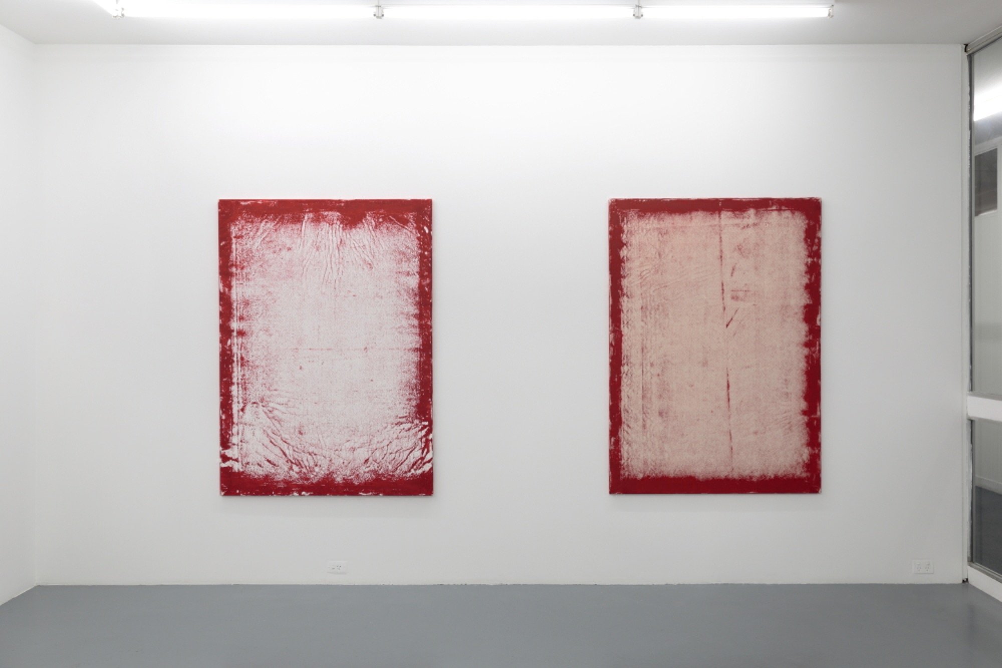
Troy Ramaekers’ current exhibition at Footscray gallery Five Walls, titled Double-B Sides, features four deceptively simple paintings. The artist has stretched large canvases, taller than wide, and around the edge of each is a bleeding red border. This border contains a trace of the stretcher behind the canvas as well as the ground, where the artist has pressed down with a squeegee of some kind to make a print or a frottage of both the support and the floor. The result shows a compelling residue of the texture of the floor, the shadow of the stretcher bars and the layering of the block printing ink on the unprimed canvas. Questions about process and materiality merge with questions about meaning: has the canvas has been stretched before, inverted on the ground, painted and then re-stretched in reverse? Are these prints of themselves as much as of the ground? The result is a striking image that is both a print and a painting inside-out, a doubling of the usual relation between printing block and print.
Ramaekers describes these works in terms of the B-Side songs released on vinyl recordings. The single—hopefully popular, and lucrative—would be played and played while the songs on the B-Side would be marginal, experimental. To the fan of the hit single, the B-side would fade into insignificance, but to the connoisseur, B-sides are a site of greater experimentation and freedom, perhaps ultimately producing the better songs. From one point of view the B-Side simply fills the space on the record, from the other the popular song enables the release of more interesting material. Double B-Sides brings this idea to bear on the structure of painting.

The history of modernist painting provides the dynamic of this conceptual structure. Not only in the way that the taut canvas has a material history of its own, but also through discussions around surface, mark-making, the gesture of the artist and the marginal structures at the edge of painting—these expressions operate as a kind of conceptual hook that draws in an anthology of ideas around philosophy and semiotics. Philosophically, I think of Valerio Adami’s drawing of the back of a canvas that features on the cover of Jacques Derrida’s The Truth in Painting, a text that itself traces the marginal structures at the edges of painting’s often assumed border. Semiotically, I’m also drawn into a circle around signifier and signified, printed image and printing block: two sides of the same theoretical coin. The coin here is painting, but it is also the print, and it’s hard to avoid thinking of the vinyl record as an engraving of its own.

This dizzying array of connotations and connections seems to be a type of trap though, however sweet and reassuring. Don’t get me wrong: these thoughts are vital for thinking through the structures of the frame and its relation to the material of painting, a vitality that is clearly present in Ramaekers’ work. My worry is not that these ideas have simply been thought before, or even perhaps overthought. It is rather that I don’t want to confuse the vertigo of these connections with the falling into them. While it would be possible to compulsively jump, I feel like the challenge of these paintings and prints is to warily circle the theoretical depth, remaining in the present-day physical space rather than immediately reaffirming the arguments that, having broken a trail already, seem to present the easiest course.

The ink of the paintings provides a solid frame around the edges, but within that there is variation and depth. Three out of four of the paintings are on unprimed canvas, and the red ink hovers on the loose fibres. When standing close by, this subtle depth is palpable. Marks on the floor where Ramaekers made the work also show up in the image like lines on a skin, set against the cream-coloured cotton material. When standing further away, the effect is one of a portal, or perhaps (obviously) a picture frame. The pictorial frame of the literal canvas support, to be sure, but also the frame of a cinema projection after the film has run through: like Nam Jun Paik’s Zen for Film (1965), each fibre of dust or hair within the projector is writ large on the projection screen. Even further back in cinema, the news reels created for Citizen Kane (1941) were given their scratchy realism using the floor, with Orson Welles famously dragging the negatives across it for the desired effect. In series, Double B-Sides could be taken as empty cinematic frames, albeit standing on their shorter edge in the video format made popular by mobile phone recordings. But there is a decidedly analogue emphasis throughout the works, stemming from the two-sided recording on vinyl and its material and theoretical articulation. However, these arguments seem to haunt Double B-Sides in a way that is more a re-animation than a nostalgia. The theoretical arguments about the limits of frame and work still seem to have a pulse.

The idea of the canvas as skin remains for me an important possibility for these works; perhaps underneath there is a body, or no body—like the emperor’s new clothes? A bit of minor internet-sleuthing suggests that Ramaekers is both musician and visual artist, and the musical premise of this show seems to support this idea. The connection between abstraction and music is a well-worn path, so I’m a bit suspicious of my thoughts here, but could the artist be exploring the structurally drum-like quality of the stretched canvas, the Double B-Sides a reflection on the beat and the canvas as attention given to structure?
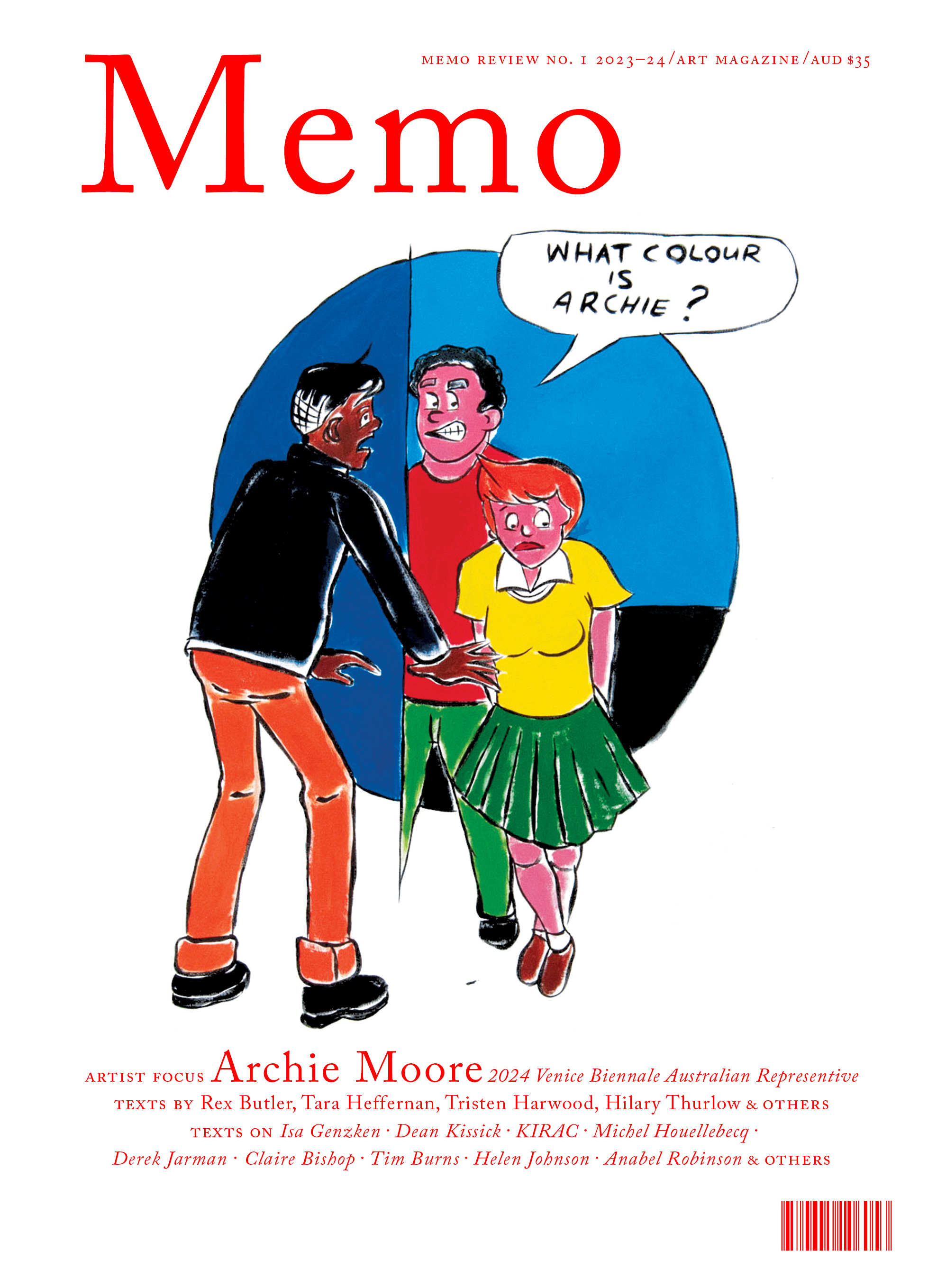
Issue No. 1
Grab a copy of Memo’s first glossy annual magazine issue, featuring an extended artist focus on Archie Moore, the 2024 Venice Biennale Australian Representative, with essays by Rex Butler, Tara Heffernan, Tristen Harwood, and Hilary Thurlow.
Issue 1 features articles by Audrey Schmidt, Philip Brophy, Helen Hughes, The Manhattan Art Review’s Sean Tatol, Cameron Hurst, Chelsea Hopper, among your favourite regular Memo contributors. There are reviews and articles, including on Melbourne design art, French literature’s ageing enfant terrible, Michel Houellebecq, Derek Jarman’s Blue (1993), the celebrated Spike magazine cultural critic, Dean Kissick, the local cult-favourite Jas H. Duke, and much, much more.
Memo Magazine, 256 pages, 16 x 25 cm

This detailed approach to the structures of art has a complex relation to the vividly lived cultures around the gallery. Located above a shop in Footscray (next door to Trocadero, another artist-run space), Five Walls director Aaron Martin has maintained a strict focus on abstraction throughout the gallery’s six years in operation. Abstract painting is not really the A-list of art any more, but its apparent marginality allows it to retain a sense of experimentation, reflection and energy. Here it seems not Culture with a capital C—like the abstraction of high modernism that still haunts us occasionally—rather it appears as one culture among many. It is this decidedly non-spectacular emphasis that allows abstraction to be an important part of culture as a process rather than some fictive end-point. Double B-Sides demonstrates the vitality of this process by means of some critical reflections on the print and the frame. The exhibition closes today, but there is still an opportunity for the intrepid to seek it out.
David Wlazlo is a PhD Candidate in Art History and Theory at Monash University.
Title image: Troy Ramaekers, Double B-Sides Photo credit: Tim Gresham)


