Meagan Streader: A Window is a Square Horizon
by Tara Heffernan
Today, corporations … dictate the development of a graphic device that must positively project an “all-encompassing” visual image. This requirement underscores the difficulties encountered in designing a trademark that is a mark of individuality, while at the same time having the qualities of universal application.
—Lester Beal, The trademark: a graphic summation of individuality (1968).
The awareness of one’s position in relation to the (Minimalist) object and perception of the object’s orderly presence makes possible an awareness of one’s position in relationship to the universe. The provocation of that awe is the object’s function.
—Buzz Spector, Objects and Logotypes (1980).
Meagan Streader’s current exhibition at MARS Gallery, A Window is a Square Horizon, comprises a collection of eight small sculptural works with a pronounced two-dimensionality, a deviation from the immersive, site-specific interventions for which she is known. Streader is an early-career Australian artist working in the lineage of both Minimalism and the Californian Light and Space movement. Most texts available on Streader describe her practice as an investigation of light and its impact on sensory experience. While this suffices as seductive PR, it is a tired, typical narrative commonly attributed to artists that work in a technologically curious Minimalist style. It serves to subdue more informed engagements with the work and its implications as a commercial cultural object that both constitutes, and responds to, tendencies in design and architecture, and accepted ways of seeing and interacting with art. (And, moreover, it blindly adheres to the already rather dubious narrative built around the Light and Space movement.) What I see in these sculptures and their evocation of the “windows” of contemporaneity is something more compelling and sinister. For these reasons, A Window is a Square Horizon is worthy of deeper consideration.
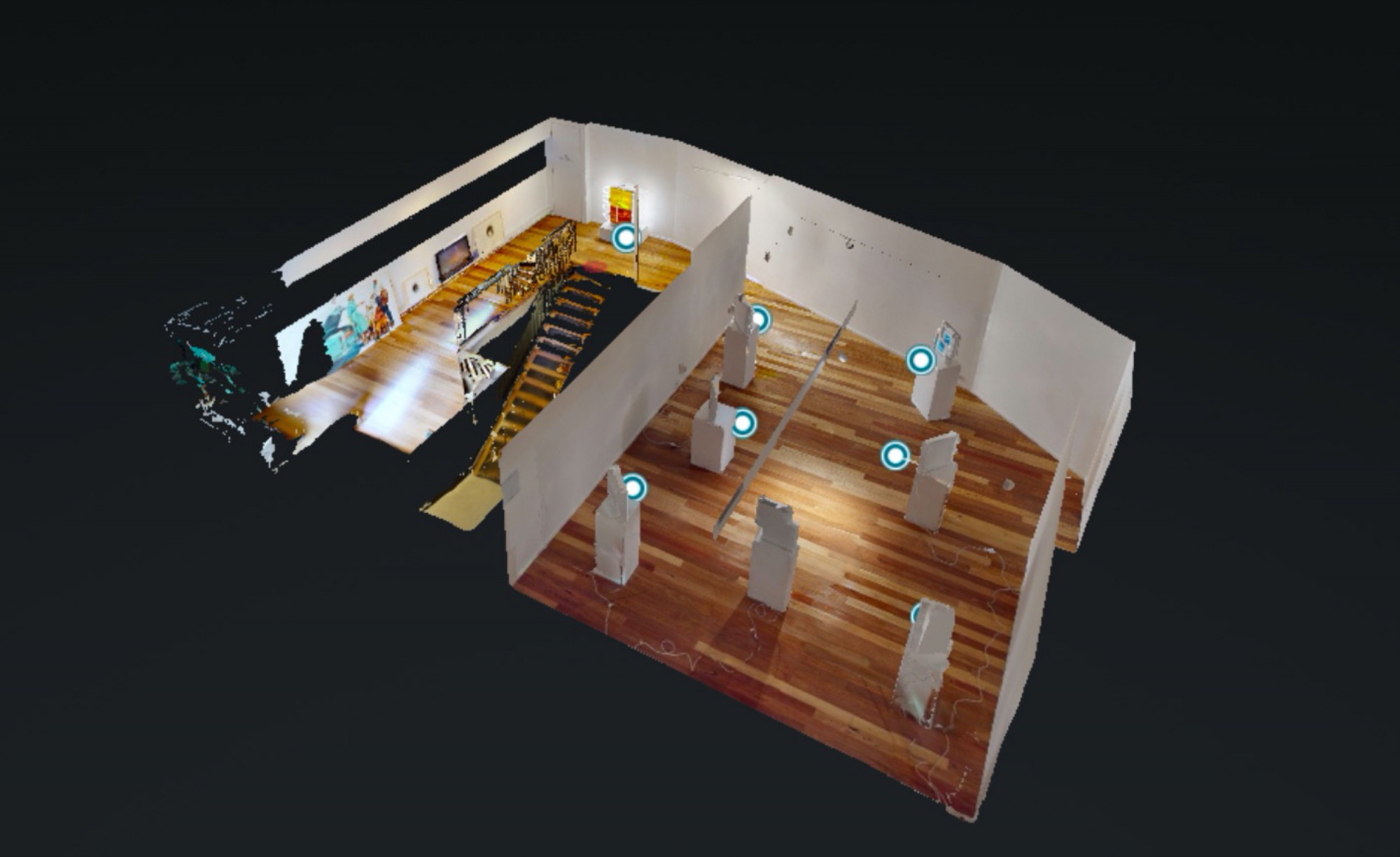
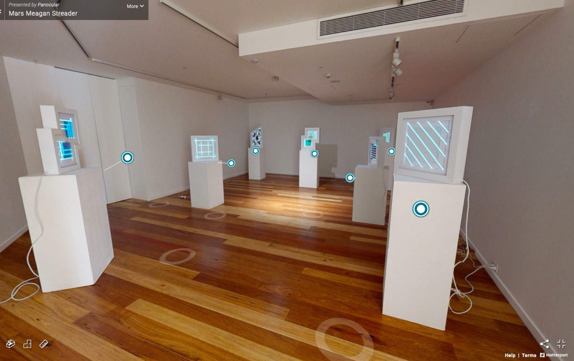
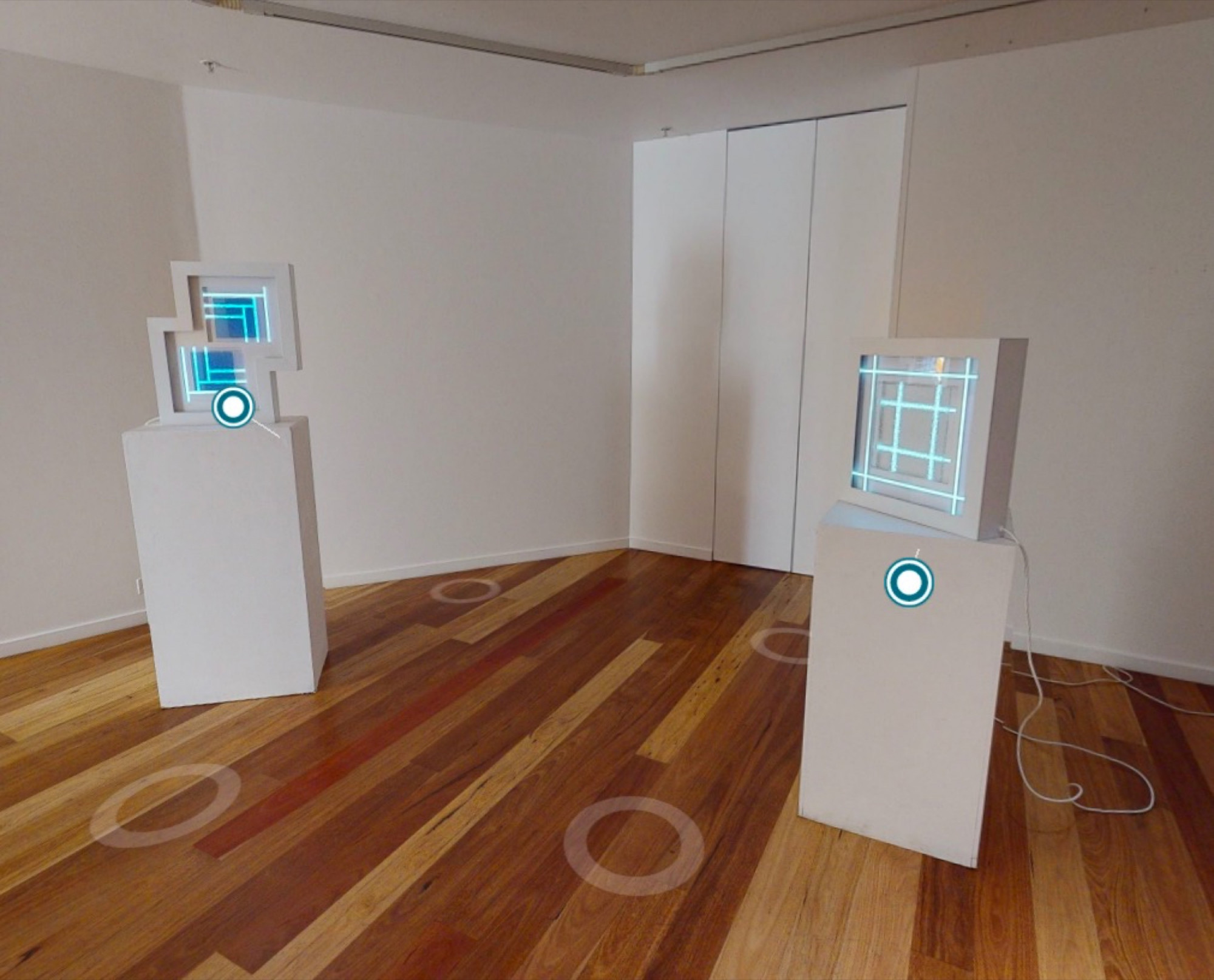
Behind the works lies a multifaceted process of visualising and interpreting objects and space through technology—a process in which multiple “screens” or “windows” have been utilised. Streader developed these works during Victoria’s first COVID-19 lockdown by looking at sites in Melbourne’s CBD via Google Street View. The artist focused on features such as doors, windows and glass—all architectural details with interpenetrative purposes. In this process, Streader viewed three-dimensional spaces (that she has presumably seen in real life but perhaps only in passing) in two-dimensional space. In their sculptural form, they were returned to three-dimensional objects that nonetheless possess a pronounced two-dimensionality—all of them are rather flat and boxy with an obvious front and back, resembling bulky picture frames. To complete this cycle, I have viewed these works exclusively online, returning them to the flat plane in the immersive virtual tour available on the gallery website. The limitations imposed by this viewing experience are, ironically, rather complimentary to the intentions and aesthetics driving Streader’s work. Similar to Street View, we navigate the space by moving around a flickering translucent O on the gallery floor (a form whose geometry echoes Streader’s minimalist aesthetics), which transports us to a new point in the gallery from which we can access a 360-degree view. Though it can hover over any surface, it occasionally stutters while locating a stable point.
The evocation of the window “as a square horizon” in the exhibition’s title (taken from a quote by contemporary artist Olafur Eliasson) might initially sound strange. Here, the horizon serves as a metaphor. It signifies the point that separates us from what is beyond the sites that ground us—our particular locality, our personal experience, our imagination, etc. The window also denotes the Renaissance innovation of perspectival drawing, a method that made it possible to emulate the way the viewer perceives objects in space, which the Renaissance theorist, Leon Battista Alberti, compared to an “open window”. In the words of Amelia Jones, it is this analogy, between window and sight, that positioned “the artist at the center of seeing, knowing, and making”—an ideal that has carried throughout history. In the last half-century, this has been repudiated by post-modernist artists and revisionist theorists alike for its troubling deference to objective truth. Streader is similarly invested in interrogating the role of the window as both “a structural and psychological boundary”. As the gallery text explains, via “variations of the square, angling and offsetting materials and pattern, this new series aims to reveal the shifting and unstable nature of perception through visual disorientation”.
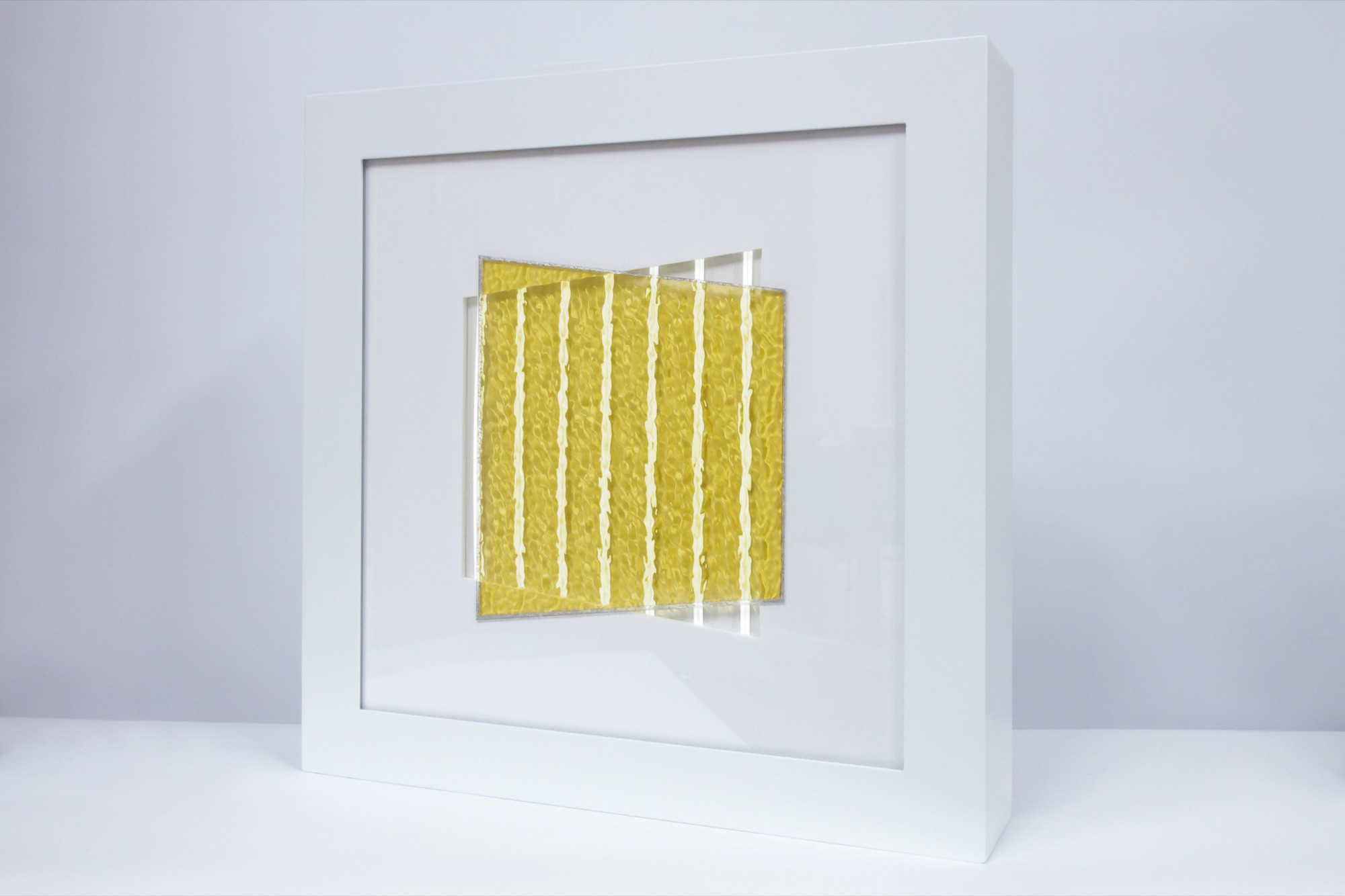
In this series, Streader has directly engaged with the expanded idea of the window, acknowledging the screens we confront every day (smartphones, laptops, gaming consoles, etc.) as another kind of window to the world—another horizon. While the motif of the window is evoked by the shapes and materials in the sculptures, the window (in this expanded form) also suggests something slightly more menacing. As the Italian futurists of the early twentieth century recognised, the window is an invention with interpenetrative power. They used it as an emblem of the modern breakdown between private and public, inside and outside. The intense interpenetrative potential of the window is even harder to deny in the age of the internet. Complete connectivity is a comfort, a crucial source of entertainment, education and social contact, but it also makes us vulnerable to surveillance, hacking, datamining and information-overload. Intriguingly, while the artists of the Light and Space movement were concerned with the sensory impact of light and technology and how it influences our experience of space and architecture, concern with the socio-political role of technology in commercial spaces was peripheral at best. Rather than acknowledging the interrogative, disorienting influence of light in fabricated public environments, artists of the movement repackaged it as “sublime” or “transcendent”, a focus that eschewed the art gallery’s adherence to the aforementioned conventions of surveillance. This depoliticisation occurred despite the fact that the atmosphere of California—its colours, technological innovations and commercial landscapes—is strongly associated with the movement. Perhaps due to the undeniable association between Streader’s work and that of these influential artists—particularly Mary Corse and the obnoxiously famous James Turrell—all the texts on Streader’s work similarly appear to side-step this implication, though the exhibition text claims that Streader’s sculptures “reveal the pervasive role of light in governing physical and social navigations of fabricated spaces”.
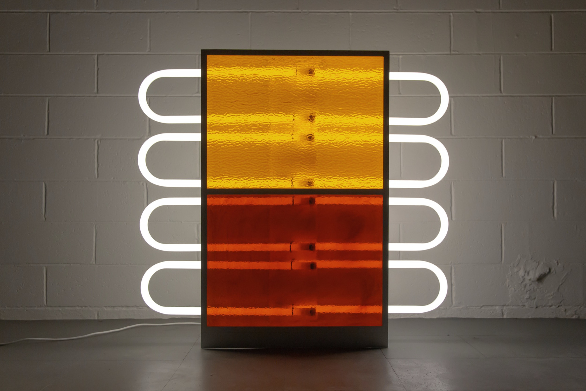
If we think of Streader’s sculptures literally as windows (using our imagination to return the materials utilised to the “real” fabricated spaces of contemporary life), the windows they most recall are those of the increasingly generic spaces of high-density living. The tubular lighting (created by florescent tubing or electroluminescent tape) is reminiscent of the oppressive fluorescent lights that line dank hallways and damp concrete stairwells. Moreover, neon is the material used to spell out “HOT GIRLS” on strip club exteriors or “24 HOUR KEBAB”—the comforting, three am beacon after a big night out. This likeness is most stark in Rise (2020), a sculpture located close to the stairs as you enter the main gallery space. Rise comprises two panels of richly coloured glass, the top panel an orange-yellow and the bottom an earthy, blood red. These panels are backlit by a set of four curved-edged rectangles formed by fluorescent tubing. The bubbled surface of these panels, which features in most of the sculptures in the exhibition, recalls the thick glass used in windows, doors and room dividers that have become a staple feature of late twentieth century urban apartment blocks, offices and public bathrooms—their bubbled texture regarded as an innovation that provides a semblance of privacy with its blurring effect, while still (ideally) allowing some natural light to enter. As confirmed by the hipster obsession with tracksuits, “wifebeaters” (an uncomfortably classist nickname for a sleeveless undershirt) and trucker hats, there is a profitable romance to the “urban primitive”. In sculptures that employ base materials, the associations with—and appropriations of—mass-production and the common features of the urban environment constitute a subversive nod to the insidious role of surveillance in urban design and the iconography of the street, entering the corporate office or wealthy home as rarefied art objects.

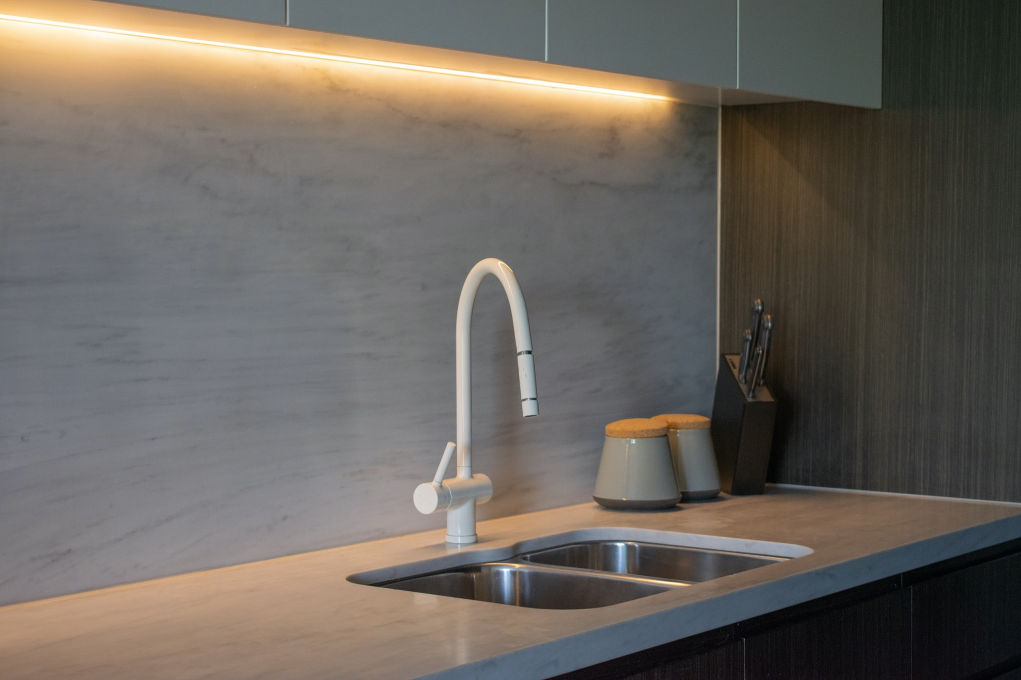
However, the bulky geometric forms, matt monochromatic surfaces and grids of light (created predominantly with electroluminescent tape and fluorescent tubing) also recall the highly ubiquitous architectural and design features of modern homes. Encompassing a great socio-economic divide, such features are shared by high-class hotels and McMansions. However, they also feature in a generic style of tract housing that’s become increasingly common in the outer suburbs of capital cities and expanding regional areas. These aesthetic echoes are evident in cleanness and sterility of works like View From Home (2020) or Blue, Parquetry (2020). Under the textured glass, the clean lines of the electroluminescent tape are rippled—an effect that might resemble the reflection of light on the surface of a swimming pool, or the pattern made when harsh light is filtered through window-blinds at night.

Undeniably, part of the commercial viability of these artworks is their aesthetic congruence with modern homes and design. Beyond this, however, there is a lingering stigma attached to Minimalism (and Light and Space art) that partly emerges from how readily it was subsumed by corporate culture. As detailed by Alexander Alberro in his book Conceptual Art and the Politics of Publicity (2003), the 1960s were a time when experimental contemporary art was embraced by the monied American elite. It suddenly became fashionable to align oneself (and, crucially, one’s business interests) with the latest innovations in the art world, providing evidence of a radical, forward thinking nature. Moreover, during this booming post-war period, the ideologies of artists and businessmen were alarmingly symbiotic. In both worlds, there was burgeoning and parallel investment in “ideas” as a site of innovation and commercial enterprise. In art, this was evidenced by the rise of conceptualism and the attendant process of deskilling. Around this time, artists began to employ industrially produced materials that they reconfigured into art objects.
For the most part, the brilliance of the Light and Space artists also stems from their adaptations of pre-existing, often outsourced, technologies. In 2020, Doug Wheeler’s 49 Nord 6 Est 68 Ven 12 FL opened at David Zwirner gallery. The work is a completely white room with one wall bordered by a glowing, hidden light-source. This effect is achieved as the light emanates from another, slightly larger room in which the viewing room is encased, hiding the light source and making it appear to be a magically manifested rectangular halo of light. The work has been widely praised (and Instagrammed). Though it is impressive in Wheeler’s reconfiguration, concealed lighting (in which the fixtures are hidden behind floating wooden panels or in inconspicuous corners) is also a ubiquitous feature in trendy home and office design. Further, recessed lighting (in which the light is installed inside the ceiling so that the light appears to emerge from a hollow) has been a feature common to many department stores and other commercial public spaces for the last half-century. Such grandiose works help us forget that these technologies are generally not innovations by artists but comprise pre-existing technologies that have been pushed to their limits in the gallery space for the purpose of creating an “immersive” sensory experience. Despite the pre-existing interpretations of Streader’s work, the sculptures in A Window is a Square Horizon deviate from this immersive agenda. They are free standing sculptures, not wall mounted. This further dislocates Streader’s sculpture from the illusion of a real window or an embedded architectural feature of the space (and perhaps reflects the detached and transportable nature of the “windows” that occupy our everyday lives—our phones, laptops and tablets). In Streader’s sculptures, the mechanisms and tricks of light and geometric abstraction are brought to the fore, condensed into objects on plinths that do little to transform the space around them. While we might reasonably accept that this decision is a consequence of commercial viability, much of Streader’s past work has flaunted aspects of its construction in a similar way, by exposing snakes of electrical cord, for example, or other aspects of the work’s process.
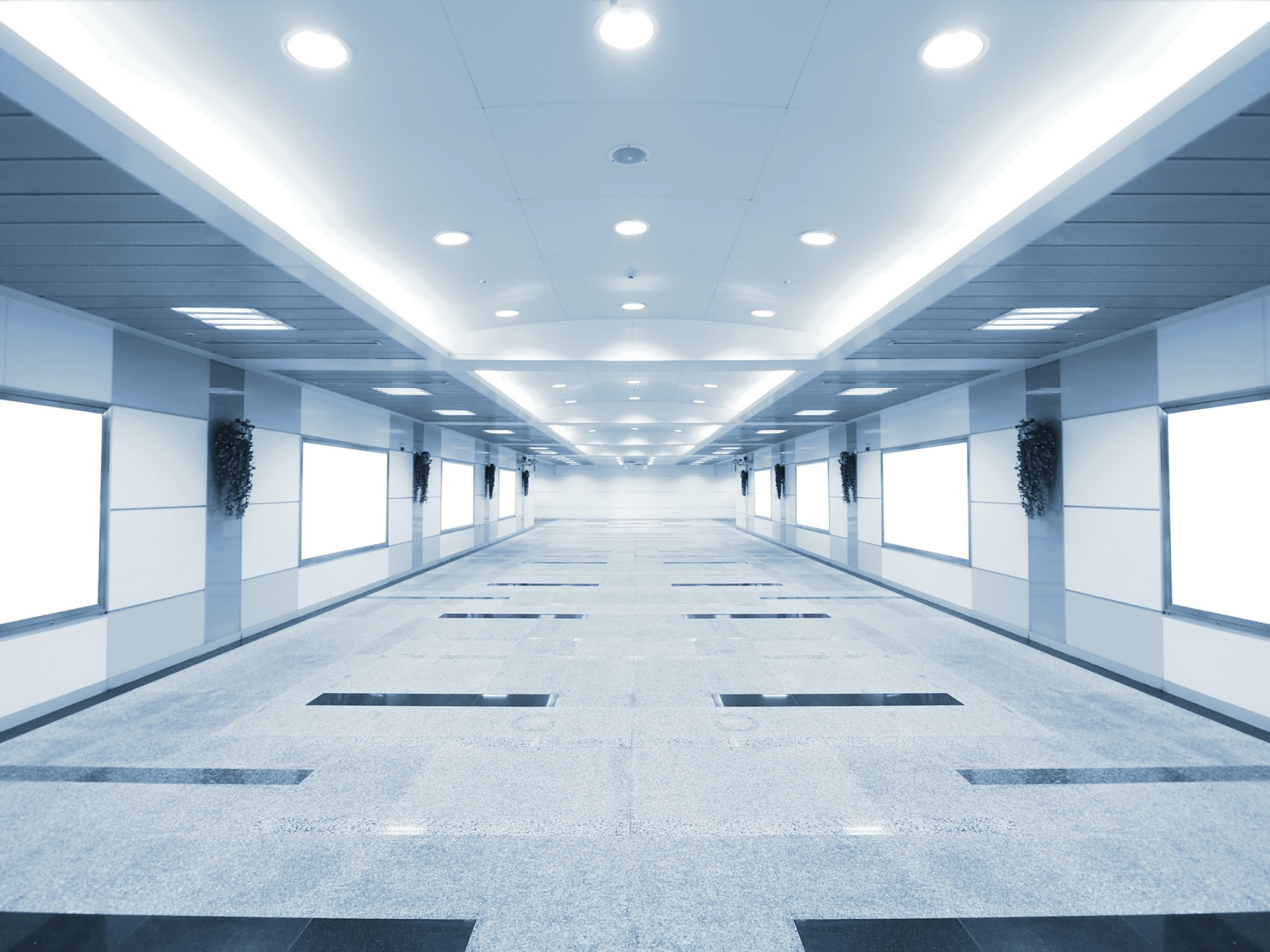
Perhaps most compelling in the aforementioned allegiance between minimalist art and commercial culture, however, is an aesthetic and conceptual parallel at the core of their agendas: to make material speak to universal experience, unburdened by history, identity or tradition. This is manifested in the reduction of information, a rejection of ornamentation and individual character for pure explorations of form—a radical depersonalisation with the aim of global appeal. This desire to globalise might seem dubious. None of us are truly universal subjects, but the drive to homogenise experience gives us this illusion of commonality. This magical promise is the stuff Andy Warhol emblematised in his soup cans—the spectacular mundanity of mass-production and consumption. Warhol’s obsession extended to the homogenised spaces of consumerism and transit. He loved department stores and airports, describing the “airport atmosphere” as his “favourite kind of atmosphere”, gleefully listing the food, entertainment, facilities, “graphics and colors”, and—perhaps most pertinent—the “optimism” as reasons. (We might note that within this glut of global consumerism, othered cultures are reduced to products to be consumed through art, cuisine, home décor, repackaged wisdom and trauma narratives: rare bastions of “authentic” identity in the cosmopolitan food court of supermodernity.) In his influential book Non-Places: An Introduction to the Anthropology of Supermodernity (1992), Marc Augé identifies the airport, along with shopping centres, railway stations and hotel chains, as prime examples of the non-place, a term he uses to define the homogenised “spaces of circulation, consumption and communication”. They are often light-saturated spaces, with vast expanses of monochromatic surfaces—concrete, glossy tiles, carpet or AstroTurf—homogenous artificial spaces devoid of unique character—all elements that come together to anonymise the space and the subjects that pass through it, so it might seem as though it could be anywhere on the globe. At least this is the illusion. For we know these spaces to be highly surveilled locations in which racial profiling is rife.
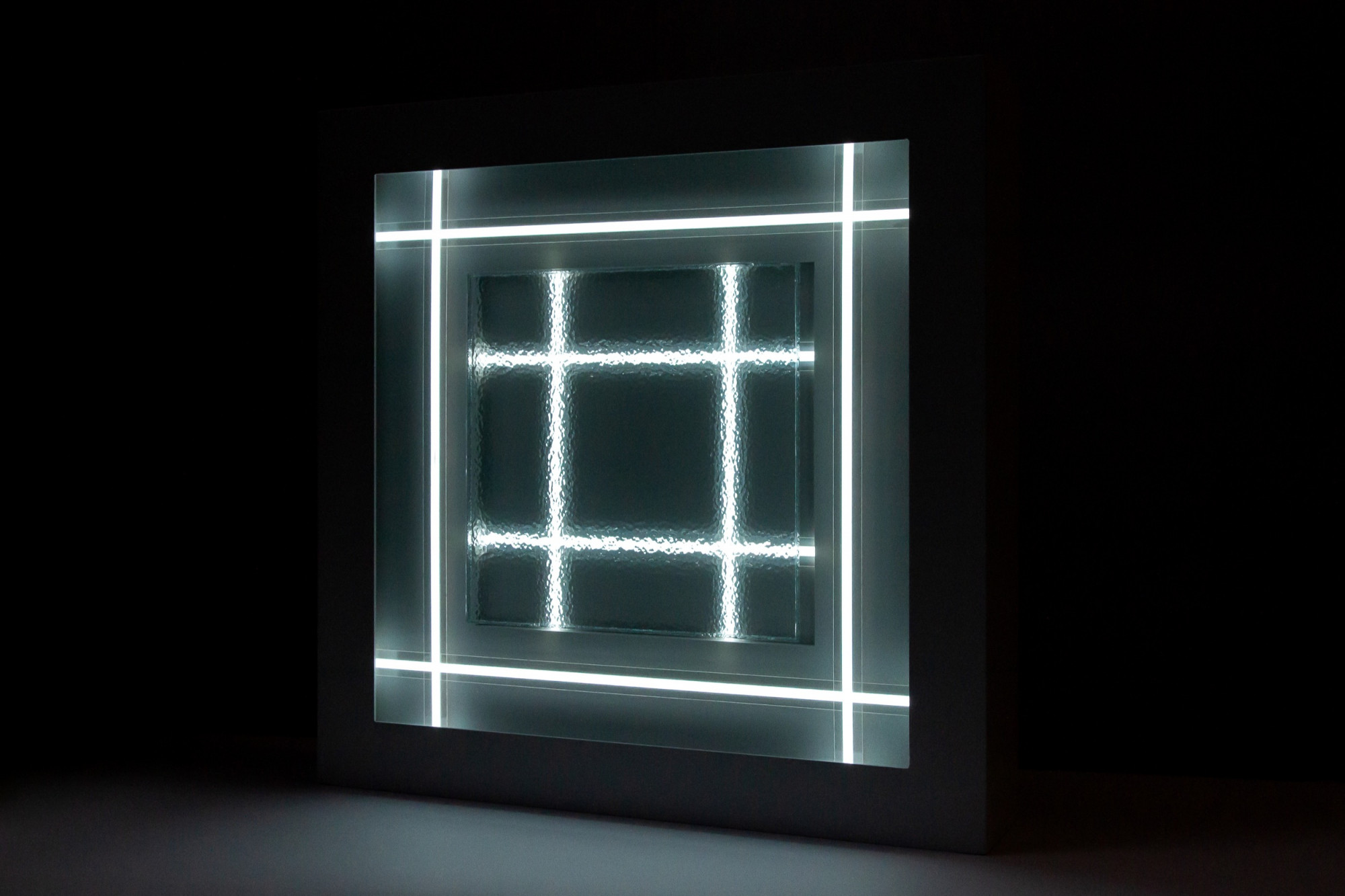
Something pervasive and frightening seems latent in Streader’s work. Looking at the aesthetically harmonious geometric forms and patterns in glass, light and aluminium, encased in perfect matt finishes, there is a certain calm evoked by the hygiene and order. There is no threat of the messy, the organic. It speaks of the seductive drive to depersonalisation and anonymity that increasingly defines fabricated public environments (and, increasingly, private ones too). While giving the comforting illusion of transcendence—of our geographic locality, class, race and history—it is an aesthetic of authority. Rather than merely investigating the role of light in defining our interactions with space (a motivation that seems largely irrelevant considering the small scale of these works), the implication of the “window” in its expanded form seems a testament to the encroachment of these spaces and ideologies into our everyday psyche, our homes and social lives.
The original dates of the exhibition were disrupted by the COVID-19 stage 4 lockdown. At the time of writing, the exhibition is still available to view online
Tara Heffernan is a PhD candidate (Art History) at the University of Melbourne. Her thesis concerns the work of post-war Italian artist Piero Manzoni—specifically, the political and cultural dimensions of his employment of humour and transgression in relation to capitalist aesthetics. Heffernan’s broader research interests include politics, feminism and the lineages of modernism and the avant-gardes in contemporaneity. She has published in Third Text Online and regularly contributes to Australasian art publications such as Eyeline and Artlink.
