Del Kathryn Barton: The Highway is a Disco
Victoria Perin
Although Memo Review has already examined an exhibition from the National Gallery of Victoria's quadruple billing of female Australian artists (see Paris Lettau's review of Our knowing and not knowing: Helen Maudsley), I believe that as the arts community has directly requested more representation of contemporary women artists at the NGV, we should also respond with extended critical attention. Plus, there are few exhibitions that the reader can visit in early January, during the traditional art gallery shut-down period. The NGV, however, is open either side of Christmas Day, so with that in mind we turn to Del Kathryn Barton's show, The Highway is a Disco. Depending on how cynical you want to be, you can look at four simultaneous solo exhibitions of living female Australian artists as an abundance of gifts, or a suspiciously tidy offering to appease the chorus of unimpressed women in the Australian arts scene. While I am one of their number, and am nothing but apprehensive about the grouping of these particular four women, whatever, it's Christmas, just enjoy the reprieve from the #cockfest.
In the brief interview published in the large exhibition catalogue, Barton notes how she was disturbed by early criticism of her work, particularly the charge of being 'overly decorative'. Hopefully, when I claim (I believe correctly) that her work is decorative, this will not be taken pejoratively (some of my best friends are decorative). Those who called the work decorative wished to dismiss it and insult the artist in an unmistakably gendered way. I hope to say something about Barton's deliberately feminine work that is true, but avoids judgements that pander to the sly misogyny massaged into our view of art, artists and everything. I worked hard to accept the work on its own terms. Although, I state here, so as to not hide the candle of my review, and perhaps give away cheaply my conclusion in the second paragraph, my critical judgement is plain: I did not like this exhibition.
When I worked at an auction house I welcomed the consignment of a drawing, watercolour or painting by Barton. Her work was a relief from the uncontemporary, extremely male-dominated stock that made up the regular non-Indigenous Australian art sale. Entering this exhibition, however, I left behind a vision of Barton's work as an occasional respite. I was entering a territory of her overwhelming dominion.
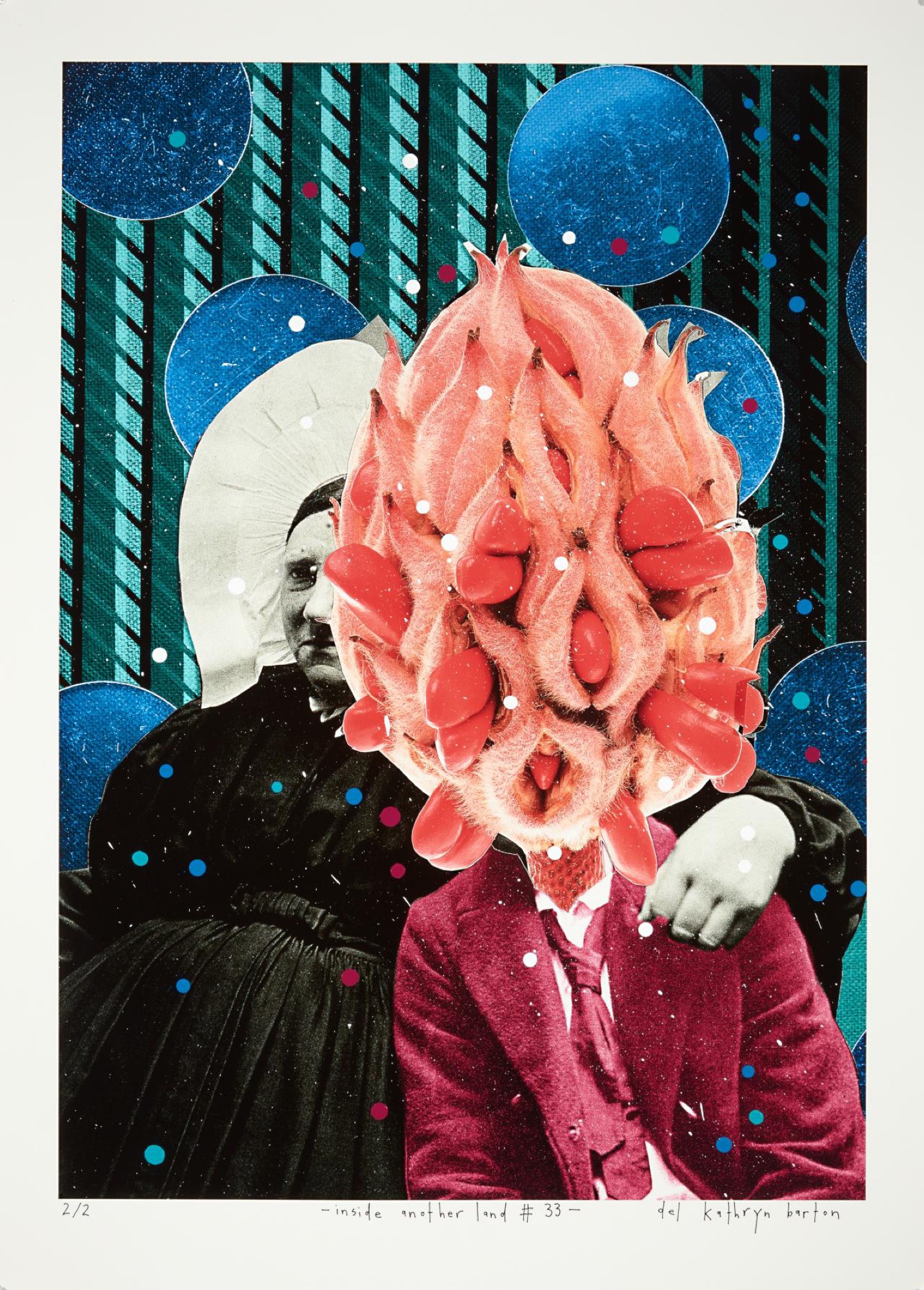
I expected this. I knew very well that Barton's aesthetic accepts nothing less than a contemporary horror vacui, a term taught to art history undergraduates that refers to a 'fear of empty space'. It's necessary here because there is stuff everywhere, over 300 artworks. With the Exhibition Design Dept. extending themselves beyond the (now expected) wallpaper, after my first visit I see an Instagram video of Barton and several assistants painting a wall with the use of cherry-pickers, working elbow to elbow. Five textiles works are now hung directly on the wall painting, layering the art. As I missed the fact that this was a 30-foot painting on my first visit, you might accuse me of not paying enough attention. Yet it's hard to zoom out on the bigger picture when Barton constantly wants to grab your attention with her details. She baits the viewer to step forward, to look closer at her spidery lines, gitter-eyeballs, and galaxy-like sprays.
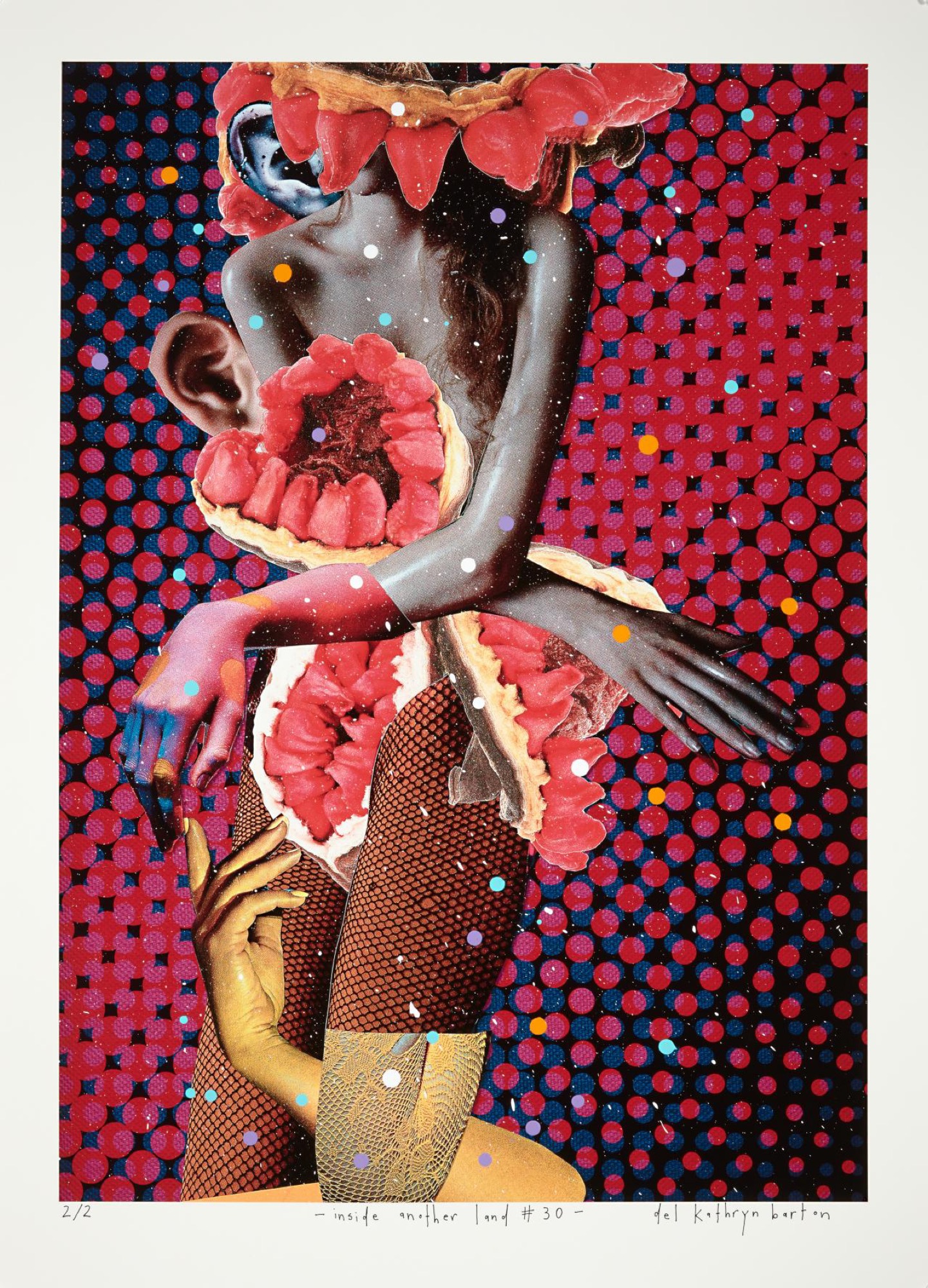
The first of such details are the dots that Barton has placed all over the inkjet prints in the first room, a composite piece made of 75 digital collages, inside another land (2017). With the dots, it is certainly possible that Barton is referencing Yayoi Kusama, the Japanese artist currently on display in the NGV Triennal down the road. Barton loves referring to other female artists, particularly if they are of powerful, iconic stature (that's Gertrude Stein above, her cheeky arm around a blossoming bud). Their influence on Barton is not hid, but worn proudly, easily. This naked quotation only deepens later in the show. Turn the corner and there's Barton Frida Kahloing herself.
The dots I take note of because they are an embellishment to these collages that are already tied together stylistically. The collages are remarkably consistent, uniformly sexy, colourful, fun, luscious, and opulent. They don't need the dots to unite them. In this first room I can already feel myself rejecting elements I imagine as 'additional', 'unnecessary' even. I try to resist this because, as I can already sense, there is more to come. Barton is a giver, who offers abundance. I tell myself: stick with it, it is not my job to edit Barton, merely to receive her.
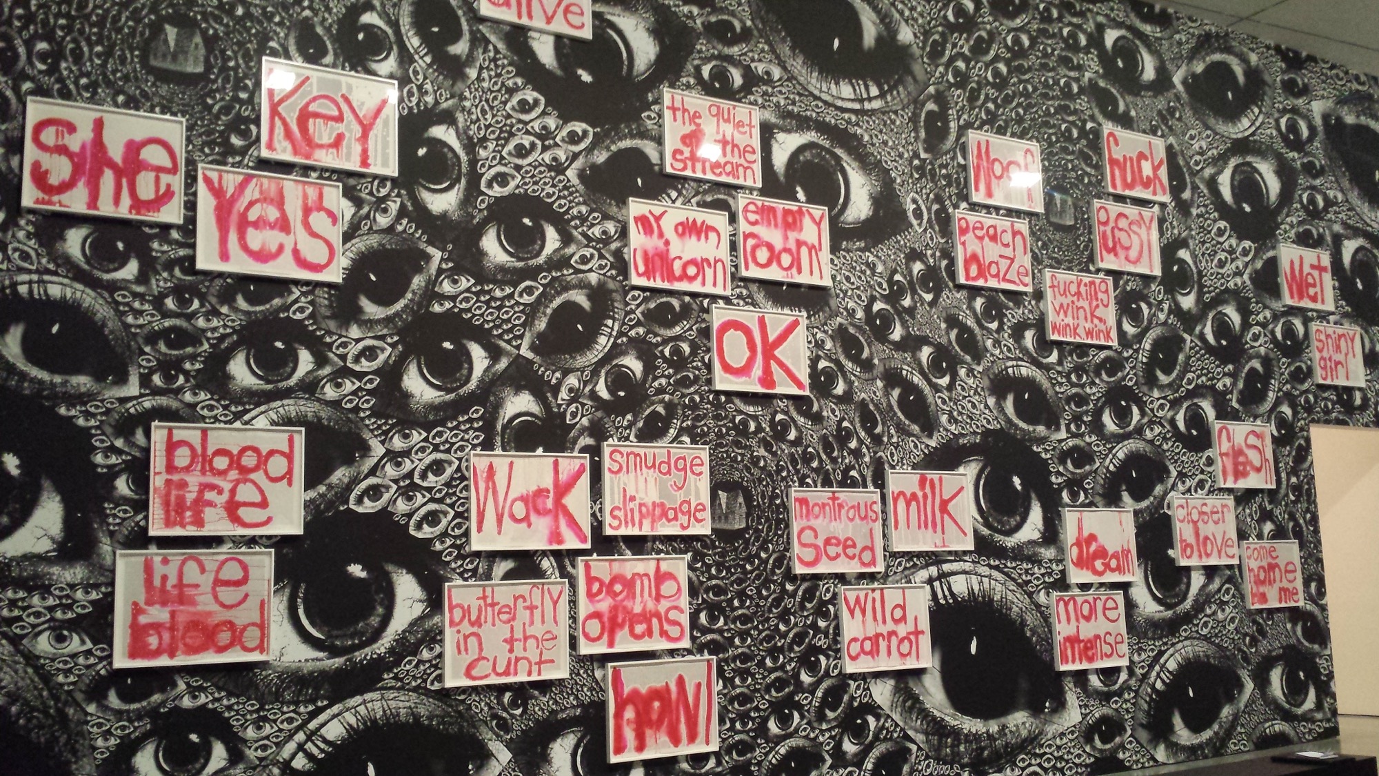
The question then turns to: 'what is Barton offering?'. In the next room a 2014–17 text work screams 'charged' words in dripping pink-red paint. 'She', 'key' and ‘wet’ are some, along with 'come home to me', 'more intense', 'monstrous seed', 'OK', 'shiny girl', 'flesh', and (why not?) 'fuck'. On the opposite wall is a frieze of highly finished, swirling paintings from this year, possibly featuring a 'lady and unicorn' theme, sing blood-wings sing. From the language in the text work and the facing eros-drama, I realise that I'm supposed to be experiencing a sensual intensity, a colourful, twisted flesh-fantasy. I can hear pulsing music from another room and I think I'm supposed to feel urgent. Despite this, I can't summon the grit and intensity. All I can see is how luxurious it is. The creatures are so gorgeous. They're just so meticulously attractive, I'm never repulsed. Without the darkness Barton seems to think is there, what is left? Passive psychedelia? I believe Barton feels intensely, but a second-hand trip, like a dream told to a friend, is never as emotional as the teller thinks it is.
Given to works on paper, I should like the room of (relatively) spare drawings that acts as a palette-cleanser in the middle of the show. Instead I can't wait to leave. Each work looks like the one before it. I can't distinguish between them. Here in the cleanest room, Barton's brand becomes startlingly apparent. It isn't about the detail, but the drawing, a signature way of making a mark that Barton adapts within a repertoire of oscillating forms, figure-work and background 'noise'. In the largest room, I am struck again when I realise that a handful of large figure paintings, all distinct, nevertheless all have the same face, but more importantly, the same energy. It doesn't make me think of any international female art icon. I think of the creepy mediocrity of that other Australian auction stalwart, Norman Lindsay, and his deranged female nudes, who all share a single, leering, fantasy cartoon face (but, boy, could he ever draw).
Apart from the collages, there are other times that Barton attempts to distance her dependence on the hand: a sculptural work that the wall-text describes as elegiac, but has the unavoidable impersonality of international commissioned construction sculpture; and Barton's first video piece, a work that made me audibly and repeatedly whisper to myself, 'oh no'. While I disliked the homogeneity of Barton's usual style, RED (2017) a 15-minute video work, is so expensively clunky that I instantly wished I could have just stayed out in the light, back out with Barton's signature markings and her undeviating graphic charm.
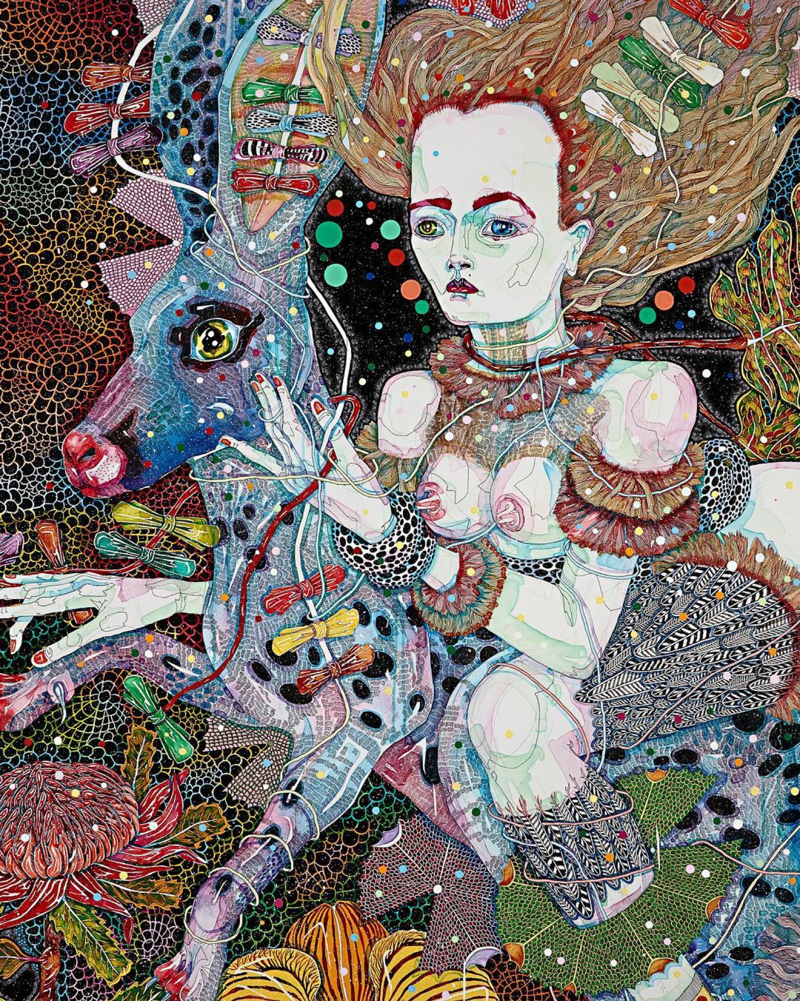
The costumes, soundtrack and the rock-and-roll editing do their best to replace what is lost in removing Barton's hand directly: the delicacy worked over, the prettiness, the horror vacui. In place of such signatures, we are given an uncanny substitute, the face (especially the pale skin and the tight cheekbones) of actor Cate Blanchett. Blanchett has been translated already into Barton's style, in her Archibald Prize finalist entry Mother (a portrait of Cate) (2011). So, her face here echoes back to that portrait. Barton's world proves circular and inward, looking at itself.
The video depicts the sexual cannibalism of the Redback Spider, with Blanchett as the mother who eats her mate. The video pays homage to French artist Louise Bourgeois, one of the Barton's great loves. I suggest, however, that it starts with some light allusions to Yoko Ono's Cut piece (1964), with Blanchett cutting off a handsome suit to reveal a web-like costume. Blanchett looks angry and sexy, but also silly and overly sleek. In a film with so many long scissors, I'm never afraid that somebody will get cut. That is to say, there is a lot of gesturing to danger, without the viewer ever getting frightened. A lot of primal screaming, but no one looks ugly. In the catalogue Barton recounts the actor reassuring her in a moment of anxious bumbling: “she gently put her hand on my arm, stopped me, and said, 'Do you know what Del? … I don't need to understand this.’”; As it stands, it is impossible to know if Blanchett understanding the artist's intention would have helped. But it's not like having Cate Blanchett improvising for 10 minutes is going to be bad. She's a wonderful performer.There's no risk in this venture.
The film is split into sections titled MOTHER, FATHER, LIFE, DEATH and DAUGHTER. When it comes time for the father to feature, he is accompanied by a shot of a car revving. When the spider arrives (in a wonderful dance performed by Charmene Yap), she moves in an incredibly enthralling manner, but she's writhing on a muscle car. The performance of gender isn't twisted, it moves straight past the iconic and into the parodic. But it's not supposed to be a parody of the deadly spider that eats its mate, it's dead serious. Barton has no intimation of the taboo and genuinely titillating danger that Bourgeois could reproduce in spades. Then it hits me, everything in Barton's world is conventionally beautiful, yet we're supposed to find it shocking. I don't see women reflected in her vision of “hyper-women”, I see great beauties, I see movie stars and high-fashion models.
The film addles me so much that I return to a book on Bourgeois I have, and am reassured that I was not mistaken; her work runs deep and much is risked. Things get ugly. I also recall the story about how she would host a salon in her house weekly, and allow other artists to approach her for criticism. Now, her opinion of this exhibition, and of this pale homage specifically, I would like to hear.
Title image: Del Kathryn Barton, inside another land, 2017, synthetic polymer paint on inkjet print (1 of 75 parts), edition: 2/2, 83.0 x 69.0 x (sheet, each). Collection of the artist, © Del Kathryn Barton.)

