There are perhaps three art-viewing experiences I have had that I would say changed the way I looked at and thought about art. The first was when as an undergraduate I wandered without any warning into the Colin McCahon retrospective held at the University of Sydney as part of the Sydney Biennale of 1984. The second was when, again without any warning, I stood mesmerised before the front window of an art gallery on a busy road in Brisbane staring at three Emily Kngwarreye yam paintings in 1998. And the third was when, with a day to kill before an unsuccessful job interview, I went to the Museum of Modern Art in Los Angeles and saw the great Black Paintings of Frank Stella that had once been in the collection of the Italian Count Panza.
By this time I was an art historian of sorts and had been showing Stella slides in classes on modern art for years. I thought I was familiar with them, certainly I could talk about them at tedious length to undergraduates, but nothing prepared me for actually seeing them. Of course, they’re famous for their off-kilter asymmetry, with their boxes within boxes not quite fitting in their frames, and their broadly brushed stripes of enamel paint following on from Pollock’s decision no longer to use oils and artists’ paintbrushes.
But in the flesh they glistened darkly in the beautiful dim gallery light. You could see or better feel the hand of the artist applying the paint, even in so restricted a format and mediated by a housepainter’s thick brush. The paintings were obdurately present and insistently materially dense. They were things, ungraspable as any mind’s eye gestalt but subtly shifting depending on how you stood in relation to them – or at least their materiality was in profound tension with the form Stella sought to impose on them, lassoing in the most physically resistant aspects of the work with those thin pencil lines between each of the squares.
I remember standing motionless for long minutes in front of each of the paintings, exhilarated, I suppose, both by the sheer physical presence of the work and the sense of my own refinement of perception that I was actually able to respond to it. It was an experience I only ever got close to, once I was back in Australia, with the work of Ronnie Tjampitjinpa, George Tjungurrayi and especially Emily Kngwarreye.
Certainly, I got very little of it from the works in The Field Revisited, which similarly I have pored over for many years as reproductions before finally seeing in the flesh. In fact, the uncanny thing about the show – remounting the original The Field exhibition of 1968 50 years later as though to bring it back to life – is that standing in front of its various paintings, sculptures and objects it was as though I was still somehow seeing them in reproduction.
Hanging them on its silvery walls, the exhibition includes large Ben-Day-dotted reproductions of the original works the Gallery wasn’t able to track down – Noel Dunn’s Untitled (1967), Rollin Schlicht’s Twentieth Century Note (1968) – but again the uncanny thing is that so many of the works actually there looked like their own copies, seemed to stand in for their own absence. Not just, say, Normana Wight’s greyscale shaped canvas Untitled (1968), which even in its original disappears before us, but to start with David Aspden’s Fifth Force (1968) and Ron Robertson-Swann’s Orange Oreil (1965).
Why like their own reproduction? It is the danger we suppose with any act of literal recuration, in which we’re always trying to imagine what they once looked like, but also because the works are somehow too reductive, too diagrammatic, almost like a page ripped from a how-to-make-an-abstract-painting manual.

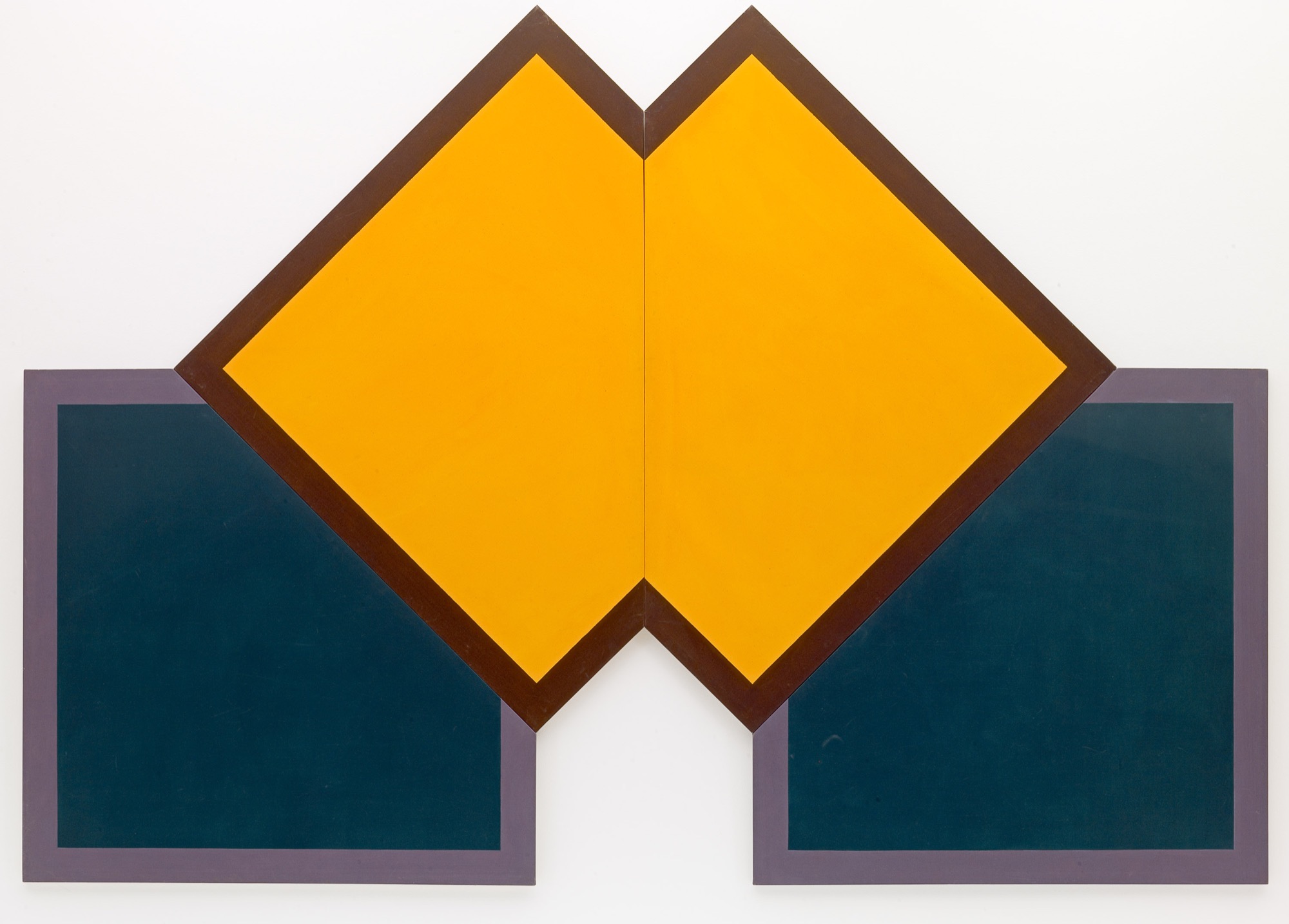
Take again, say, Syd Ball’s Ispahan (1967) or Tony McGillick’s Arbitrator (1968): they are both absolutely symmetrical, divided down the middle across two halves. There is no real tension between the forms within the canvas and the edges of the canvas itself. It is absolutely what we don’t have in Stella’s Black Paintings, with the compression there between the boxes and their container, or what was once called their depicted and literal shapes. Or to make a comparison available to us in Australia, it is not like Morris Louis’ Beta Nu (1960) at the NGA, in which the two torrents of multicoloured paint on opposite sides of the expanse of white canvas subtly inflect each other, speak to each other, play with and against each other.

Or take Michael Johnson’s Chomp (1966), long held up as one of the signature works of the show. Everything hinges on that bottom black line, which is at once part of the jagged shape marked out at the top, part of the smaller area below it and even as it were erases itself so that it can be read as blue in a larger work framed only by the outer edges of the canvas. It is obviously an example of hard-edge painting taking up the original technique of Cubist “passage”, invented by Picasso in his Les Demoiselles d’Avignon (1907), but ultimately coming out of the extraordinary shoot of that onion that spans table and canvas in Cézanne’s Still Life with Plaster Cupid (1895).
It is the basis of those “shaped canvases” Stella started making after the Black Paintings: complex figures of triangles wedged into squares, animated by a whole series of contrasting and complementary colours (Chocorua, 1966, Moultonboro, 1966). In Johnson’s hands, however, this new “technique” is reduced to its most elementary and uninteresting. It is like we were looking at the outcome of the first lesson of a hip 1960’s art class teaching students how to make their own Stellas.
The temptation must have been enormous – and many did not resist – to diagnose all of this as “provincialism”. This is the option someone like Terry Smith took after encountering the Sydney “Colour-Form” painters at Central Street Gallery in the late 1960s. I think in many respects he is wrong, or at least provincialism is not the only story of Australian art we can tell, but a number of the works in this show are undoubtedly the evidence you’d use if you were making the argument.

But there are other things in the show that are not so easily dismissed or diagnosed, that complexify the provincialist reading. Take perhaps the best wall and the best works of the show: Janet Dawson’s Rollascape (1968) and Wall II (1968-9) next to John Peart’s Cool Corner (1968) and Corner Square Diagonal (1968). The highlight of the show for me – a little along the lines of my Stella story – was a passage of white paint in Dawson’s Wall. She’s painting maybe a modern glass skyscraper or apartment block of the kind undoubtedly then being put up in Melbourne – and, my God, how much better a depiction of the urban landscape is the brutal simplicity of Dawson than the awful multi-coloured confections of James Doolin on the same theme.
Actually, it’s not quite as literal as that in Dawson because the perspective doesn’t quite work, and we appear to have another building behind the first to the right. But there is an exquisite passage in the second set of panels to the left, painted in a slightly more yellow tone, that inexplicably tilts up rather than running straight across. It’s a subtle miracle, almost like a ghostly shroud ascending – and the curator intelligently installs it in dialogue with Peart’s shaped blue-green canvases that similarly rise up in their corners while framing a white absence at their centre.
Issue No. 1
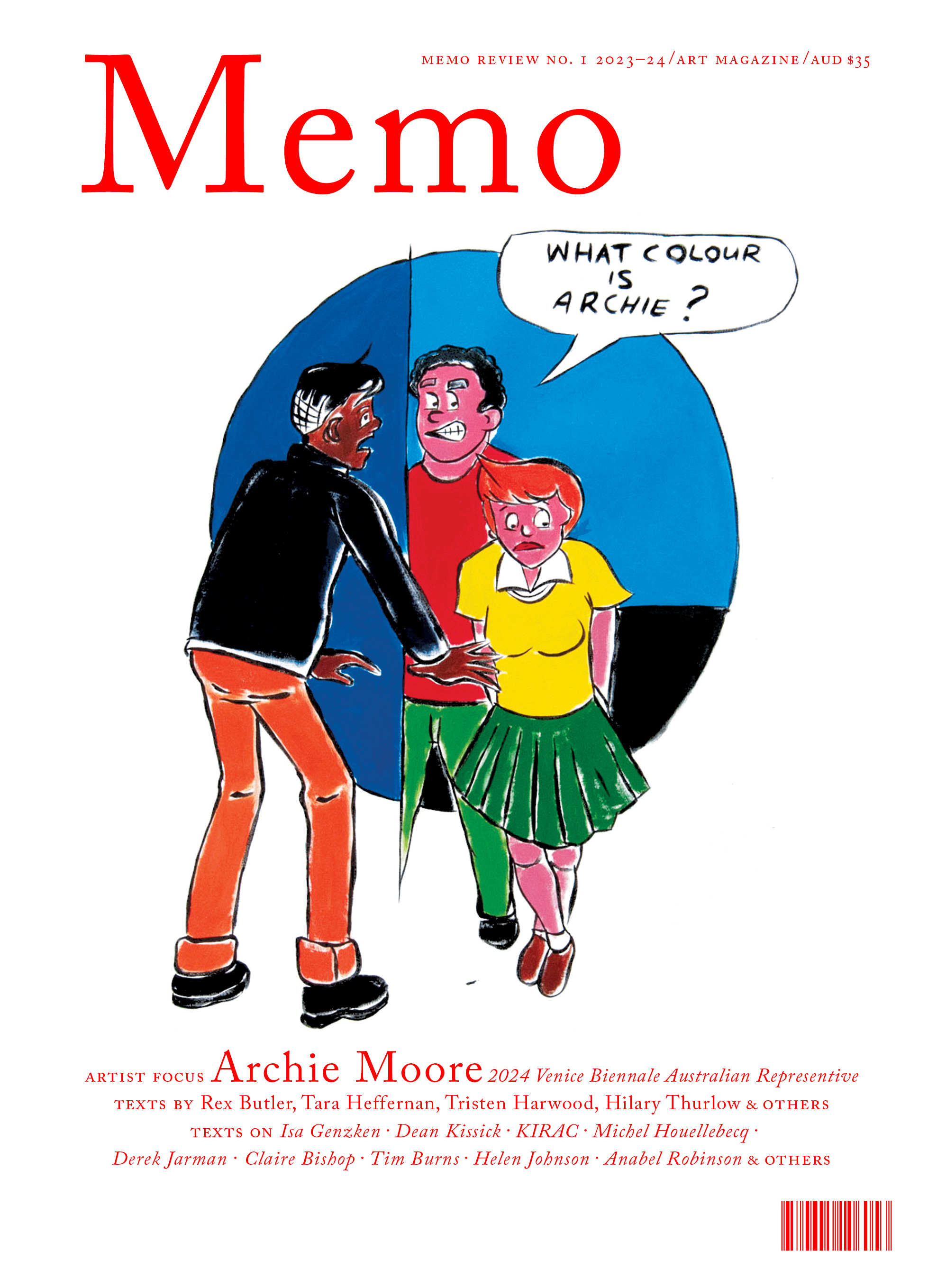
Grab a copy of Memo’s first glossy annual magazine issue, featuring an extended artist focus on Archie Moore, the 2024 Venice Biennale Australian Representative, with essays by Rex Butler, Tara Heffernan, Tristen Harwood, and Hilary Thurlow.
Issue 1 features articles by Audrey Schmidt, Philip Brophy, Helen Hughes, The Manhattan Art Review’s Sean Tatol, Cameron Hurst, Chelsea Hopper, among your favourite regular Memo contributors. There are reviews and articles, including on Melbourne design art, French literature’s ageing enfant terrible, Michel Houellebecq, Derek Jarman’s Blue (1993), the celebrated Spike magazine cultural critic, Dean Kissick, the local cult-favourite Jas H. Duke, and much, much more.
Memo Magazine, 256 pages, 16 x 25 cm
It might have been good at this point for the curator to break with their fidelity to the original hang of the show and put these works into some kind of relation with Robert Hunter – both the at present overlit Untitled (1968) from The Field and the tremendous, cathedral-like retrospective across the corridor from The Field Revisited. In all of these works we get something of the true tension or better paradox of this moment of abstraction: that the sense of the literal, the real, the representational is precisely heightened by its sublimation in the depicted, the geometric, the abstract. Abstraction, as has been pointed out again and again, in the hands of Greenberg and Fried does not at all involve the unilateral doing away with of the physical, but on the contrary seeks to brings out the medium or material, and to that extent something of the bodily: the mark, the hand, the brush. All of these things are framed, presented, held out before us to contemplate in a way never seen before.
In fact, something like this tension between the properly abstract and the merely material is the true issue at stake in The Field Revisited and of course the show on which it is based. The original The Field, as has often been said, was a famously “unresolved” exhibition. It lives on as the constant subject of discussion and recuration not because it is finished, coherent, proposes a reproducible art-historical thesis, but on the contrary because it is incoherent, self-contradictory, incomplete.
But what exactly is – to add our voice to the chorus – the productive error of The Field? The obvious irony of the show is that, for all of its claims of up-to-dateness and all of the attacks upon and defences of its avant-garde credentials, it did not actually represent the latest in contemporary art at the time, either in the US or here. It is a caution expressed by the then Assistant Exhibitions Officer Royston Harpur in the original catalogue: “In the case of The Field, we are dealing with an art movement that has not been current for at least two years”. It is a sentiment that was expressed more generally by Charles Green on the occasion of one of the many attempts to curatorially “remake” the show, Fieldwork at the NGV in 2002, when he spoke of “colour-field painters out of step with the late 1960s, minimalists already escaping field painting and conceptualists who fiercely dismissed both abstraction and minimalism”. And this idea is put in perhaps its most universal form by artists Ian Burn and Nigel Lendon writing in the catalogue of yet another attempt to restage the show, The Field Now at Heide in 1984, when they suggest that what The Field ultimately sought to do was introduce the “rhetoric of the ‘new’ and the ‘logic’ of an institutionalised avant-garde”.
All of these are good at locating the general dividedness of the show, the way it does not offer a coherent curatorial position or body of work but an amorphous and incoherent “field”. But there is more at stake in it than merely different temporalities or successive stages of fashion. In fact, the true importance or at least persistence of the original The Field lies in the exact form of its self-contradiction, its argument with itself. It is this, we suggest, that it is the real reason it has lived on and needs incessantly to be dealt with.

But what do we mean by this? If we look with any attention at the show today (and this would undoubtedly have been possible back then), we can discern two radically antithetical strains of then-contemporary art: modernist painting and sculpture and Minimalist objects. In the former category, we might include any number of works, but let us just say Harald Noritis’ Come Away (1968) and Col Jordan’s Knossus II (1968). In the latter category, we’d include Tony Coleing’s untitled polymer resin poles, Wendy Paramor’s yellow aluminium Luke (1967) and Noel Dunn’s untitled painted plywood L-beam.
Of course, at the time of the original show, there was intense debate between the two: Michael Fried’s landmark ‘Art and Objecthood’ celebrated its own 50th anniversary last year, and the year before Fried the Jewish Museum in New York put on Primary Structures, the first large-scale institutional recognition of the Minimalist insurrection against Greenbergian modernism.

In a precise, logical sense, The Field – against any mere temporal discrepancy or vague “fieldness” – systematically mixes the two options, forcing us to draw the distinction ourselves with each work. Is what we are looking at a painting or sculpture or is it rather an object? Is Dale Hickey’s inertly centred Malvern (1967) still a painting? Is Mel Ramsden’s thin horizontal black stretcher? Clement Meadmore’s winding steel forms with their internal contrapposto are undoubtedly still sculptures, but are Tony Bishop’s stainless steel corkscrew Clik-clak-clik (1968) or Nigel Lendon’s faux-metal white slabs?

That this is the productive incoherence of the show is revealed by the fact that just five years later not John Stringer but the other, mostly overlooked, co-curator of The Field Brian Finemore put on Object and Idea, also at the NGV, making just this distinction between modernism and Minimalism and moreover retrospectively rewriting 20th-century art on its basis, putting on one side Picasso, Cubism and The Field and on the other Duchamp, Dada and his own show. In fact, Finemore arguably gets The Field wrong – it actually mixes the two sides he seeks to keep apart – but he does indeed retrospectively point to exactly the distinction at stake in it and offer the best way of seeing it.
The Field Revisited is ultimately too triumphalist for my taste, too unreflective (for all the silver wallpaper), not faithful enough to the productive failure of the original. It is made to serve – as so much else – the public visibility of the gallery rather than a true questioning of the art. David Homewood and Paris Lettau hint at this in their essay for the catalogue when they speak, deliberately anachronistically and I presume codedly, of the hanging of the original show in terms of spectacle, a forerunner of the contemporary public art institution in which the works of art disappear and we come only to have our presence clicked off by the guards.
Title image: David Aspden, Field 1, 1968, synthetic polymer paint on canvas. 245.0 x 152.5 cm. Private collection, Brisbane © David Aspen.