The title of Don't Be Too Polite: Posters and activism cuts off the gendered call made by the sing-song union ditty: Don't be too polite, girls, don't be too polite / Show a little fight, girls, show a little fight. A sensible (if regrettable) choice, as indeed the un-fair sex is also represented in this exhibition of screen prints made by various Melbourne poster collectives in the 1980s and 90s. The ratio of women to men was also noted at a related panel discussion, when a large audience crowded into the level two exhibition room on a Saturday afternoon, to hear a discussion on poster art and collectivism. Excluding the host (Roger Butler, Senior Curator of Prints and Drawings from the National Gallery of Australia, Canberra), of the five speakers there was only one male artist on stage. When an audience member quibbled about the quota, each of the artists demurred, graciously refusing what I interpreted as bait, saying broadly it was characteristic of their particular collectives: sometimes gender was an issue, sometimes it was not. This typified the collegiate discussion, in which the five artists talked nostalgically about the posters they made when they were young.

For a nuclear free and independent Pacific, 1985 colour screenprint.
Courtesy of the State Library of Victoria
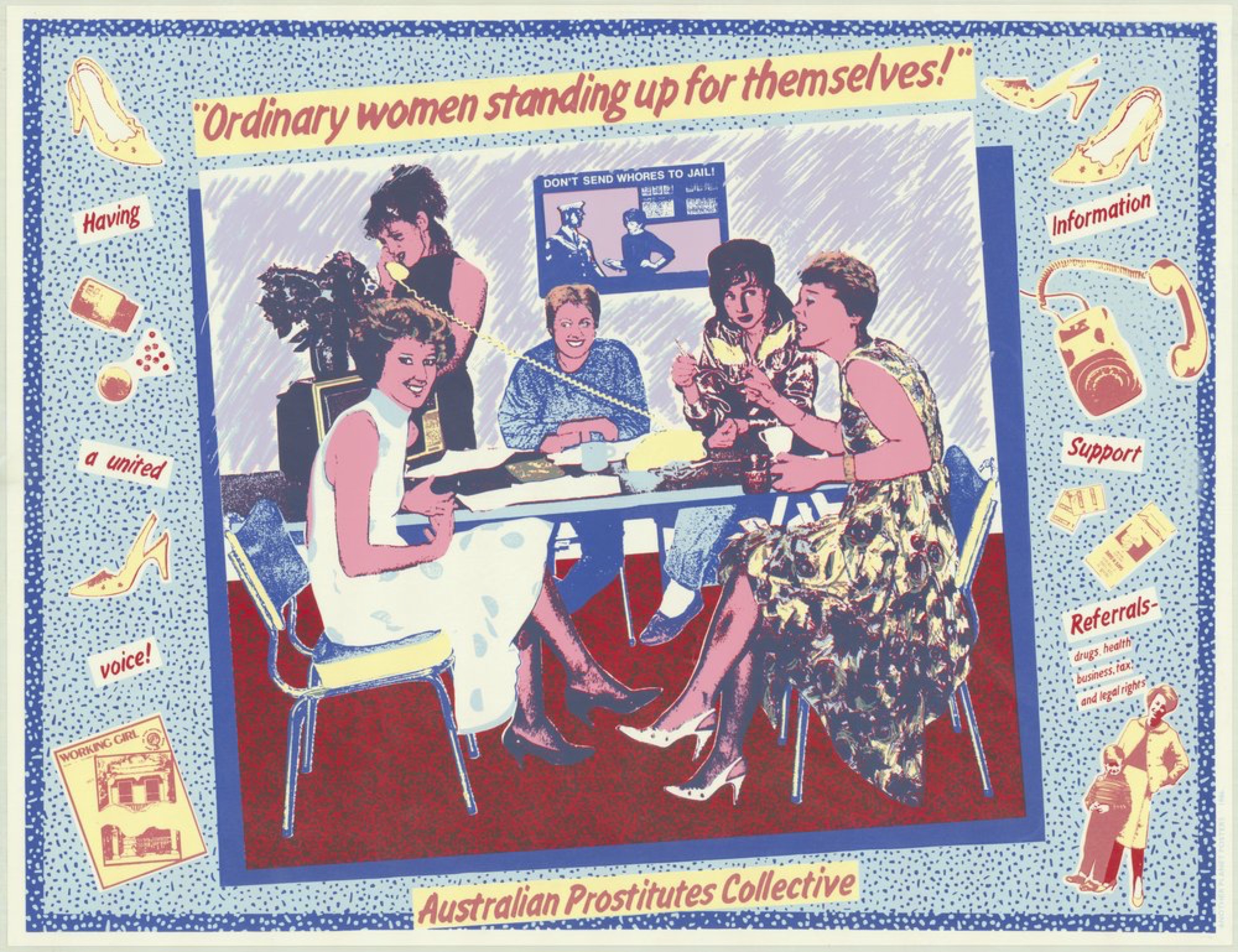
The fruits of their labour were all around us. Bright, colourful images shouted slogans from the walls: “MEDIBANK: CUT TO DEATH”, “Ordinary women standing up for themselves! – DON'T SEND WHORES TO JAIL”, “WHITE AUSTRALIA HAS A BLACK HISTORY”. The panellists were all represented in the exhibition: Wendy Black, Nicholas Mau, Julie Shiels, Dianna Wells and Carole Wilson. Mostly on the shy-side of middle-aged now, they each spoke about the difficulties inherent in creating art within a collective. Particularly vivid were the memories of endless conversations, discussions that strayed from what should be done, to who should do it, to how it should be done, back to what should be done. They all laughed at the thought of those tedious battles. As artists they appeared to have all moved on to a newer, more individually focussed practice.
Echoes of these past conversations are perceptible in Don't Be Too Polite. This small display of 31 prints, selected by Curator Samantha Comte and Acting Assistant Curator Alyce Neal, gives voice equally to anti-nuclear protest, tenants' rights, ocean health, workplace automation, Indigenous history, prisoner empathy, women in parliament, immigration, cuts to the dole and more. (In spite of this, bizarrely for the period and medium, support for the gay community and a response to the AIDS crisis is inexplicably absent from the exhibition). The poster artists believed, at least initially, in anonymous production, which means that fewer than half of these posters are signed by the individual creators. Instead, works are signed by the collective, the three in this exhibition being: Red Letter Community Workshop Inc. (1977–1991, originally Breadline Posters), Another Planet Posters (1985–1991), and their eventual amalgam RedPlanet Inc. (1992–2001). Although each poster is now attributed via wall-text, Don't Be Too Polite adheres to this anonymity, by grouping the exhibition in mini-themes, rather than by date or individual. I searched for, but could not find, a full list of the artists in the show: not in the entry blurb, in the various related pamphlets, or (surprisingly) on the Ian Potter website. In addition to the artists mentioned above, the show features work by Pamela Braras, Julia Church, Bob Clutterbuck, Mark Denton, Tanya McIntyre, Gae Nhyus, Ian Patrick, Carol Porter, Chris Reidy, Colin Russell and Kath Walters. I mention them all here because it is harder than it should be to trace the network of these creators online.

White Australia has a black history, 1987 colour screenprint.
Courtesy of the State Library of Victoria
Looking back, these artists were participating in a national and international poster golden-age. The well-known groups in Sydney, like Earthworks Poster Collective, had the same advantages: the arts funding was flowing, materials were cheap (but also extremely toxic), higher education was free, and rent was largely affordable (no part-time job to rush off to). They would in time be visited by European 'poster hunters', who would swoop in buying one of each design. In fact, rather than a time of punk-ish scarcity, this era was remembered by the panel as a moment of relative abundance. Dianne Wells in particular spoke of the privilege in having a salaried job in the poster collective as an artist (when she was straight out of university, no less). At another point, it was estimated that a staggering 95% of funding came from generous federal or state sources. “We were the darlings of the Australia Council,” Carole Wilson laughed. Naturally this fed into administrative duties, largely grant application writing. More groans rose at the memories of endless writing, endless justifying, faking and flogging. Even when the funding started to dry up in the '90s, eventually being cut off completely by the Australia Council in 1998, RedPlanet chose to die like a star with a massive burst of high-stakes activity—flying the Guerrilla Girls to Melbourne for lectures and workshops in 1999 being one such action.

Courtesy of the State Library of Victoria
As a result, the posters are steeped in a global consciousness. Once you get past the generalised hand-drawn '80s pastel haze, every second image can be recognised as a rip of some other print-making aesthetic: Warhol, the Sex Pistols posters, World War propaganda, charter maps, pin-ups, Kraftwerk album covers, and medieval woodblocks. This was attributed to the speed in which they were required to create designs. Need a poster for a march on Wednesday? Quick! Pull out the Russian constructivism book! (As a side note, these works are not just accessible in a visual-culture sense, some of them are accessible literally. The State Library of Victoria exhibited and sold duplicates from their collection en masse in 2005. Subsequently, in December last year, while the exhibition was on, a poster on display by Colin Russell and Julie Shiels was sold at auction for $100. A bold piece of Australian protest art history for less than a pair of jeans at Topshop.)
Again, at the end of the discussion, an audience member sought to provoke the artists by comparing the work in the exhibition unfavourably to Peter Drew's Real Australians series, an ongoing nation-wide poster campaign. Drew's posters are simple and powerful, declared the questioner, these posters are complex, (too) colourful. She loves those Peter Drew posters. For me, Drew's posters have a good heart, but their simplicity is also a political vagueness (effectively hijacked by the Aussie—Rolf Harris and Aussie —'Jihadi' Jake Bilardi response posters). The Age writes: “(Drew) suspects someone with “puritanical” ideas on nationalism was producing and distributing the (response) posters. '(They) are that silly point of view that if something is not 100 per cent good, that you can't enjoy it.'” Drew's reckoning of nationalism as not “100 percent good” is too faint an understatement if you believe the sentiment that (as corrected by some graffiti on Drew's street-art) Real Australians Say Welcome Are Aboriginal.

Beautifully slim, 1992 colour screenprint. Courtesy of the artist
In contrast to the broadness of the Real Australians, the posters in Don't Be Too Polite have a refined specificity. Perhaps this is the result of the chorus of people behind, if not every poster, then the collective standing behind each poster artist. The polyphony must have been impossible to deal with at some points, but these posters demonstrate an intersectional political rigour.
Issue No. 1
Grab a copy of Memo’s first glossy annual magazine issue, featuring an extended artist focus on Archie Moore, the 2024 Venice Biennale Australian Representative, with essays by Rex Butler, Tara Heffernan, Tristen Harwood, and Hilary Thurlow.
Issue 1 features articles by Audrey Schmidt, Philip Brophy, Helen Hughes, The Manhattan Art Review’s Sean Tatol, Cameron Hurst, Chelsea Hopper, among your favourite regular Memo contributors. There are reviews and articles, including on Melbourne design art, French literature’s ageing enfant terrible, Michel Houellebecq, Derek Jarman’s Blue (1993), the celebrated Spike magazine cultural critic, Dean Kissick, the local cult-favourite Jas H. Duke, and much, much more.
Memo Magazine, 256 pages, 16 x 25 cm
“We genuinely thought we were going to solve racism,” Wendy Black chuckled during the panel discussion. While their past selves may have been naïve, their creations demonstrate a maturity born from a kind of peer-reviewed social responsibility. For this they are persuasive, rallying. Some of the anti-nuclear images brought me right into the panic of the Cold War, which is impressive since I was two months old when the Berlin Wall fell. Beside their effectiveness, they are sometimes also very beautiful, like Chris Reidy's elegant Peace the only safe fallout shelter. Mobilise against nuclear power in 1982 (1982); sometimes very funny, like all of Carol Porter's work (on nuclear trials: If it's so Safe and Pure / Test it on the Cote D'Azur (1995); and occasionally acutely moving, like Carole Wilson's Women, prison & poverty is not a simple issue (1988).

Zipped away with zilch to say, 1987 colour screenprint.
Courtesy of the State Library of Victoria
Although they were often souvenired by their admirers, these screen prints were never intended simply to preach to the converted. Out on the streets in a time before billboard saturation, these were working pictures, fighting pictures. The very best ones sharply reconnect me with causes and petitions I believe in. I come away fists up.
Victoria is commencing her PhD at the University of Melbourne. Her research concerns printmaking in Melbourne during the 1960s, 70s and 80s. In 2013, she was the Gordon Darling Intern in the Australian Prints and Drawings Department at the National Gallery of Australia.
Title image: Julia Church Ordinary women standing up for themselves!…, 1986 colour screenprint.
Courtesy of the State Library of Victoria )


