On the path, curated by Babs Rapeport and Isabella Darcy
- 19 Jun 2021
As soon as it was RISING, it was falling, and crashing, and burning. The glossy black merchandise was being given away. The budget must have gone straight into the Birrarung. In the pandemic, ambition is presumptuous. Fate-tempting. As yet another Stage 4 clanged down at the end of May, COVID remorselessly halted any moderately organised event. RISING petered out. Locked down together, artists and housemates Babs Rapeport and Isabella Darcy plotted a spontaneous paste-up exhibition.
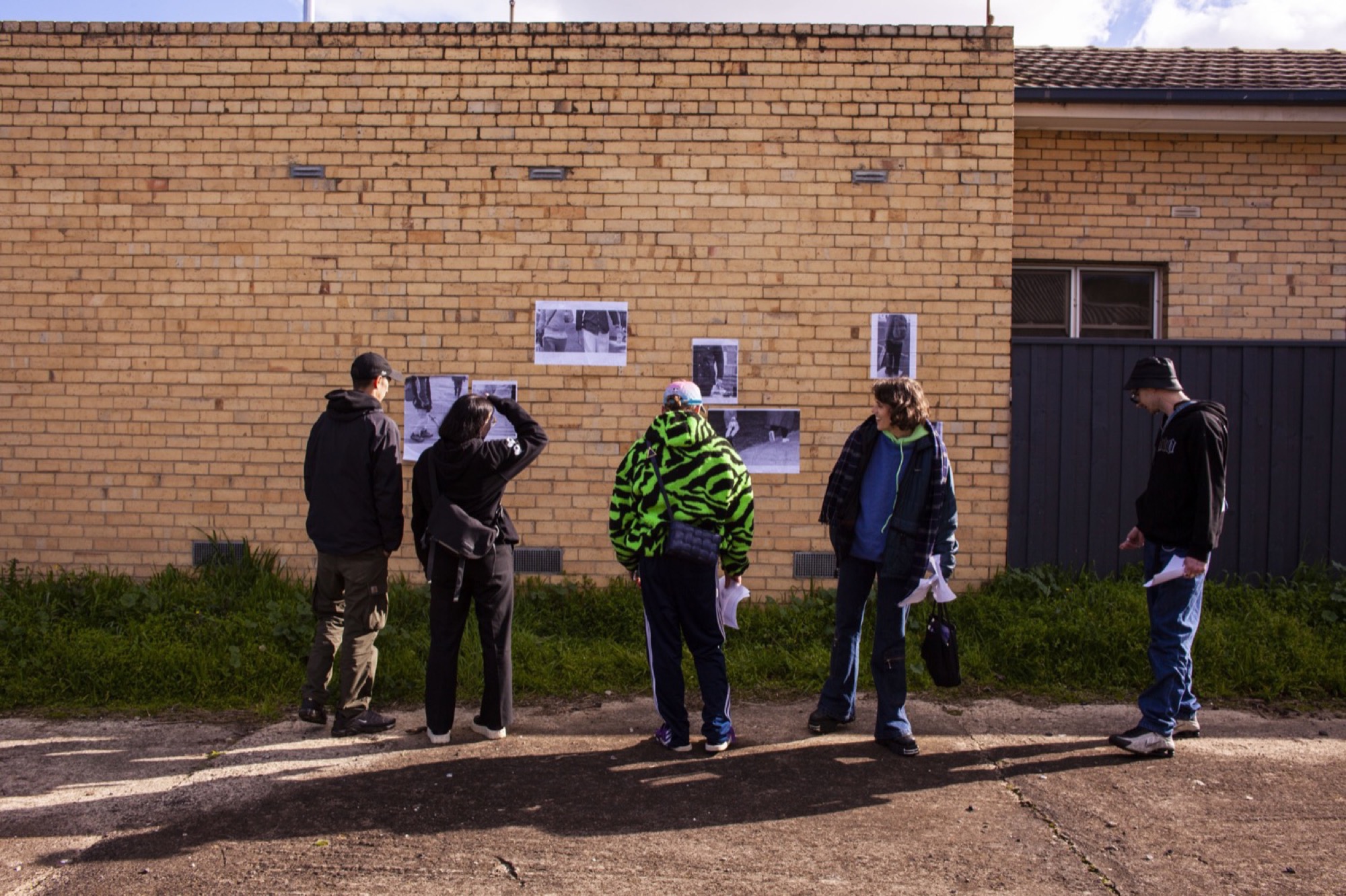
On the path opened on a bright Sunday morning roughly three weeks later. Eleven emerging and mid-career artists exhibited, connected by a loose proximity to the suburb of Thornbury. Unfunded and off-the-cuff, it would surely fail any planning and consultation criteria of a public body. It could have happened or not happened. To say the event was disorganised (or “disorganising”) would be incorrect. It was cusping organised, perhaps. On the verge.

The show crossed the seven blocks of a snaking nature strip called Bracken Avenue. Our first foray down the path was slightly disoriented. Beginning in the middle at a Fyffe Street coffee station hosted by the curators, we were provided with a map and made our way towards its due north (cardinal south, it turned out) in search of a water drain. We encountered others who had turned back, lost. They wished us luck. Trying to identify the distinctive idioms of each artist along the way felt like a test of our collective memory. David Attwood loves logos–that must be his. Didn’t Gab D’Costa do a climbing wall work at that Thornbury gallery the other month? Is this “Dog Piano Lessons” poster a part of the show? It wasn’t.

We eventually found the water drain and scaled its fence. Eitan Ritz’s The river’s lovely voice (2021) was smudged up on a Besser block wall. Printed on paper, the work’s design was not dissimilar to those water-like rippling stencils peppered across the city on Yarra Trams’ glass-clad stops. The work dripped down from the water drain at the top of the exhibition and coursed through four of the show’s seven blocks, all the way to Keon Street. It appeared wrapped around a tall green stinkpipe, up on a power pole, down on a green high-voltage pillar, as if conducted by the electricity surging through Thornbury’s powerlines. The river’s lovely voice was our waypoint, echoing the Merri Creek to the west and the Darebin to the east, and assuring us that we remained on track as we made our way down the path.
Most of the other artists’ work also appeared multiple times, alternating with lost cat signs and tags. Clare Longley’s work on a paling fence abutting Turner Reserve was comparatively large and singular. Difficult to spot, its discretion was balanced by an abundant title: Main drag, swinging feat drag. Thumping through the arterial, a twisty fizzy knot. A fuzzy wuzzy wizzy, concrete walky talky (2021). Longley often paints magical figurative scenes, balustrades twisting with blossoms. Main drag was washy abstraction, a powder blue bruise and shifting umber mass caressed by strokes of blush pink. The reprinted oil painting clung to its fence support like wet linen.

Also in Turner Reserve and pasted-up just one power pole before a Ritz river was a two-sheet drawing by Australian Tax Office employee (aka @deceased_bureaucrat) D’Costa. Her drawings reflected the park’s toy collection, a litter of plastic cars, trucks, ponies, and climbing equipment. One drawing depicted two motor vehicle playground spring-rockers in motion, recalling Giacomo Balla’s 1912 Futurist masterpiece Dynamism of a Dog on a Leash. A rocker gushed green-house gases out its exhaust pipe. Do these inner-city lefty parents (there’s a bold “Defend the ABC” banner just down the path) forget they’ve got the kids play-acting a carbon-emitting future on the front lawns?
The origin of the paste-up exhibition idea was a series of posters Rapeport made advertising garments they had lost (a grey PVC bustier, a giant beaded paper clip brooch, a woven tartan bag and a brown windbreaker, if you see them anywhere). Their contribution invoked a vaguely threatening Neighbourhood Watch citizen surveillance program. The work was titled unattended suspicious objects (2021). A set of arrow-shaped stickers printed with technicolour crochet and knitting swatches were wrapped around two bike racks on either side of the road between block 3 and 4. Paul Yore, Kate Just and yarn-bombing came to mind. As a “guerilla” practice, yarn-bombing is earnest, exuberant and swiftly grotesque; unattended suspicious objects was an ironic pastiche of the genre, which is largely in the purview of Extinction Rebellious middle-class white women. Rapeport seemed to be prodding at certain time-worn truisms proferred by this demographic: that “craft is art”, that “fashion is political”. Obviously. But the forms aren’t neutral. How are hierarchies of taste ideologically inflected at any given moment? Which political affects do certain materials consciously or unconsciously align with? Can knitting be fascist?

These questions were left unanswered by the esoteric text, titled Ways on the Derech (Path), that accompanied the show. The text compiled several Jewish stories connected to the concept of the path. Its title not only referred to the suburban thoroughfare of Bracken Avenue but also to the Hebrew word for path; apostate Orthodox Jews are said to be “off the derech”. The text implied that these artists are on the path, staging tensions between tradition and transgression.
The path is also a robber’s path. This idea is expressed in the curators’ self-identification of the exhibition as one “hosted by Settlers” on unceded Wurundjeri Woi Wurrung Country. It also appears in their Acknowledgment of Country, told in part through a Jewish parable:
One time I was walking along the path, and the path passed through a field, and I was walking on it. A certain young girl said to me: My Rabbi, isn’t this a field? One should not walk through a field, so as not to damage the crops growing there. I said to her: Isn’t it a well-trodden path in the field, across which one is permitted to walk? She said to me: Robbers like you have trodden it.
Issue No. 1
Grab a copy of Memo’s first glossy annual magazine issue, featuring an extended artist focus on Archie Moore, the 2024 Venice Biennale Australian Representative, with essays by Rex Butler, Tara Heffernan, Tristen Harwood, and Hilary Thurlow.
Issue 1 features articles by Audrey Schmidt, Philip Brophy, Helen Hughes, The Manhattan Art Review’s Sean Tatol, Cameron Hurst, Chelsea Hopper, among your favourite regular Memo contributors. There are reviews and articles, including on Melbourne design art, French literature’s ageing enfant terrible, Michel Houellebecq, Derek Jarman’s Blue (1993), the celebrated Spike magazine cultural critic, Dean Kissick, the local cult-favourite Jas H. Duke, and much, much more.
Memo Magazine, 256 pages, 16 x 25 cm
Passersby were mostly supportive of the quasi-lawful exhibition, although one agitated man accused the artists of being, of all things, Christians.
Augusta Vinalli Richardson’s four-part paste-up on block 5 also contained political tensions. Her distinctive ovoid forms, like pragmatically arranged Neolithic puzzles, were paired with short sentences inspired by the work of the Indian theorist Gayatri Chakravorty Spivak. Each panel meditated on the ways in which unruly identity categories are crammed together by a culture fixated upon productivity and efficiency.
Further down at block 7 was the work of Ruth Cummins. We have always known her as an inside artist whose work looks like it belongs within the suburban residences sitting behind the fences on the path: blankets, cushions, pillowcases, towels etc. On the path presents the first outside art we’ve seen by the VCA graduate, three works aptly titled Cladding (March), Cladding (April) and Cladding (June). All 2020, Cummins surprisingly took her first aesthetic steps outdoors, depicting the exterior of the structure we assumed she was confined within during last years’ long lockdown. The three small prints, looking like studies of the artist’s larger domestic tapestries, were each smeared with an impasto porridge of wheatpaste drying in the winter sun. For June, the sun was unusually bright. It illuminated a charming little graffitied clearing across from Cummins’ work. There Krista Lyle’s three summery postcard-sized photographs titled Croatia 2, Croatia, and Greece depict idyllic scenes of an unknown swimming hole and what must be the Adriatic coastline. I want to go on a holiday, someone said. We kept walking.

We were certain that the title Moodboard #21 (past-up) referred to a work, right next to Cummins, that looked like pastel lazy-loading placeholders in a Google image search. Not so. It was night café (1 & 2) (2021), a triptych of sorts by Shannon Lyons, which had appeared at the water drain and block 4, and reappeared all the way down here at block 7. More than any other work in On the path, Lyons‘ abstracted swatches made us look over the fence: to the solid primary colours of Thornbury’s nascent architecturally-designed homes (the number of professionals and managers living here has nearly doubled since 2001); to tin sheds; to freshly-built cladded townhouses home to shiny new cars; to 1980s triple front bland brick homes built by a previous wave of the upwardly mobile; to a smattering of Federation revival; to a lonely pair of oversized knickers hanging from a hills hoist.
The real Moodboard #21 (paste-up) was actually further up the path. Rihanna walked the Derech in Isabella Darcy’s work, continuing the proud tradition of pop-Jewish mysticism nearly twenty years after Madonna’s highly publicised engagement with Kabbalah (peaking with the mildly offensive Die Another Day theme song). It was a greyscale set of images, both found and taken, of cropped and chopped torsos captured mid-walk. The subjects were anonymised celebrities interspersed with candid shots of civilians on Bracken Avenue. The pop princess of Barbados skimmed a New York sidewalk barefoot next to a schlepper in Asics. One figure in the companion Moodboard #20 (paste-up), back in the drain, stashed a hot water bottle in the pocket of a tautly buttoned coat. Darcy has an eye for detail. It magnetised the mundane strolls.

David Attwood’s work, Ears after Isa, was a palm-sized sticker of an ear punctured by a Nike tick earring. The title referenced the German artist Isa Genzken, who photographed a series of women’s ears on the streets of New York in 1980. Attwood’s work was a found image that exuded a distinctively millennial flatness. The picture was reminiscent of the peak web 2.0 images created by Brad Troemel and Joshua Citarella, among others, on the prolific Tumblr page “the Jogging”, and of the work of contemporary Ukrainian internet artist Hanne Zaruma. It’s one of the most distinctive styles of the 2010s, marked by incongruity between banal objects and bodies in neutral lighting. Classic examples: a Macbook wavering under aqua bathwater, hot felon Jeremy Meeks with wheatgrass hair growth, a Coors beer can nestled in a hollowed-out baguette. Just Do It. Accept the collapse of corporal and corporation.
Millennial tech-scepticism reappears in Tim Woodward’s text-centric works, PHOEN and GALLOP. The former showed an iPhone held by an anonymous hand. The screen displayed a glitched set of keyboards, proffering what the artist charmingly described to one of us in a DM as a “dull/sweet ouija board sext”, a QWERTY bot attempt at romance. The latter work was made up of stark white pages filled with oblique, alliterated word combinations. It’s data-set lorem ipsum.

We reached the end of the path. What unifies a show like this? The whole thing had a certain chaotic panache, a meandering je ne sais quoi. You’re on the path. Does it matter where the path is going? Or does it matter that you’re present for the journey? Does it matter if the wheatpaste is thick and glutinous, smeared (by hand, apparently, unfathomably), in a way that does not quite ring truly professional? Shabbat shalom, friends. Enjoy the walk.
Cameron Hurst and Paris Lettau are contributing editors of Memo Review.