The Changing Face of Victoria exhibition is tucked away up on the third level of the “dome” in the State Library of Victoria (SLV). It is one of those seemingly never-ending exhibitions common to tourist spaces, showcasing the vast Library collection while also meeting the Library’s official mission to promote Victorian history. The current iteration of the exhibition has the overarching theme of “the spirit of activism and invention” and is divided into four discrete sections: water, workers’ rights, camping and coffee. Visitors are welcomed at the entrance by a bold tag line or mission statement proclaiming “Learn from the Past. Change the Future.” The installation for the show breaks with the normally staid museological approach of past SLV exhibitions—the old-timey sepia toned photographic wallpaper has been swapped for white cube style walls and dimly-lit display cabinets of books, magazines and objects are accompanied by a gallery-style hang of posters, artworks and photographs.

While the exhibition tag line seems tenuous in regard to some aspects of the exhibition (a wall dedicated to contemporary coffee company logos and the assortment of keep cups?), it does at least resonate in the section dedicated to workers’ rights. The items on display here are mostly examples of applied and decorative art objects. There is John Hennessy’s preparatory designs for the procession banners of the Victorian Operative Plasterers Society from 1900, a series of posters including Rick Amor’s A Short Working Week? It’s About Time (1985) designed for the ACTU, an ‘Anarchy’ flag that was flown at demonstrations and debates in the 1920s, as well as a large display of badges.
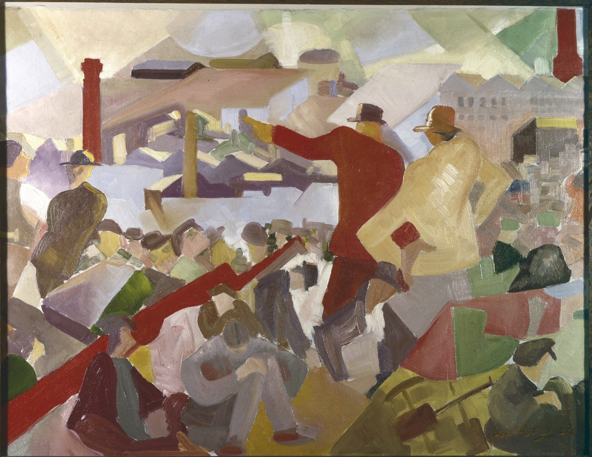
Also included is a curious piece of fine art—Patrick Harford’s painting Strife (1923). An awkward and angular work, it depicts Frederick J. Riley, labour activist and politician, alongside Christian Jollie Smith, a founding member of the Australian Communist Party, addressing a large crowd of workers on the banks of the Yarra. The unassuming placement of Strife here betrays its definite position as one of the earliest examples of an aggressively modernist art produced in Australia. Yet although there has been a trend in recent years of exhibitions that focus on the historical intersections of labour politics and art in Australian art history and despite the relative scarcity of domestic modernist painting, this painting’s current status has been curiously nil in any of these reconsiderations or retrospectives.
That Strife even survived was largely due to its illustrative qualities of working-class history and not for any recognition of its formal painterly qualities. Hanging in the library of the Victorian Labor College throughout the 1930s and 1940s, it was donated in 1977 to the Library’s ever growing political ephemera collection (itself originally founded by Riley). Here the logic underpinning the collection of an organisation like SLV stands in contrast to that of the art museum. While the SLV collection does contain its fair share of rare books, manuscripts and fine art, it is in the main a mass of cultural detritus—what could uncharitably be called junk. This quality of “junk” is in part deliberate as, ever since the cultural turn, quotidian, marginal and atypical (or rather, ur-typical) items have been increasingly seen by cultural institutions as worthy of preservation and exhibition. Many of the items that end up in these library collections find their interest not so much in any individual quality but en masse.

Is it possible that The Changing Face of Victoria, rather than a gallery show, is a more appropriate setting for Strife? Perhaps. Harford only came to art “later”, at the age of twenty-five. Previously, he had been a member of the vast pre-war working class, becoming deeply involved in labour politics by the start of the First World War. An active member of the Industrial Workers of the World, Australian Socialist Party and Victorian Sociality Party, he worked variously as a journalist, public speaker, secretary and fund-raiser. And while he campaigned against wartime censorship and conscription, he eventually enlisted and served for two years on the front in France.
Yet Harford was by no means an outsider artist. It was upon his demobilisation to Melbourne that he was introduced to a small circle of Melbourne intellectuals and artists via his marriage to the poet and activist Lesbia Keogh. Harford undertook a brief period of study, enrolling in drawing classes at the National Gallery in 1920—where he was allegedly ejected due to his promotion of modernism—and classes at the Victorian Artist Society (a contemporary profile suggests that he “demonstrated that all technique could be acquired in a few months, and straightway commenced teaching the Society’s hoary veterans how pictures should be painted”).
Harford became an exhibiting member of the Victorian Artist Society in 1923, his membership referred by Louis McCubbin. He submitted work to their annual exhibits sporadically until 1930, also occasionally exhibiting as a guest of the Twenty Painters Society. As a member of the National Gallery Past Students association throughout the 1920s, he helped organise their popular social events: newspaper reports detail his decorative panels that were “grotesque” parodies of modern art and his bold, “futurist’” lighting arrangements.
Although his other paintings do not survive, the exhibited titles do: Yellows (1923), Nocturne in Blue (1923), Stride the Hill Sower to the Sky Ridge (1924), Clouds of God Arranged Like Altar Flowers (1924), There Are Trees That Are Dancers (1924), Danseur Drolatique (1925) and As a Prince He Prepares to Dive (1929). The evocative titles suggest that these works were the “intriguing and beautiful” landscapes that Harford reportedly produced around the beginning of his career. While mostly ignored by art critics, The Bulletin did award him the dubious distinction of being Melbourne’s “only futurist”, and his later paintings were reportedly “almost unintelligible mixtures of colour and line, the colours mostly primitive, the lines running to corners”.

Despite his relative marginality, Harford did have an impact on art in Melbourne through his criticism of the prevailing attitudes toward figuration. This influence can mainly be seen in the modernist paintings of his colleagues William Frater and Arnold Shore, which were driven in-part by Harford’s argumentative rejection of realism. Although they undertook studio experiments in Cubism and abstraction both Frater and Shore were ultimately drawn towards a form of Cézannist post-impressionism. The early surrealist-inflected paintings of Eric Thake also derive in part from the bound volumes of the English art periodical Colour that were given to him by Harford. Unlike Frater, Shore or Thake, who all sustained painting careers long enough to gain recognition by the 1940s as veterans and members of the art establishment, Harford had long since dropped out. Ongoing gambling and alcohol problems exacerbated his precariousness and by the early 1930s he had left Melbourne to seek work amongst the travelling hoards of unemployed. Eventually Harford found himself in Sydney and it doesn’t appear he continued to exhibit, though when arrested for public drunkenness in 1939 he stated his occupation as “artist”. It seems he did maintain some minor level of contact with the Melbourne art world: in 1935 Henry Miller Tatlock published Harford’s short poem Botanical Gardens in his modern art and literature periodical Manuscripts (“I do hate tags on trees: I’d rather guess / This one’s Spain / That one Arcady”). The next thirty years are uncertain, but he died alone on the suburban outskirts of Perth in 1970.
Before Harford passed away, though presumably unbeknownst to him, he did manage to achieve the status of a footnote in Bernard Smith’s Australian Painting (1962). Here he is mentioned in passing as the first modern painter in Melbourne who rejected the “imitation of nature”. If this mention raised any interest from any readers or researchers at the time, it does not appear to have come to anything since.
Issue No. 1
Grab a copy of Memo’s first glossy annual magazine issue, featuring an extended artist focus on Archie Moore, the 2024 Venice Biennale Australian Representative, with essays by Rex Butler, Tara Heffernan, Tristen Harwood, and Hilary Thurlow.
Issue 1 features articles by Audrey Schmidt, Philip Brophy, Helen Hughes, The Manhattan Art Review’s Sean Tatol, Cameron Hurst, Chelsea Hopper, among your favourite regular Memo contributors. There are reviews and articles, including on Melbourne design art, French literature’s ageing enfant terrible, Michel Houellebecq, Derek Jarman’s Blue (1993), the celebrated Spike magazine cultural critic, Dean Kissick, the local cult-favourite Jas H. Duke, and much, much more.
Memo Magazine, 256 pages, 16 x 25 cm

At first glance Strife might be seen directly to anticipate self-consciously political styles of art from the era, such as social realism. Yet I feel it lacks the didactic or instrumental qualities typical of that approach, as are seen in other works in this part of the exhibition like Grant Hobson’s Industry of Workers (2006), a series of grim photographic posters on de-industrialisation and workplace relations, or Sam Wallman’s playful celebration of union power in the illustrated concertina booklet Vital Signs (2017). A quality of inertia instead pervades Strife. While a dynamism is conveyed from Riley, with his fist striking leftwards and his right arm clenching Jollie’s waist, the rest of the scene has a strange quality of stillness, listlessness—perhaps even boredom? The figures in the foreground are slumped, crouched and huddled and look almost asleep or as though they are only half listening. Here, Strife captures an irony of the workers movement in that the (then) forward momentum of the speed of progress was achieved through its very opposite: the strike, the stop-work action, the slow-down. As the International Workers of the World slogans proclaimed during the war: “Fast Workers die young. Someone has to be last - Let it be You”; “Slow work means more jobs, more jobs means less unemployed, less competition means higher wages, less work, more pay”.
If it is not, then, a case of “art as a weapon”, how has Strife survived as just a work of art? In and of itself Strife is decidedly un-naturalistic. The flat, blocky design and confusing perspective is certainly Cubist-derived, but it is not slavish in its application. The geometry of the figures, factory horizon and skyline sit uneasily with the individual, harried daubs of paint that make up much of the crowd. In the crowd, the brushwork masses together, holding an inherent threat of disorder and instability as it dissolves into a sea of pure colour on the painting’s right-hand side. Light and colour appear to have been a major preoccupation for Harford; the factories are shadows of lavender and glares of soft yellow, the skyline is comprised of all-glittering square and circular slabs of light like a mass of spotlights hardening into crystal, and pale blue and bright reds cut through the crowds earthy tones. While the figures within the painting seem especially clunky (see the almost comical face of the top-hatted figure on the far right, or the clumsy red blobbiness of Riley in the centre), other qualities suggest a more sensitive hand: the snaking yellow highlights along the edges of the soldier, or the simple swirls of the worker’s bubble-butt on the painting’s left-hand side.

Despite this inertia, there is also a formal energy to Strife that means it can not be easily placed alongside other painting produced in Melbourne at the same time, whether that be the uneasy stillness of the Meldrum school tonalism or the still-lifes and landscapes of Arnold Shore and Jock Frater. The loose painterly quality of Strife also places it apart from the Sydney moderns—it lacks any of the platonic yearnings of Roy De Maistre and Roland Wakelin’s Colour in Art (1919) paintings, or the control of Grace Cossington Smith’s tightly packed dry-stone walls of paint. There is instead an anticipation of subsequent Melbourne painting of the 1930s. The thick, simplified geometric forms would become standard in the Synthetic Cubist study exercises that were produced at the George Bell School (see for example the student work of Russell Drysdale), while the freer and slightly chaotic brushwork has a synergy with Arnold Shore’s somewhat later work, such as The Circus (1929) and Ravel’s Bolero (1931). The combination of geometric forms, unnatural colours, and massed figures also recall the idiosyncratic Ballets Russes studies Roger Kemp began painting around 1935.

Further, there is a question of whether Strife is simply novel for the fact of survival. Is it merely the illustration of a footnote, or does it have painterly qualities that compare with the dexterity and skill of other celebrated modernists? There is certainly an amateurish quality to Strife. That the painting had questionable artistic worth was acknowledged by its previous owner Mary Brodney, who noted that although she felt it captured the atmosphere of the workers’ movement of the time, her artist friends (the Social Realists of the 1940s) were usually unimpressed by the work. Given that so much of Australian art historicising, whether explicitly or not, has been an attempt to dispel the suspicion of amateurism (is the provincialism problem not also an amateurism problem?), I suspect that it is this rough quality that has possibly played some role in keeping Strife within the confines of a library’s political ephemera collection.
It is this second-guessing quality about what is going on with Strife—the volatility of its inherent worth—that marks it as decidedly contemporary in a way that few other modern Australian works are. The uncertainty of Harford’s status as an accomplished painter speaks to the instability of modern painting practice over the last century where the skilled hand of the painter has been increasingly hidden in a variety of détournements. This is painting’s bluff of the 20th century, one that continues unabated today, and seen in works by local practitioners of so-called “bad painting”.
I do suspect that when his brother-in-law Esmond Keogh dismissed Harford as having “amateurish talent” he was probably correct. Yet, for all his likely amateurishness, Harford was not a naive artist in the tradition of Broken Hill painters such as Sam Byrne or Pro Hart. As Arnold Shore recalled of Harford, “(he) seemed to know quite a lot about art. When he argued with (Jock) Frater he usually seemed to have the best side.” Instead, I would suggest that Harford should be thought of as one of the first artists in Australia to be “modern”, or even contemporary. Before he undertook his brief period of art schooling he had already internalised, even if in a reductive way, the basic precepts of avant-garde painting as it emerged in the late 1910s. Esmond had introduced him to modern art via Picasso reproductions and copies of Blast! before he had even begun making art. Harford’s attitude towards art was inflected by the challenge that he had seen in the angularity and antagonism of these works from the beginning, perhaps even providing his inspiration to take up painting. This is unlike many other painters in Australia during the period, many of whom only embraced modernism after lengthy periods of study and exhibition. Indeed, this type of habituation towards “modern” tendencies was one that took several decades to become standardised.
The tag line for the workers’ rights section of the exhibition states: “What are you working for?” It is tempting to transpose this question onto Harford and the realm of artistic labour. The answer is a confronting one, as it is likely “nothing”. The abject failure of his artistic career provides a corrective to the whiggish way that the history of Australian modern art is often framed. As a sympathetic journalist wrote of Harford in 1927, “(he had) a strong sense of the futility of Melbourne art as a whole”. It is perhaps this feeling of futility, of working towards nothing, that really transports Harford through the ages to the present. Though Harford faced a problem unknown now in that he was only one of a small handful of people trying to make art modern—their work surviving as much due to providence as patronage—the contemporary artist today faces a situation of total over-saturation and over-documentation. Yet Harford does manage to join the contemporary moment of excess by now being one more JPEG amongst millions of others.
Jarrod Zlatic is a writer and musician from Melbourne.


