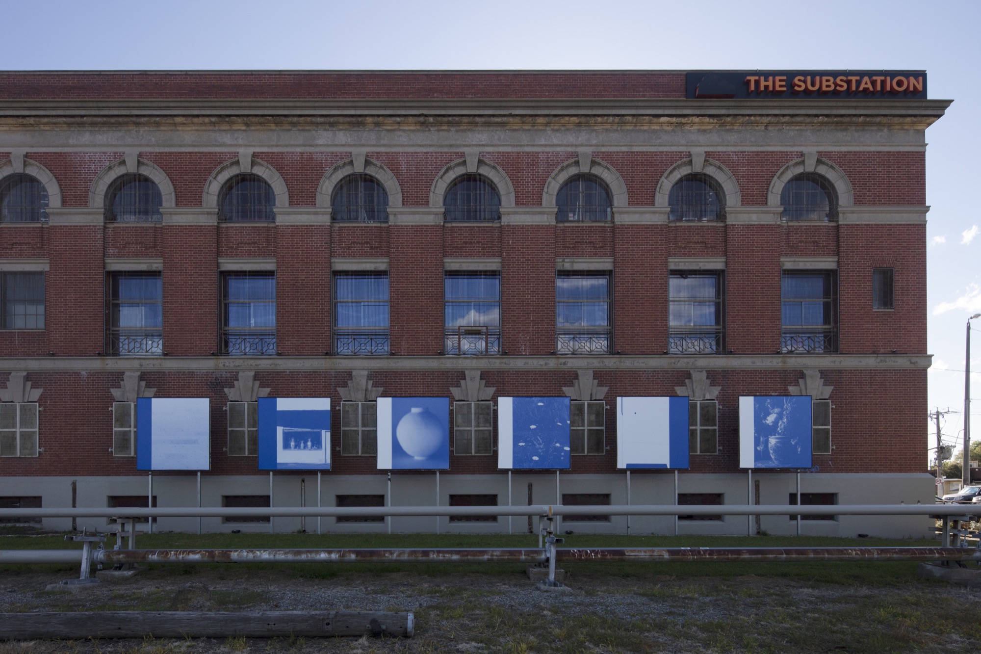
Traianos Pakioufakis’s billboards caught my eye while I was passing on a bus: a flash of blue in my peripheral vision that had me turning to figure out what I’d just missed. They face a cycle path, beyond which lie a railway and a busy road, so stray glimpses must be all that many people ever get of them. Not in my case, though. I ventured back on foot for a closer look and was glad I did, the threat of passing cyclists notwithstanding.
The six square billboards line up against the side wall of the Substation, like escapees from an Instagram account that have just been apprehended. Each combines a photo with an upright colour band along one edge, a device that creates cohesion within the group and links it lightly to the structure of the wall behind. The photos show a range of subjects, which have a loose coherence of their own. Three are of ceramic vessels, two are close-ups of patterned surfaces (paving stones and what is possibly a painted wall) and the last shows wildflowers in front of an embankment. The flowers are by no means outliers: a bouquet bursts from one of the ceramics, foliage crowds in behind some others. The last of the ceramics has a spherical white body that echoes the abstraction of the close-ups.

The strongest bond between the billboards is formed by their shared palette of blue and white, which sets them off abruptly from the Substation’s iron-coloured brickwork. This seemed to me a jarring combination to begin with, until I noticed the sky reflected in the windows overhead, at which point—because it was a clear day—the disparity diminished. Blue makes sense for other reasons too. Black and white might have been right for another site, but here it would retreat into the shadow of the wall. Colour wouldn’t generate this problem, but the ensemble would be tougher to coordinate. Blue tones strike a balance between the two and enhance the settled feeling of the photographs.
It may well be the artist’s Greek heritage that is prompting this assessment but, to my eye, his project feels classical. Contemplative and measured, it grants respite from the passing clamour of traffic, so much so that the billboards feel like portals to another world. Visible within it are deft configurations of form. Exploiting effects of unstable equilibrium within and between the images, Pakioufakis has set up a sophisticated interplay between his rhythmically repeating colour bands and the enlivening variety of his photographs. Those in which a field of blue predominates encourage us to peer into their depths and discover an array of hidden detail. Their pale colleagues read as blank expanses initially, but soon reveal details of their own. Combining elements of both is the image of a row of Chinese vases on a windowsill, which has been captured from a distance through another window. The frame of the second window looms like an eclipse across our field of vision, adding an element of horizontal drama to a series that is vertically accented.

Relationships like these more than justify the project’s existence, but there is more to the photographs than their appearance. There is also the matter of their pre-pandemic origins to ponder, knowledge of which reorients our response to them. As the Substation website informs us, they were made between 2008 and 2019 at sites in Greece, the United States, Australia and Italy. They thus return us to a decade very different to our own, which hasn’t simply slipped into the flow of history but has been consigned more emphatically to another era by an intervening rupture. The instants and encounters they preserve belong both to the life of the photographer and the period itself. They thus evoke its lost mobility and other freedoms which have since been stripped away.
Issue No. 1
Grab a copy of Memo’s first glossy annual magazine issue, featuring an extended artist focus on Archie Moore, the 2024 Venice Biennale Australian Representative, with essays by Rex Butler, Tara Heffernan, Tristen Harwood, and Hilary Thurlow.
Issue 1 features articles by Audrey Schmidt, Philip Brophy, Helen Hughes, The Manhattan Art Review’s Sean Tatol, Cameron Hurst, Chelsea Hopper, among your favourite regular Memo contributors. There are reviews and articles, including on Melbourne design art, French literature’s ageing enfant terrible, Michel Houellebecq, Derek Jarman’s Blue (1993), the celebrated Spike magazine cultural critic, Dean Kissick, the local cult-favourite Jas H. Duke, and much, much more.
Memo Magazine, 256 pages, 16 x 25 cm
Time will tell if our reopening world restores them. Meanwhile, there is the question of the photos’ own mobility to think about. Like many photos these days, they have appeared in other contexts before arriving at their current destination. Circulating between media and formats, they have acquired travel histories of their own. The artist’s Instagram reveals, for example, that he works as a designer and photographer. The billboards are linked not only to these areas of his practice, but also to the work in other media of his colleagues and collaborators. The spherical vase, for instance, was created by Alana Wilson, with whom he has exhibited. His hazy image of it has featured on an album cover he designed, as have the other photos of ceramics.


The title of the billboard project, Exofilla, refers directly to this history: as the Substation also tells us, it means “front covers” in Greek. Discovering this fact transforms the billboards from Instagram escapees into a set of giant sleeves, enfolding audible worlds whose content we can only imagine. Some of the other photos have been published in magazines or as prints, and may yet find future uses elsewhere, each time repurposed, reformatted and reedited.
The point is not to trace these past and prospective journeys in exhaustive detail. It is to plunge into the nexus they establish between a host of different times, locations and experiences. None are strictly relevant to our encounter with the billboards themselves, but they belong to the relational matrix from which the project arose. The billboards have been added to this network, which will in time give birth to other images. Contemplating this development in a city that is gradually reopening invites a series of reflections on the flow of time: on the retreat into nostalgia of the pre-pandemic past; the unsealing of closed borders that will restore to us some measure of our freedom; and a future, either imminent or distant, in which the rift created by the virus between a world of freely circulating images and their immobilised creators will—we can be hopeful—begin to narrow. But enough of the nexus and its network of connections. There’s a cyclist on the bike path by the billboards, who has me in his sights!
Luke Smythe is a lecturer in art history and theory at Monash University. His book Gretchen Albrecht: Between Gesture and Geometry was published this year by Massey University Press. A book on Gerhard Richter is forthcoming.


