Suzanne Archer: Moving Forwards, Looking Back: A Survey 1969–2016
⬤ Nicholas Thompson Gallery 1 Jan - 1 Feb 2017
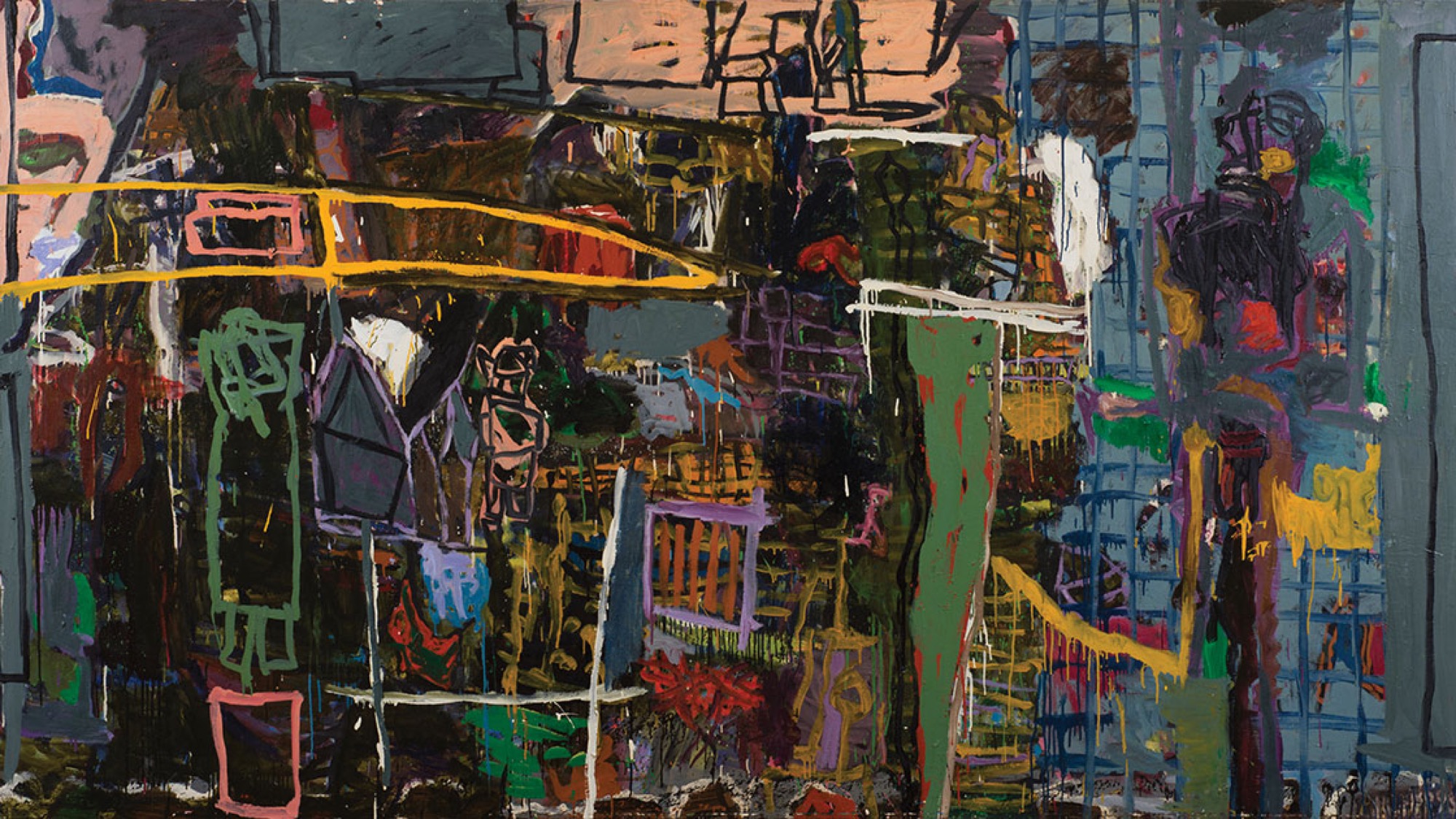
When the well-known painter Gareth Sansom opened Suzanne Archer’s show at the Nicholas Thompson Gallery in December, he made the rather large claim that two of the paintings—-Coalesce (1993) and Ant holes and Bandy-Bandy (1994)—-were the best he’d seen in Melbourne all year.
It’s a kind of old-school remark—all that talk of the ‘best’ and the reference to the specific ‘painting’ rather than the more general ‘art’—but we can see why he made it.
Sansom and Archer actually go a long way back together. They both featured—Sansom as the latest appointed member of Melbourne’s all-male ‘antipodeans,’ Archer as a newly arrived abstract artist from England—in Mervyn Horton’s Present Day Art in Australia in 1969. Horton, at the time the editor of Art & Australia, included both as predictions of a sort in his painting-heavy primer, published on the cusp of big changes in the Australian art world.
The year before, 1968, saw the opening of The Field at the National Gallery of Victoria, generally understood to mark the end of ‘modernism’ in Australian art, and with it both the pre-eminence of painting as a medium and the idea of there being some identifiable national art. The decade that followed is generally held to be the moment of the entry of social issues into art: feminism, community-based protest, the discovery of Aboriginal art.
Sansom flourished throughout the period. His vivid, iconoclastic, sometimes cartoon-like canvases, an intoxicating mixture of French art brut and British Pop Art, justified Horton’s early advocacy. But Archer, a woman painter in the ’70s, a decade that should have been her making, virtually disappeared. She spent her time raising a family, and her CV shows her passing from commercial gallery to commercial gallery with virtually no group shows, the usual barometer of critical taste.
The ’70s, that ‘feminist’ decade, did not really change Archer’s circumstances, with her assumption of the role usually earmarked for women in our society and the burden of domestic responsibilities. And the ’80s with the rise of post-modernism were equally not kind to expressive, thickly applied oil painting, unless it could be understood ironically or shown to be undertaken half-heartedly, which certainly was not the case with Archer.
Seen in this light, Sansom’s praise can seem to be of the kind very easy to make by a successful artist to one less successful: given freely, promising nothing, looking as much as anything worthy for the one making it as for the one it is about.
Except that it was also true: Archer’s Coalesce and Ant holes and Bandy-Bandy are amongst the best paintings shown in Melbourne last year, absolutely as good as and maybe even better than Sansom’s own excellent show at Station Gallery in September.
But together both artists—testament to Horton’s prescience in putting them together—have a lot to tell us about the state of painting today, bringing back a lost moment or a lost opportunity that might allow us to rethink the practice in a way that was not at all apparent with the disappointing Painting. More Painting show at the Australian Centre for Contemporary Art.
In what way? It is hard to know quite what kind of a painter to call Archer. The catalogue for the show at Thompson’s reproduced a photo of her sitting in front of some abstracts she had done from 1969, but the first work in the exhibition is a small collage done the same year, inspired she says by Kurt Schwitters, that uses cut-out typeface as a kind of brushmark. This is followed by a not-entirely successful piece from a decade later, in which she uses a metal stencil instead of collage to run letters across a semi-abstract acrylic on paper.
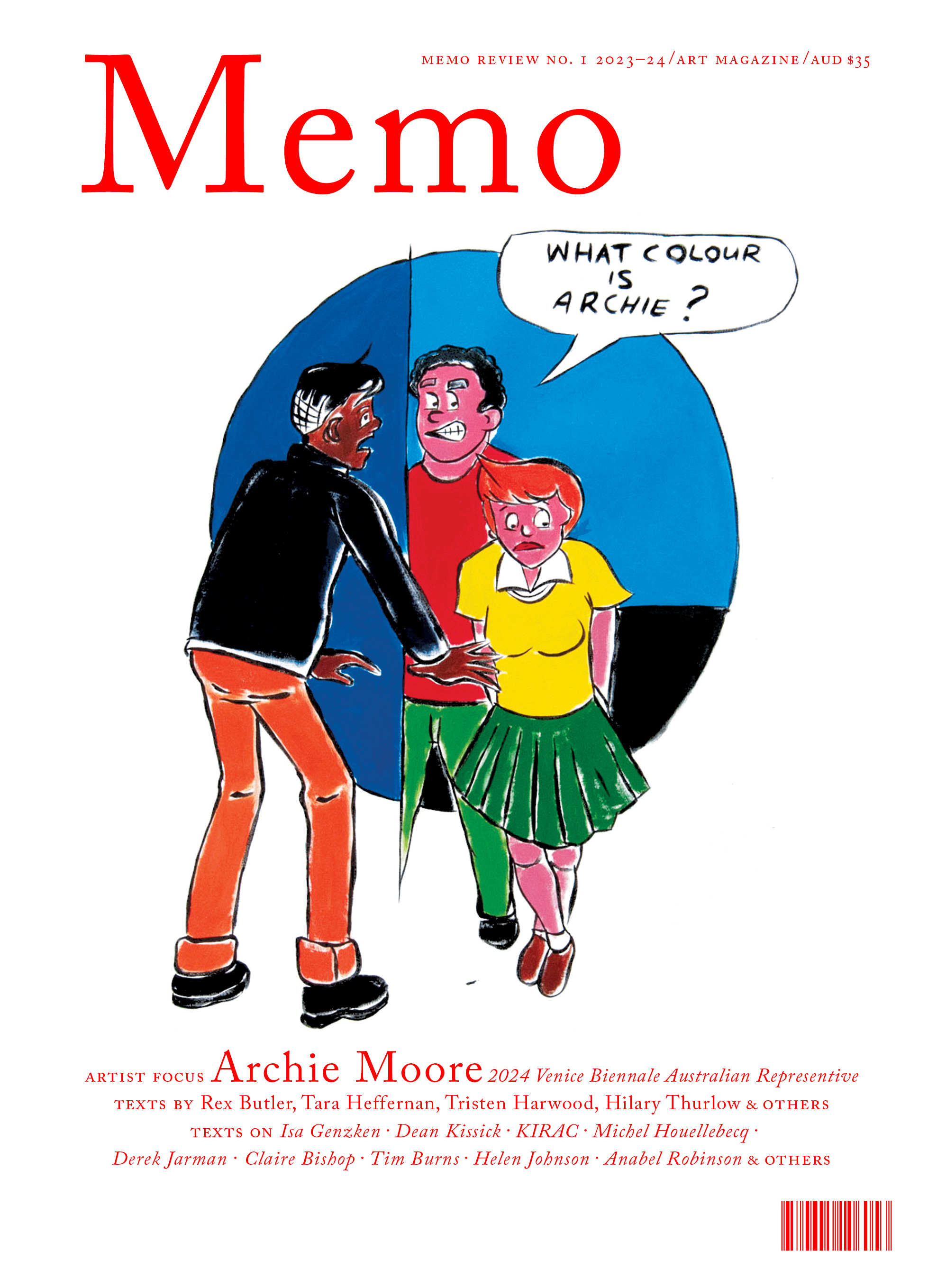
Issue No. 1
Grab a copy of Memo’s first glossy annual magazine issue, featuring an extended artist focus on Archie Moore, the 2024 Venice Biennale Australian Representative, with essays by Rex Butler, Tara Heffernan, Tristen Harwood, and Hilary Thurlow.
Issue 1 features articles by Audrey Schmidt, Philip Brophy, Helen Hughes, The Manhattan Art Review’s Sean Tatol, Cameron Hurst, Chelsea Hopper, among your favourite regular Memo contributors. There are reviews and articles, including on Melbourne design art, French literature’s ageing enfant terrible, Michel Houellebecq, Derek Jarman’s Blue (1993), the celebrated Spike magazine cultural critic, Dean Kissick, the local cult-favourite Jas H. Duke, and much, much more.
Memo Magazine, 256 pages, 16 x 25 cm
It is this mixture of elements that is taken to delirious extremes in the big canvases of the 1990s with their series of dark patches on the surface, overlaid with wavering silhouettes, gestural criss-crossings, splashes of white paint and meandering marks that lead nowhere, all done in a variety of clashing and eye-watering colours (green on red, purple on orange, violet on mustard).
The Sydney Morning Herald reviewer for Archer’s show last year at Thompson’s called her paintings ‘towering and texture-stuttered,’ and as much as anything they remind us of someone like Ian Fairweather in their endless reworking and crossing-out, their piling up of compositional detail to the point of self-erasure and yet with the whole remaining clear and legible with a little effort on the part of the viewer.
The works are often described as landscapes, based on Archer’s bushland walks around Wedderburn outside Sydney, where she now lives—and Archer sometimes gives them titles like Ferns, Waratahs and Downpour. But, if anything—and here her connection with Sansom—we would call them ‘Pop,’ if we remember that Pop Art, especially in the early British incarnation she would have encountered as a student before emigrating to Australia in 1965, was often a dirty, thickly painted form of social realism.
It is indeed one of the salutary things that the excellent 2014 Art Gallery of New South Wales Pop to Popism show reminded us of: that Pop Art was not always the slickly silkscreened images of popular culture we see in Warhol and American Pop and that was imitated so slavishly by Australian artists in the 1980s. It was just as much in the hands of French (Bernard Buffet) and English (David Hockney, Derek Boshier) artists a tough-minded fusion of the figurative and abstract, a putting together of various painterly styles and systems that have little or nothing in common, much as with Sansom in Australia.
There is a lot of this in Archer, and her very best works—like the three-metre long Coalesce—for all of their evocation of natural harmony, precisely fail to coalesce, or only just, remaining on the edge of coherence, allowing us to see—and enjoy—the joins.
There is nothing romantic about being an excellent, over-looked artist, and in recent years, as old age approaches, Archer has started making paintings of skeletons and skulls, and in 2015 a blue-tinged mask of her youthful face.
But Sansom is right: two or three of the paintings in this show are amongst the best to be shown in Melbourne last year—forgetting for a moment Degas—and perhaps for many years. The real question is, why weren’t people saying things like this when Archer was making and showing them in the 1990s?
Rex Butler teaches Art History in the Faculty of Art Design and Architecture at Monash University.
