Smallness: Trevelyan Clay & Kate Smith
⬤ Trevelyan Clay, Moments Today, Neon Parc | City 31 Aug - 20 Oct 2017 ⬤ Kate Smith, An Impression of an impression, Sutton Gallery 20 Sep - 20 Oct 2017
I confess to being a sucker for bad painting. Not, that is, for all painting that fails in whatever way to be good, but for the particular style of offhand, deliberately underwhelming sub-expressionist painting most closely associated with a number of artists from Cologne who rose to prominence in the 1980s (Martin Kippenberger, Werner Büttner, and Michael Krebber being some of the most well-known). Shorn of the rock-star theatrics that many of the German artists indulged in, this trend found an echo in the work of some Australian artists, such as the casual-looking abstraction of Elizabeth Newman, who remains an important influence on many of the younger Melbourne artists working in this idiom today.
My own attraction to “bad painting” undoubtedly has something to do with my art-historical education. As an undergrad, I enthusiastically imbibed a rather narrow account of the development of contemporary art, one in which—despite the supposed eclipse of teleological narratives—critical, ‘anti-aesthetic’ tendencies provided the standard for what constituted progressive art and materially-based practices like painting generally appeared as backward and irrelevant. As silly as it sounds, I was genuinely surprised to discover that the standards that seemed to hold in the academic discussion of contemporary art weren’t reflected in the world of Melbourne artists and galleries. Not only were painters still painting, their work was taken seriously as art (including by some of my teachers), and not only in ironically self-reflexive terms. Of course I knew that painting (and the whole ‘aesthetic’ approach to making art that it often represents in the contemporary art world) had never gone away and that certain galleries continued to exhibit their dinosaurs. But the work I was surprised to encounter was mainly made by young hipster artists and shown by young gallerists. And much of it was ‘bad’: casual, offhand, half-way between ‘real’ painting and parody, often accompanied by readymade objects or shoddy assemblages. In its modesty, its presiding sense of smallness, it seemed to have internalised the judgments made against painting since the 1970s and turned them into the central terms of a distinctive aesthetic vocabulary.

This style of painting is still alive and well, and two current exhibitions offer excellent opportunities to bask in its charms. At Neon Parc—one of the main hubs for this sort of work—Trevelyan Clay presents thirteen new oil paintings (all 2017), most of them using the eye-popping colour palette (calling up Rainbow Serpent festivals and video games as much as any art historical reference points) that Clay has made his own. Where some of the paintings in Clay’s previous exhibitions prominently featured representational elements and absurd text, what is on display here is primarily abstract, although in a wide variety of styles. Side by side we find biomorphic forms, Op Art patterning, impasto textures, and one painting (Dark Skies) that, in its loose geometry of red and pink lines scratched out on a moody purple and blue ground, calls Paul Klee strongly to mind. Rather than demonstrating the post-historical aesthetic supermarket of much of the 1980s postmodernism excoriated by the October critics—a coexistence of styles made possible by the belief that none of them mean anything any longer—Clay’s stylistic eclectism is unified by the unassuming, almost hobbyist tone shared by most of the paintings in the show. (Self-reference also bridges the stylistic divides, as in Melody, where a colourful arrangement of V and chevron shapes also found in Hot Painting is used as the ground for some loose gestural marks and a thickly painted grid that appears in Rose Matters, hung next to it; the effect is as if Clay is defacing one of his own paintings).

The works using organic rounded forms (Vampire and Nefarious) display most obviously one of the characteristics of much painting in this style: a deliberately under-worked surface on which visible brush strokes read not as expressive but as unfinished, like a wall in need of another coat of paint. This colouristic thinness, in which the white ground is often visible, gives the picture a sort of deliberate inertness that, for me, seems to be one of the central aesthetic values of this kind of painting. The surface neither reaches out to the viewer nor invites an immersive closer look; rather, a painting like Vampire, quite remarkably considering its traditionally compositional nature, simply hangs on the wall, an object among objects. But this is not a failure, as it would be in a modernist painting, because this quality of inertness is what gives a painting like this its charm – the sense that it doesn’t care whether you look, that it almost can’t be bothered hanging on the wall anymore.

However, the best paintings in the show do not display this thinned-out surface. In fact, in Rose Matters, a grid pattern highlighted by splashes of prominent pink, and Boiling Moss, a vibrant overlay of orange on top of an intense, somewhat sickly green, the paint is worked into a thick impasto. Using all-over compositional devices that allow the eye to focus on the details of textual variation on the uneven surface, Clay successfully combines the characteristic modesty of these paintings with a compelling surface that prompts the viewer into the sort of close looking we might devote to a modernist painting. This engagement is noteworthy, because this sort of painting, in ‘presenting a deliberately bad example’ (to use Helen Johnson’s phrase), often seems to oscillate between demanding aesthetic engagement and a sort of deadpan joke at the expense of aesthetic experience. As in some of the recent work of Elizabeth Newman, here Clay’s painting no longer seems to take refuge in its self-conscious failure. The same cannot really be said, I feel, for the large paintings in the show, which use arrangements of regularly repeating geometric shapes to create effects reminiscent of Op Art. Where Clay’s smaller paintings use their modesty to great effect, blown up to the scale of 60s abstract paintings his work appears paradoxically cramped, the tightly packed decorative surface not given the space that it needs to succeed at this size.

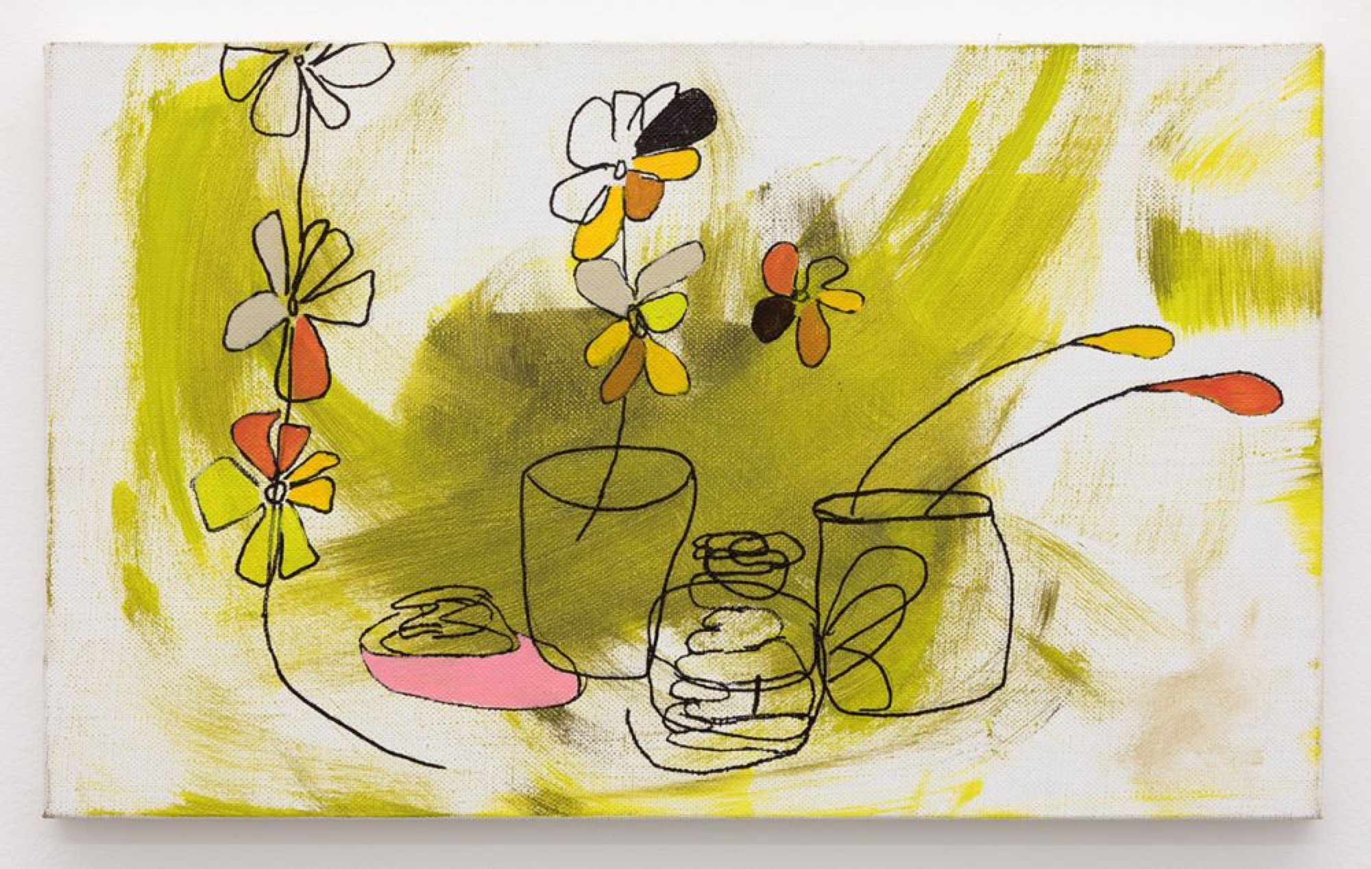
Smallness is also a key issue at Kate Smith’s show at Sutton Gallery, which presents only four paintings (each around 30 x 50 cm), hung with irregularly large gaps between them. Smith has collaborated with Clay in the past, and belongs in some ways to the scene (almost a subculture) around galleries such as Neon Parc. However, she now lives in a tiny town in New South Wales and out there, she has said, it’s ‘just you and art history’. Representative of her idiosyncratic engagement with the history of her medium, three of these works belong to a series called An Impression of an impression (After Rupert Bunny) (the odd capitalisation is Smith’s own). The three are all quite similar, featuring still life arrangement of flowers and vases in texta and biro over irregular backdrops of roughly painted green strokes. In spite of the high art references, Smith pushes here against the borders of bad taste, her charmingly naïve flowers recalling teenage doodles or kitsch desktop wallpaper. But unlike these reference points, Smith’s forms are drawn with such an offhand touch that they threaten to devolve into formlessness, to become puddles or lumps.
Issue No. 1
Grab a copy of Memo’s first glossy annual magazine issue, featuring an extended artist focus on Archie Moore, the 2024 Venice Biennale Australian Representative, with essays by Rex Butler, Tara Heffernan, Tristen Harwood, and Hilary Thurlow.
Issue 1 features articles by Audrey Schmidt, Philip Brophy, Helen Hughes, The Manhattan Art Review’s Sean Tatol, Cameron Hurst, Chelsea Hopper, among your favourite regular Memo contributors. There are reviews and articles, including on Melbourne design art, French literature’s ageing enfant terrible, Michel Houellebecq, Derek Jarman’s Blue (1993), the celebrated Spike magazine cultural critic, Dean Kissick, the local cult-favourite Jas H. Duke, and much, much more.
Memo Magazine, 256 pages, 16 x 25 cm

Smith’s brushstrokes are elegant and authoritative but inexpressive, and in these works they function mainly as background for the crudely outlined still life forms, some of which are almost arbitrarily filled with colour (including some lovely varieties of pale pink that might provide one of their links back to Bunny).

Smith’s surfaces are manifestly composite, layering painting and drawing without synthesizing the two. The superimposition of distinct formal modes on the single surface gives it the appearance of a palimpsest. This is particularly marked in the first piece in the series, where, like an ineffective correction, a long thin triangle of pinks partly obscures some lines in texta. It would be tempting to see this unresolved, composite surface—which makes the painting appear as a work in progress—in negative terms: as a deliberate refusal of compositional finality and formal coherence, an attack on the medium. But this feels too abstract and intellectual. Instead, I think we should see Smith’s play with the borderline between the achievement of formal resolution and its failure, as concerned with the aesthetic effects of courting, yet ultimately avoiding, dissolution and incoherence. Rather than attacking painting in any sense, Smith is just loosening it up, transforming the painting’s surface into an airy structure in which all sorts of things coexist without seeming to touch.

The kitsch dimension of these three paintings is entirely absent from the fourth in the show, the oddly titled You can be Phillip Seymour Hoffman, or you can calm down, which is certainly one of the most beautiful works by Smith I have seen. Lacking the explicit representational forms found in the other works in the show, much of the surface of this work is taken up with an irregular semi-rectangular yellow shape, made up of uneven brush strokes with a vaguely circular motion. In the rest of the painting we see delicately modulated greens and pinks, in such an awkward formal arrangement that, on first look, it almost seems as if this part of the painting once took up the whole surface but has been painted over with the big yellow shape. Where Clay’s large paintings end up looking small, this is a small painting that somehow manages to feel very big. The yellow, both in colour and texture, is so immersive that it invites looking at the painting like a Barnett Newman, as close to the surface as permissible. The apparent formal awkwardness of the work, its oddly unbalanced nature, reveals itself to be a stroke of formal intelligence. For it is precisely the fact that the yellow field does not take up the whole surface, but is played off against this area of subtle yet vibrant visual activity tightly packed into a corner, that makes this monochromatic area feel so expansive and its colour feel so intense. Unlike monochrome paintings, which often appear to us simply as coloured objects hanging in a room, here this experience of colour somehow emerges within the painting as we move from one of its moments to another, creating a deeply pleasurable visual oscillation that feels as if it could be repeated ad infinitum. It is perhaps in the subtlety of aesthetic moments like this that contemporary painting is most alive.
Francis Plagne is a writer and musician from Melbourne.


