Preparation is a group exhibition organised by artist Tim Bučkovic with works from Julie Irving, Jake Madel, Julius Linnenbrink, Manuel Gröger, Lalita Sherwell, Sibylle Czichon, Allan Rand, Ina Gerken and Bučkovic himself. Within the context of the exhibition, the word 'preparation' is both processual and genealogical. First, the works in the exhibition reveal some aspect of the process of their making and, as such, underscore the temporality that they embody. Second, preparation speaks to the genealogical specific to the way painting has been disseminated and developed since the moment of high modernism. Many of the artists in the exhibition were peers of Bučković's at the Kunstakademie Düsseldorf, where he studied from 2015-16. The works in the exhibition seem to carry the legacy of the various artists who either attended or taught at the school, and 'preparation' therefore carries connotations of the previous generation's development and establishment of the practice of painting for later generations.

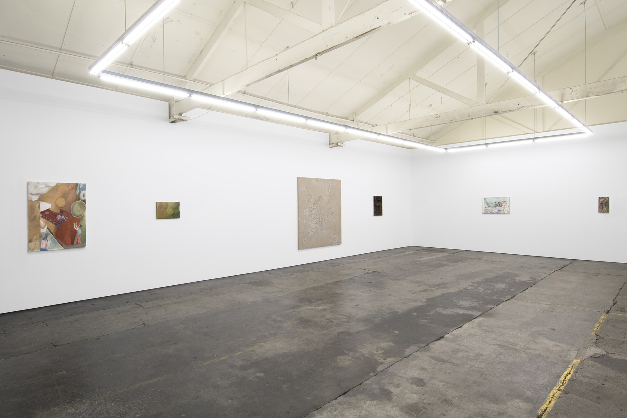
Haydens is a traditional white cube space, but with the hang extending to the office - a trend that has in recent years become quite popular, perhaps to remove the pomp of traditional commercial spaces. There are about twenty works in Preparation, but the hang is minimal, with abstract and figurative works sitting side by side with maximum comfort. Bučkovic has established a rhythm between small and large works. For example, Ina Gerken's large 100 x 80 cm abstract canvas balances three tiny drawings on paper by Manuel Gröger. Without a demonstrable formal thematic at hand, the flow is necessary—and it works well.
The gallery is a relatively new commercial space run by Hayden Stuart and housed within a studio complex in Coburg. Almost singlehandedly, Stuart has developed and sustained these studios for some two-and-a-half years, providing spaces for some of Australia's most important artists—including Megan Cope, John Nixon and Damiano Bertoli—to work out of. Late last year, Stuart opened Haydens, the gallery space he had been building largely alone for several months. Still in its infancy, the gallery has already shown promising signs and its close proximity to such a robust group of studio artists makes it all the more primed for strong exhibitions. There is also very much an anti-antipodean impulse at play. Since opening, the gallery has exhibited a fairly even mix of local and international artists and has resisted the urge seen in so many other Australian galleries to situate the Australian artists as secondary to the international 'taste makers'. Preparation reflects this trend, with little emphasis placed upon the nationality or base of the artists involved.

The exhibition is undoubtedly a love song to painting; anassertion of painting's relevance after modernism. Certainly, no other medium has undergone such an intense yet unresolved renaissance in recent years. I distinctly recall, less than a decade ago, my art history professor reiterating time and again just how uncool painting was. It was, they said, a “dead medium.” The biggest problem with painting is that it was perhaps the single most abused medium by modernist formalists, AKA Clement Greenberg and his disciples. Of course, even though Greenberg laid the groundwork for painting's discourses and ideology of medium specificity—above all, an emphasis upon the flatness of the painting surface—this is not to say that this theory characterised the bulk of painting created from modernism onwards. But the legacy of that theory continues to be the irritant that catalyses artistic and theoretical responses to the medium even today. Preparation constitutes an example of a wholehearted return to the medium of painting. The critical question, then, is what reading/s to apply to such a resurgence?

There is no unifying formal element amongst the works in Preparation, though organiser Bučkovic states that there is a dialogue between the works insofar as “the tail end of an image can lead into an idea fragment or mental energy contained in the next image.” But there is more to the works' relationships than just a daisy-chain-like connection between them; I would suggest there is as much a rhizomic effect at play. Numerous strata of associations criss-cross between various of the works, while missing others, creating a complex network of formal and historical associations. Strictly speaking, the show comprises both painting and drawing, in which in a very post-modern way one medium bleeds into the next. I'm thinking, in particular, of the American artist Steven Parrino, whose painted monochromes were produced in a more industrial sense and therefore took on the characteristics of an object rather than a painting. Or Lucio Fontana, who produced a number of multiples based upon his slash paintings that were made out of plastic and which, paradoxically, were not painted. While these examples point to a certain industrialisation of painting, it is apparent in Preparation that the hand continues to play a central role while admitting that, yes, the definition of painting continues to broaden. Indeed, Manuel Gröger is the only artist in Preparation to exhibition non-painting work. His collection of delicate sketch-like drawings—in ink and pencil—operate as finite works in themselves but also make reference to the preparatory sketches that painters will usually make before applying paint to canvas.

If (to take one classic reading) the language of the avant-garde taught us that abstraction was a reference to the machine and figuration to the body, then the constant back and forth between the two dominant painting styles indicates a very skewed version of the contemporary moment predicted by the avant-garde. However, the relationship between the human and machine is not as euphoric today as it was in the twentieth century. I mentioned earlier that the abstraction seen in Preparation still values the hand. We see this in the work of Sibylle Czichon and, in particular, Julius Linnenbrink. But Linnenbrink's works are slicked with almost toxic sheens and painted in caustic colours that evoke unnatural, human-made things. Eye and Ear (2019)—a small, slimy green painting, murky with layers—sits next to Jake Madel's untitled acrylic and rabbit skin glue work that depicts what appears to be two outlines of dancing human figures, arms in the air. Lacking identities, they nonetheless dance upon the, rabbit skin glue base, a material used by humans for centuries. The interplay between the very natural animal-derived material and Madel's use of the acrylic paint to evoke the synthetic encapsulates the unease that the contemporary has made of the avant-garde vision.
Pedagogical legacies are a sub-theme of Preparation. In fact, Bučković has included works from his teacher Julie Irving, whom he now teaches alongside at VCA. Irving's floating abstractions rendered in various tones of beige and cream bear little resemblance to Bučković's own paintings, but still reveal a deep sense of ongoing intergenerational concern insofar as many of the younger artists in the show question what the role of the picture surface should be. In the case of Irving, we see a shift between the illusion of floating and all-over flat composition that other artists also move between, such as Lalita Sherwell, who paints human figures upon abstract, floating planes.
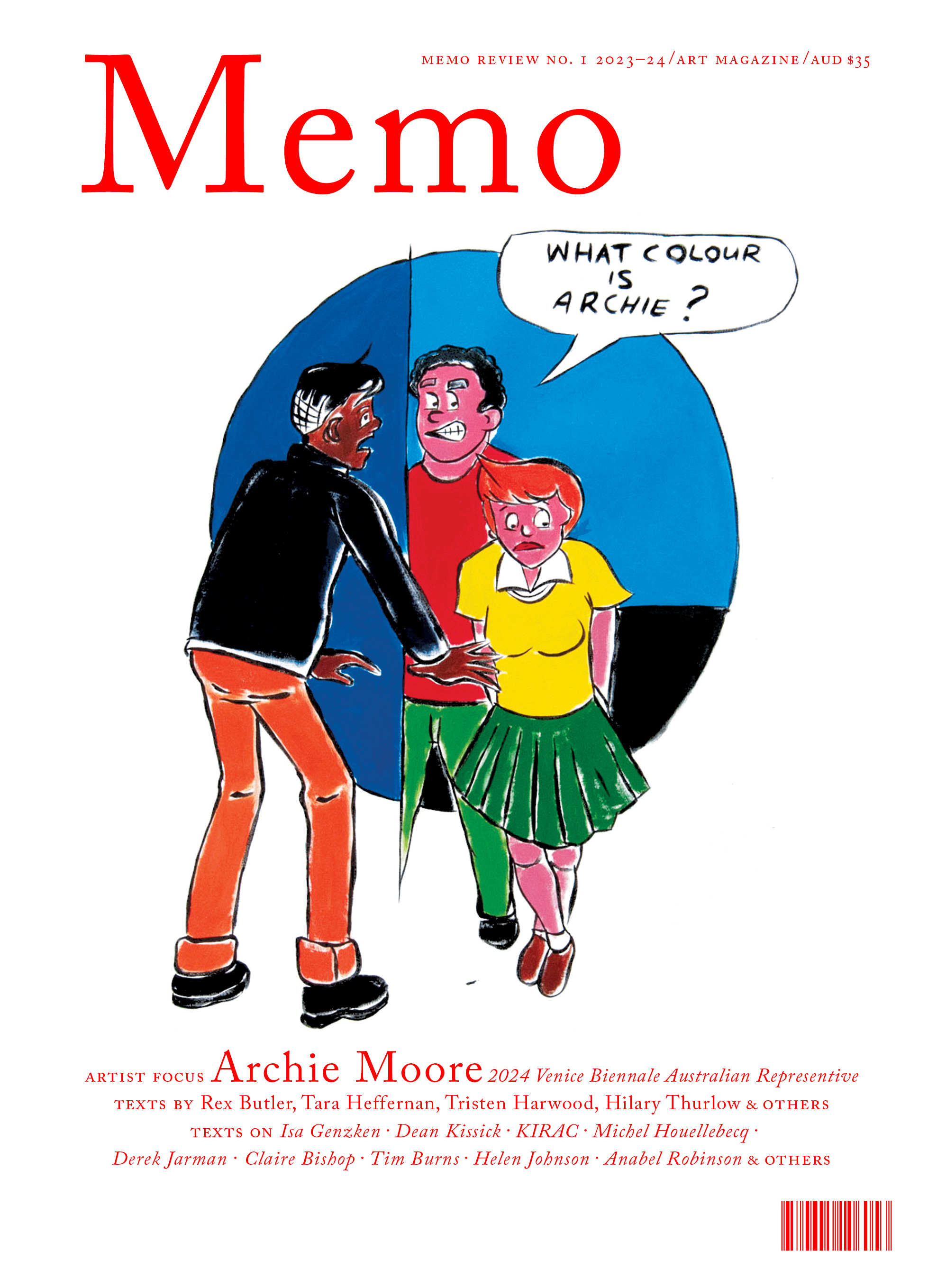
Issue No. 1
Grab a copy of Memo’s first glossy annual magazine issue, featuring an extended artist focus on Archie Moore, the 2024 Venice Biennale Australian Representative, with essays by Rex Butler, Tara Heffernan, Tristen Harwood, and Hilary Thurlow.
Issue 1 features articles by Audrey Schmidt, Philip Brophy, Helen Hughes, The Manhattan Art Review’s Sean Tatol, Cameron Hurst, Chelsea Hopper, among your favourite regular Memo contributors. There are reviews and articles, including on Melbourne design art, French literature’s ageing enfant terrible, Michel Houellebecq, Derek Jarman’s Blue (1993), the celebrated Spike magazine cultural critic, Dean Kissick, the local cult-favourite Jas H. Duke, and much, much more.
Memo Magazine, 256 pages, 16 x 25 cm

Meanwhile, the Kunstakademie Düsseldorf—sometimes described as being to painting what Frankfurt's Städelschule is to sculpture—boasts an impressive alumni of painting royalty, both students and teachers. These include Blinky Palermo, Sigmar Polke, Anselm Kiefer and Gerhard Richter. The influence of German neo-expressionism is evident in the work of Allan Rand, whose untitled work is most reminiscent of Kiefer. But to say that this style began with Kiefer and has been simply replicated by subsequent generations would be a fallacy. Rand's work is best understood not as a facsimile of Kiefer's work but as a product of incubation within the Kunstakademie Düsseldorf. His work represents the very typical way in which an art school develops its own formal style that is adopted and adapted by subsequent students. Untitled (2012) represents a branching process from German neo-expressionism. For this work, Rand has applied black and fleshy pink oil paint on the canvas to produce a dialectically charged to and fro between foreground and background, figurative and abstract. Like Kiefer, Rand uses a restricted palette and relies upon a certain play between the chosen colours to produce a hum that might come to the evocation of movement. If Kiefer's paintings are usually unmistakable abstractions of the figurative, Rand's consistently jostle between the abstract and figurative. In fact, the figurative element of the work—the seated figures, particularly—only reveal themselves with time. The first thing to come forth in the work is the interplay between the black and pink layers of paint. For one, they appear constantly to shift positions and cause confusion about their relative order. Additionally, there is an all-over sculptural quality to Rand's work. I would be lying if I said that the obvious allusion to post-war German neo-expressionism (and, dare I say, a hint of Giacometti) wasn't what attracted me to this work above all others in Preparation; familiarity is, after all, comforting. But it is the interplay between the foreground and the background and the almost frustrating inability to create binary distinctions between flat and sculptural that pique one's interest long after any novelty of association has worn off.

Virtually all of the works in Preparation can be located within the lineage established by modernist and avant garde painting. But some relate to this lineage with more irony than others. Lalita Sherwell's dreamlike large canvases are almost like 90's café art. In her works, human figures, painted with a deliberate crudeness, sit flat against the picture plane. I noticed the exit (2018-19) replicates a camera's focus. The figures in the foreground are relatively sharp while the background figures are blurry. This obvious collapse of various mediums and time periods into the one canvas inflects an acerbic “anything goes” commentary.

Exhibition organiser Bučković has also included two of his own works in Preparation, both of which occupy the nexus of figuration and abstraction. Bučković is a very talented painter with a very precise, identifiable technique. Two paintings in the exhibition, Glass Embankment (part b) and few, are composed of multiple planar fragments that evoke cubism's use of variously tilted planes. For cubism, these planes produced the effect of various perspectives. For Bučković's paintings, however, each fragment is front facing and evenly stippled with uniform brushstrokes that evoke digital pixilation. In this way, anachronism is created between these pixels and the very modernist bodies represented (Le Corbusier's Modulor comes to mind).

The modernist allusions in Preparation are unavoidable. However, the allusions don't so much present as pastiche but are, instead, part of that same genealogy that sees alumni from different generations of the same art school produce vast variations of similar formal styles. It is probably Preparation's complex attempt to look at modernism that makes me like this exhibition so much. That painting has become a sticking point for modernism demonstrates the difficulty of completely separating high modernism from the art of today. The paradox of almost methodically attempting to locate frameworks within Preparation's consciously fluid structure is not lost on me. But it is also this constant tension between the strength of modernist doctrines and painting's current moment that makes an exhibition like Preparation so fascinating.
Amelia is a Melbourne-based arts writer and PhD candidate in Art History at the University of Melbourne.


