Papermade / John Nixon: Screenprints, Woodblocks & Unique Relief Prints
⬤ Papermade, 26 Feb - 17 Mar 2017 ⬤ John Nixon: Screenprints, Woodblocks & Unique Relief Prints, 16 Feb - 9 Mar 2017
Exhibitions are usually talkative. They start off with the artist's or curator's statements and then usually just chat away with their personalised terminology and their free-associations. I intended to review the Australian Galleries group-show Papermade, as the curator Kathleen Coelho has it billed as a significant survey capturing “the history of Australian printmaking today” (even though it also includes drawings and a couple of photographs). I knew that it was a 'stockroom exhibition', and that these are typically cynical affairs in which the drawers are cleared for the purpose of selling old work. Still, few gallery stockrooms are as multifaceted and as pedigreed as Australian Galleries', established as it was in 1956 and existing now across three locations. Australian Galleries is one of Australia's largest commercial galleries and has been for decades. Change.

Far from being a history of printmaking—today or at any other time—Papermade is mute. It doesn't speak for itself nor does it speak for any of the 90-plus artists on its massive bill. There are no terms presented, except perhaps technical skill and uniqueness (in that each of the artists have a “unique” practice), which is the kind of a dull platitude that suggests there is nothing that Coelho could present as a unifying justification for the show. Truthfully, the theme of this exhibition is 'stock' except I'm quite sure this isn't even the best representation of prints the AG has access to. I know there are better prints around by some of the established artists, such as Hertha Kluge-Pott, Jock Clutterbuck, Alun Leach-Jones, Rosalind Atkins, amongst others.
It took me a good thirty minutes to realise that there was nothing to say. I realised that this exhibition, perhaps even the gallery itself, was working outside the community of discourse. Nobody, least of all the Australian Galleries, expects this show to say anything. Most commercial galleries need to have stockroom shows. I can appreciate that. But if this show represents Australian printmaking today, as it claims, then Australian printmaking is going nowhere and is full of individuals working untethered to critical standards. This exhibition presents a community that has no shared expectations for itself.

Of course, out of 90 artists, there were many works I did enjoy. Mostly early things: a 1973 Petr Herel etching, a Davida Allen series (banished to a stairwell for some horrible reason, probably because AG does not currently represent the artist), three Jenny Bell drawings and a ripper sketchbook display by Prudence Flint. Suffice to say, if you do go, the 28 Derby display is better than the 35 Derby address, but really, it's all pretty pointless. I'm sorry I brought it up. I shouldn't have mentioned it.
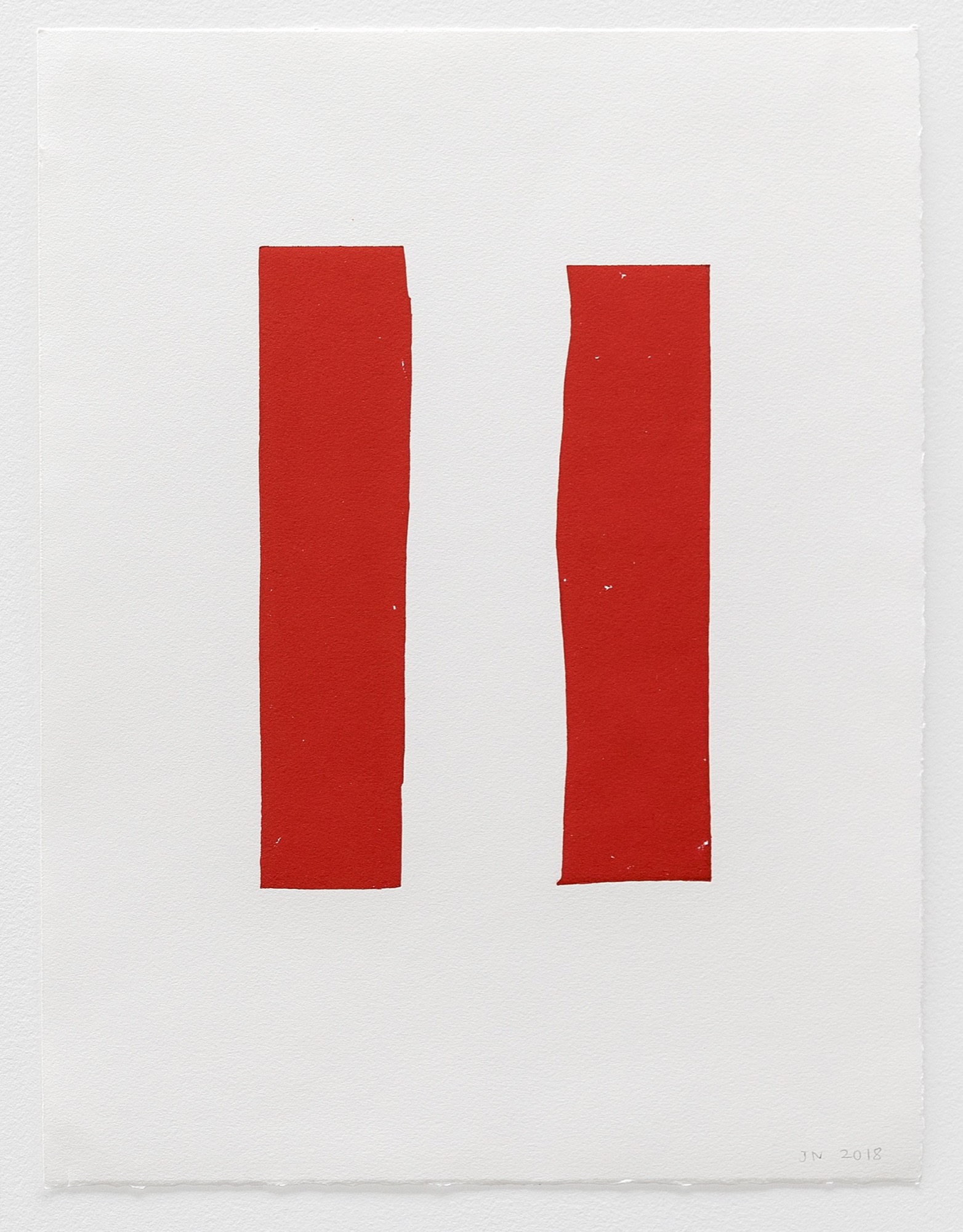
John Nixon: Screenprints, Woodblocks & Unique Relief Prints has something to say about printmaking and about the practice of veteran Melbourne artist John Nixon. Walking into Negative Press's factory space you will find around 20 sparse prints that were created metres away from where they hang. Many of these works recall earlier prints, created in the early 1990s with master-printer John Loane at Viridian Press. Those prints, as with many of these, were the product of taking the imprint of an object (in print terms, a “matrix”), but not carving into that object. That is to say, instead of printing an image, John Nixon printed the side of a blank block of wood.

Typically, a print is a picture that results from a carved or otherwise obtained design. Most of these prints, however, have no applied design. They are just matrices arranged and printed. Nixon, working here with Negative Press's master-printer Trent Walter, has often printed the abstract texture of his matrix alone, creating in saturated colours the instructions of Shikō Munakata, one of the 20th century's most important printmakers:
I advise the layman to spread India ink on an uncarved board, lay paper on top of it and print it. He will get a black print, but the result is not the blackness of ink, it is the blackness of prints.
Nixon's earlier prints with John Loane showcase the grain of shaped woodcuts: a purple oval, a red rectangle, a brown cross. In Nixon's prints from the 1990s, shape, colour and woodgrain combine to make a holy trinity, a quiet experience of prints printed purely. You make woodcuts on the 'long-grain' side of a piece of wood, so the texture of the wood shines through the final image. But once you start thinking of prints on such an elementary level, why even use wood?
That's the path down which Nixon and Walter have wandered together. As Walter tells it, while working on a project last year Nixon kept collecting junk and litter that he found, bundling it up and bringing it to Negative Press to make prints from.
Issue No. 1
Grab a copy of Memo’s first glossy annual magazine issue, featuring an extended artist focus on Archie Moore, the 2024 Venice Biennale Australian Representative, with essays by Rex Butler, Tara Heffernan, Tristen Harwood, and Hilary Thurlow.
Issue 1 features articles by Audrey Schmidt, Philip Brophy, Helen Hughes, The Manhattan Art Review’s Sean Tatol, Cameron Hurst, Chelsea Hopper, among your favourite regular Memo contributors. There are reviews and articles, including on Melbourne design art, French literature’s ageing enfant terrible, Michel Houellebecq, Derek Jarman’s Blue (1993), the celebrated Spike magazine cultural critic, Dean Kissick, the local cult-favourite Jas H. Duke, and much, much more.
Memo Magazine, 256 pages, 16 x 25 cm

You can take a print off anything that will accept ink. In fact, you don't even have to use ink. Cover your head in paint and take a print of your face. Print the grease off a fried chicken wing. My point is, if we're choosing matrices out of junk, and not carving images into them, then the choice of junk is significant in some way. Like collage, this type of 'found' print reveals something about the artist's methodology, the way their mind free-associates.
Tellingly, Nixon wasn't actually choosing ridiculous things, he was choosing 'block-like' trash: cork coasters, wavy corrugated cardboard, a Styrofoam meat-tray cleaned of blood. If every object around us is a potential matrix, then Nixon wasn't choosing eccentric material like food or body-parts, he was choosing things that reminded him of the printing process. Flat, textured (or shaped), easily inked, matrix-like things.
The results are like Nixon's earlier prints, but with a similar associated sense of the world of objects that you get with collages or sculptural assemblages. Then there is further resonance with Munakata, who suggested that printing without cutting might be a form of submission:
Now the object is to give this print greater life and greater power by carving its surface. Whatever I carve I compare with an uncarved print and ask myself, “Which has more beauty, more strength, more depth, more magnitude, more movement, more tranquillity?”
If there is anything here that is inferior to an uncarved block, then I have not created my print. I have lost to the block.

There is one woodblock in Screenprints, Woodblocks & Unique Relief Prints that is printed from an uncarved rectangle of chipboard. The texture of this chipboard is unmistakable, with its shards and splinters of wood compacted into a cheap, hard surface. I wouldn't say the personality of chipboard is there, but the anonymous board has now been immortalised. You can trace its distinct pattern; a pattern, if you think about it, which is not replicated by any other piece of chipboard in the world. This unassuming, unremarkable chipboard is a few rungs below the noble piece of wood the Japanese master was imagining, yet Munakata's sense of deference remains. Nixon didn't “lose to the block”, he let it win.
This is the last day to see John Nixon at Negative Press, and it includes screenprints and other graphic tricks that I have no more space to discuss here. Run don't walk.
Victoria Perin is a PhD student at the University of Melbourne. Her research concerns printmaking in Melbourne during the 1950s and 60s. In 2013, she was the Gordon Darling Intern in the Australian Prints and Drawings Department at the National Gallery of Australia.


