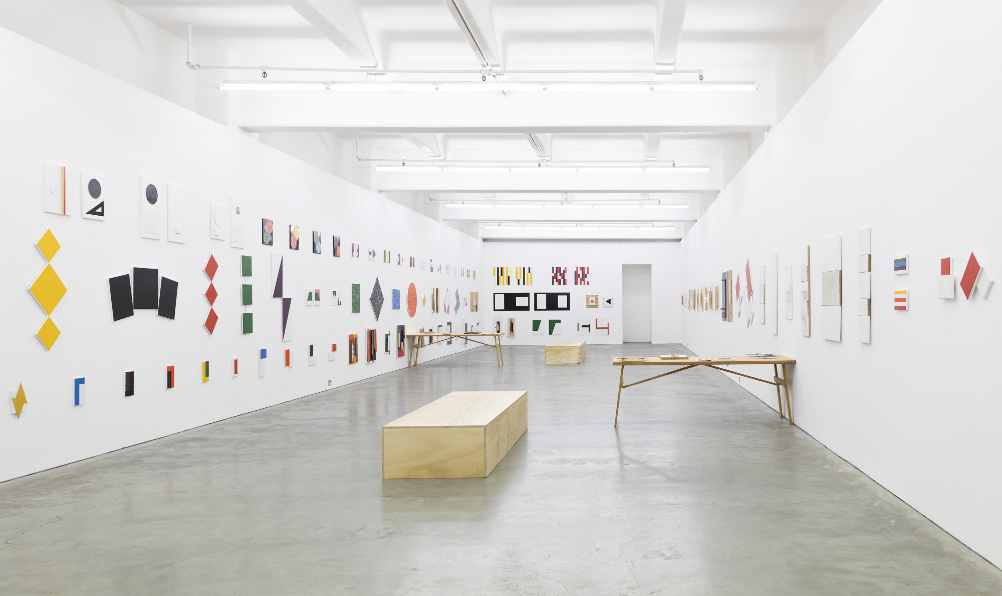
John Nixon: Groups + Pairs 2016–2020 opened only a couple of days prior to the government mandated COVID-19 lockdown. But unlike other current exhibitions, the online presence of Groups + Pairs is minimal. A standard collection of four installation shots is accompanied by a video Red + Blue, which was also produced for the exhibition. Admittedly, it is not difficult to imagine what a John Nixon exhibition might look like. For nearly five decades, the artist has been producing monochrome and readymade paintings en masse. Groups + Pairs is this, on speed. Consisting of over 100 works, the exhibition is densely packed with Nixon’s typically spare works.
Enough has been written about Nixon’s unwavering dedication to the Russian Avant-Gardes and, in particular, his undying devotion to the Suprematist Kazimir Malevich. But one aspect bears repeating, because the consistency of Nixon’s output only reminds us of this original source. Malevich’s transcendental approach to abstraction was closely tied to the revolutionary climate of Russia in the early twentieth century. That Nixon continues to work in a style that he originally dedicated to Malevich raises a number of questions about the transferability of avant-garde rhetoric into the current day when, as all too many commentators have observed, the avant-garde is preserved in time only by its failure to achieve revolution. There is a tendency to denigrate artists who consistently work in the same style. That constant reinvention should be the goal of artistic output (to repeat a common cliché) points to our short attention spans. Indeed, throughout the 20th century, avant-garde movements including the Bauhaus and Constructivism embraced repetition. For them, it represented the democratising possibilities of mass production and industry standards and, by extension, human equality. The nature of the repetition presented at Anna Schwartz Gallery is one of familiarity, not boredom—something that seems all the more pertinent given the uncertainty of our current moment.

My allotted viewing fell only two days before my deadline (the gallery is open by appointment), and I fervently studied the documentation in great detail, attempting to get a head start. Most of the photographs are installation shots, and my frustration at not being able to zoom in close enough on individual works overcame me. There is a sense that the gallery is resisting the pressure for Groups + Pairs to become another Made-for-Covid online exhibition (also, imagine uploading so many works!). But I concur that the exhibition needs to be seen in real life because of the relationship the hang creates with the body. Even by Nixon’s standards, the exhibition is big. Every wall is covered in work, some walls are hung three works deep. Despite this, the exhibition does not dwarf the body of the viewer, on account of two factors. First, the works have purposely not been hung too high on the wall, meaning the viewer—given a physically embodied viewer as opposed to a digitally mediated one—does not have to crane their neck to comprehend all the works. And, secondly, most of the pieces are small. In the 1950s, this logic of size was used to differentiate the American abstract expressionists from the German abstract tradition typified by Paul Klee, whose small abstract works were described by the critic Will Grohmann as “monk-like”. The all-encompassing exhibition design cocoons the viewer who is encouraged to spend time with the pieces; two wooden benches have been installed in the gallery, offering viewers a place to sit and view the works—an unprecedented occurrence for the gallery.

Upon entering, the first paintings that I notice are a group of monochromes (Untitled (monochrome), 2019), composed of three canvases. These works don’t so much remind me of Malevich, but of German abstractionist Imi Knoebel, whose monochromes formed part of the discussion around mass production and consumerism in post-war West Germany. In particular, a yellow work in the group, comprised of three diamond canvases arranged vertically and painted yellow, embodies Knoebel’s sculptural treatment of the canvas with readymade colours. Elsewhere, fabric has been stretched across the canvas to produce a kind of readymade/painting hybrid (Untitled (Kyoto), 2019) that—in combination with the exhibition’s largely modernist monochrome thematic—reminds the viewer of Blinky Palermo’s Stoffbilder (Fabric Paintings), which he made in the 1960s, during the height of the German Economic Miracle. Whether the allusion to German abstraction was conscious or not, the fact that I am reminded of it highlights that the monochrome had a life beyond Suprematism. Furthermore, that the socio-political backdrop in Germany could so dramatically shift the reading of the format (from spiritual contemplation to symbol of democracy) is crucial. Is it not fair, then, to afford Nixon’s work the same opportunity to be read in its own right against the backdrop it was created in?

Some of Nixon’s material choices and combinations reflects a certain “nowness” that I can only describe as tongue in cheek. Nixon’s use of materials reminds me of detritus (as opposed to useable objects), eliciting a sense of irony in a similar vein to a number of young Melbourne artists, such as Josey Kidd-Crowe, Spencer Lai or Hana Earles. For example, one arrangement of four white monochrome/readymades (Untitled, 2020) felt ironic. Interspersed awkwardly amongst white painted timber and hessian panels, were gleaming, white tiles commonly found in bathrooms or kitchens, which indexed the present (Bunnings, skips at building sites). This is in contrast to more standard explorations of the monochrome/readymade, such as a small work (Untitled, 2020) composed of a spoon glued on top of a painted black circle that is more of a direct nod to the avant-garde. Indeed, Nixon is aware of current practices, often working with or employing young artists in addition to teaching at Monash University. Two custom built timber tables display a collection of collaboration between Nixon and local weaving artist Jacqueline Stojanović. A kind of exquisite corpse of readymade, painting and weaving, these works are beautiful expressions of process and openness that speak to the sense of generosity that the large hang encapsulates. These works demonstrate Nixon’s attentiveness to current practices in addition to his steadfast commitment to avant-garde ones.

Groups + Pairs is composed of two other elements that were displayed outside of the gallery. The first is a poster composed of text advertising the exhibition overlaid with a few typical Nixon graphics—a black circle, red line and white square. Copies of the poster were intended to be pasted up in various public locations around the CBD, but the bulk have not as yet been on display publicly due to the lockdown. There is, however, one in the window of Alpha60’s Flinders Lane store where the second off-site element—the aforementioned video Red + Blue featuring dancer Grace Uchida, performing improvised choreography in two acts—is displayed on a monitor in the shop’s window. The video itself is branded as a collaboration with the Alpha60, who designed the two dresses that Uchida wears in the video–one a simple below the knee red A-line worn in the first act and the second a long, blue trapeze dress. If, as Malevich claimed, his art would “Free art from the material world” in some transcendental, spiritual way, the video grounds Nixon’s work in the material world and, significantly, in the free market.
Issue No. 1
Grab a copy of Memo’s first glossy annual magazine issue, featuring an extended artist focus on Archie Moore, the 2024 Venice Biennale Australian Representative, with essays by Rex Butler, Tara Heffernan, Tristen Harwood, and Hilary Thurlow.
Issue 1 features articles by Audrey Schmidt, Philip Brophy, Helen Hughes, The Manhattan Art Review’s Sean Tatol, Cameron Hurst, Chelsea Hopper, among your favourite regular Memo contributors. There are reviews and articles, including on Melbourne design art, French literature’s ageing enfant terrible, Michel Houellebecq, Derek Jarman’s Blue (1993), the celebrated Spike magazine cultural critic, Dean Kissick, the local cult-favourite Jas H. Duke, and much, much more.
Memo Magazine, 256 pages, 16 x 25 cm

In recent years, the crossover between art and design has been increasingly problematised, not least because design habitually co-opts select aspects of art to ends that aim at profit. In 1920s Russia, the ideal situation would have been to integrate art, design and all other facets of cultural production into the overarching program of life. By today’s standards, however, Suprematist imagery has been co-opted by design so repeatedly, that the utopian rhetoric used to seduce consumers has all but been forgotten. A Google search for Malevich results in a link to a contemporary vase on designer consignment store 1stdibs. Priced at $479 and designed by Kateryna Sokolova for NOOM, it is said to be inspired by Malevich but really just combines a couple of geometric shapes. The design industry’s incessant appropriation of art as images also has some worrying aspects. This includes its almost habitual inability to credit artists whose images they use—a classic example of which being the prolific, online platform The Design Files, which frequently profiles residences of the wealthy, while ignoring the need to name artists whose artworks are pictured in the houses. My biggest reservation regarding these collaborations for Nixon’s work is that its value is simply diminished by the fact of its setting. Indeed, the blue and red dresses designed by the brand are nondescript (true, minimalism is the brand’s style), and the video could just as easily have been displayed in the gallery at Anna Schwartz. Finally, the fact that the video is viewed from the street means that the soundtrack to which Uchida beautifully improvises is not heard. The image remains but to the detriment of the experience of viewing.

So, what is going on here? I would like to think that the video represents, like Nixon’s tile works, another tongue-in-cheek nod to our contemporary moment, particularly towards the logic of consumerism. But, more likely, this collaboration (and the proposed pasting up of posters as another knowing nod to advertising) represents the succumbing of art to consumerism. Alternatively, does Nixon truly believe that art and design can coexist harmoniously just as avant-garde artists would have had it? Russian Avant-Garde artists, after all, included uniform and performance as part of their practices. For me the video was an unfortunate footnote in what was otherwise a very successful presentation of Nixon’s work from the past four years. In fact, the presentation in Anna Schwartz is a complete exhibition in itself, and demonstrates a level of self-awareness that a lot of commentators often overlook when critiquing Nixon’s relationship to the avant-garde.
To return to my earlier question of whether Nixon’s work can be appreciated as a product of the “now” rather than a rehashing of avant-gardism, the answer is, of course, yes it can—but be careful what you wish for. For, as we have seen, an almost over-conscious need to remain up to date (collaboration, branding, design) has been less successful. The fact is, artworks index the moment of their making. In the case of Nixon, the ongoing return to avant-garde formats actually reveals subtle shifts that remind us of the passage of time. So while we might imagine a future where one speaks more readily of the different conditions against which a Malevich or a Nixon produced their works, we should also remember that the historical backdrop of Nixon’s career has also evolved over some fifty years and, believe it or not, there are traces of this in his paintings.
Amelia Winata is a Melbourne-based arts writer and PhD candidate in Art History at the University of Melbourne.


