The Pulitzer Prize-winning critic Sebastian Smee barely got a word in during the Q & A held soon after the opening of Gareth Sansom’s retrospective at the NGV. Sansom, just about the ultimate alpha-male for all of his cross-dressing, entertained the audience with tales of his early cricketing prowess, his father returning home after the war without a limb, his encounters with the last of the Antipodeans and his ill-fated meeting with his artistic hero Francis Bacon while in London in the 1960s. But it was a story he told concerning his painting Sweeney Agonistes (2005), hung in the same room as the talk, that was perhaps the most revealing.
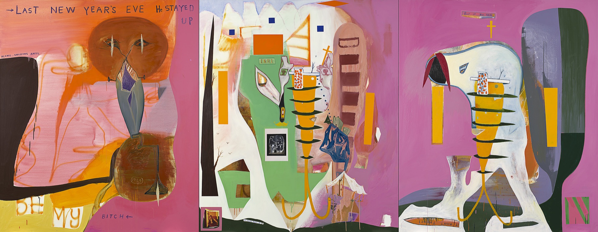
The work, a triptych, is an allusion, filtered through poetic precedent, to that ill-fated son of the Australian art world, Sweeney Reed, child of Joy Hester and Albert Tucker, adopted by John and Sunday Reed, who became for a while an art dealer before overdosing on pills in 1979. In Sansom’s depiction we have two darkly staring eyes, a cross and the letters INRI that Pontius Pilate inscribed over the head of the crucified Christ. All of this Sansom described to us on the night with pedagogic clarity. But the real revelation was his description of how he came to make the work. In fact, for all of its seeming indifference and cack-handedness, it took him a long time. For a good while, Sansom explained, he had only the central and right-hand-side panels, but after much reflection he decided they didn’t work. Then suddenly – undertaking it in the rather melodramatic words of the painting, “Last New Year’s Eve He Stayed Up Alone Sniffing Amyl” – he realised the answer was another panel to the left. It is only at this point that Sansom felt the painting was complete.
And it is intriguing to wonder why. The two panels of the centre and right “match”: the same darkly pink background, the same pale figure slouching towards the centre panel and then shown hanging up there on what we could take to be a cross on either side. It is the same perfectly standard anthropomorphism Sansom had been practising for some time by this stage of his career. But that was perhaps the trouble. What the painting needed – to put it simply – was a certain disruption or interruption, something to “come between” the two other panels. And this is to be found in that left-hand-side panel, which breaks with those other two: the restoration of the pink background against the blue and black of the centre panel, the introduction of a “witness” figure in the shape of the artist himself (the autobiographical confession of drug-taking, the scraping of the artist’s date of birth into the lower circle of brown paint).
The effect is that of a rupture, both with the materials and perhaps even the materiality of the two original panels, producing a kind of weightlessness or even ascension – fitting given the subject of the painting is a commemoration of Sweeney Reed – and it is this left-had panel, after all, that contains the words “stayed up” at the top right and Sansom’s admission that he painted it while “high” on drugs (although I’ll bet he didn’t have the original idea of adding it while on them).
In fact – although, at least consciously, he probably didn’t mean it this way – Sansom’s account of the work operates as something of a rebuttal of his interlocutor that night. For in the catalogue essay Smee contributes to the exhibition, consistent with his broadly aestheticist take on art, he concludes that what is at stake in Sansom’s work is a form of hard-earned beauty, that for all of its apparent chaos and confusion what Sansom seeks to bring about in the end is a resolved formal unity. In Smee’s words: “For all Sansom’s obsession with process, and his sensitivity to the demands of colour and form, his aesthetic decisions are really outcomes of an unconscious process of distillation and a search for coherence”.

And in this Smee follows a long line of Sansom critics, and perhaps even the artist himself in his own understanding of his work. After all, it is tempting to imagine that the true mastery of his method, the skill he has honed and wishes to demonstrate to his audience, is that of taking his work out to the edge of chaos before walking it back at the last moment through formal echoes, parallels and correspondences between apparently conflicting styles, colours and iconographies. It is undoubtedly what Sansom means when he says of his paintings: “The best ones work when they’re on the brink of failure”, and as we say this has been echoed by generations of commentators coming after him.
Indeed, how could it be otherwise? Curator Simon Maidment demonstrates his own skill in letting Sansom’s work out on a leash before reining it back in. Intelligently, he does not narrate Sansom’s work chronologically—which is always to say stylistically—but after laying down a few basics of biography and major influences (British Pop, Francis Bacon, Peter Blake) instead cuts across chronology, connecting works from wildly diverse moments in Sansom’s career. These are put together – in precisely a demonstration of the curator’s virtuosic eye – through the coincidence of such seemingly incidental features as the same small purple circles across or down the canvas – My Sin for Norman (1985) and A Forensic Possibility (2011) – or the same blast of yellow at its centre – Du hast keine chance (1981) and Friendship’s Road (1985-7).
It would serve as a testament not only to the consistency of Sansom’s use of certain formal elements (colour, iconography, style), but also to the discernment of the curator in seeing this. In both, there would be a “mastery”, both in seeing the order in apparent chaos and the chaos out of which order emerges. “The best ones work when they’re on the brink of failure” could be seen to apply at once to Sansom’s work and to the exhibition that curates it.
But let us think a little harder about Sansom’s foundational influence of Bacon, which is made so much of in the show and Sansom testified to so personally the night he spoke about his work. The exhibition begins as we walk in with Sansom’s One of Us Must Know (1966), which features the famous photo of the chubby-cheeked preternaturally youthful Bacon staring intently at the camera – and it is arguable that all of Sansom’s insertions of photos of himself into his works after this, whether straight or in stockings, are fundamentally to take Bacon’s place.
And undoubtedly such early works as He Sees Himself (1964) and Wee Ian (1967-8) feature attempts by Sansom to imitate that distinctive Bacon line and simultaneously scrappy and polished technique, with their marked-out rings or contours around which his figures circulate, bright monochrome backgrounds and unnatural paint colours (carmine red, manganese blue, cadmium green). And Sweeney Agonistes many years later is also a very Baconesque painting, not only in its iconography of the crucifixion, but – exactly insofar as this was a resource that Sansom knew he could draw on when he realised his previous pictorial solution had not worked – its triptych format.
Undoubtedly, the best account of Bacon’s work is by the French philosopher Gilles Deleuze. In an extraordinarily ambitious claim, he argues that not only can we see the successive stages of human perception in Bacon’s work, but Bacon’s work explicitly allegorises these stages, is in a sense a reflection upon how we make sense of the world.
The first stage Deleuze describes as “contraction”, in which against the underlying chaos of the world, in which one moment disappears as soon as the next appears, we manage to hold two moments together to form a present. This can be seen for Deleuze in the formation of Bacon’s figures, which come about as the simple distinction between inside and outside. The second stage is “coupling”, in which we hold two of these moments together to form something like memory or the existence of the past in the present. Deleuze associates this with Bacon’s diptychs, in which we often have two figures being brought together, whether in love or violence. The third and final stage is not so easily explained and might be seen to be where art touches on philosophy. It is characterised by a “withdrawal” or “forced movement” away from “coupling” and towards a kind of virtuality in which perception would be free from the constraints of time and space. Deleuze associates it with the series of “attendants” or “witness” figures we have in Bacon’s triptychs, frequently looking on at two figures “coupling” across the other panels.
Issue No. 1
Grab a copy of Memo’s first glossy annual magazine issue, featuring an extended artist focus on Archie Moore, the 2024 Venice Biennale Australian Representative, with essays by Rex Butler, Tara Heffernan, Tristen Harwood, and Hilary Thurlow.
Issue 1 features articles by Audrey Schmidt, Philip Brophy, Helen Hughes, The Manhattan Art Review’s Sean Tatol, Cameron Hurst, Chelsea Hopper, among your favourite regular Memo contributors. There are reviews and articles, including on Melbourne design art, French literature’s ageing enfant terrible, Michel Houellebecq, Derek Jarman’s Blue (1993), the celebrated Spike magazine cultural critic, Dean Kissick, the local cult-favourite Jas H. Duke, and much, much more.
Memo Magazine, 256 pages, 16 x 25 cm
Deleuze’s was apparently the only explanation of his work that ever met with Bacon’s approval – it was in fact Bacon’s loathing of art speak that was the punchline of the anecdote Sansom told about him – and there is a famous story of the legendarily louche and dissolute Bacon inviting the apparently upright and prudish Deleuze to a meal at an upmarket French restaurant when he was in Paris one time and the two giants of 20th-century culture suddenly realising they had absolutely nothing to say to one another for all of their mutual admiration.
What has all of this to do with Sansom? If we go back to his anecdote concerning Sweeney Agonistes, it is to put an entirely different spin upon it. Sansom added that third panel to those other two not because they were too far apart but because they were too close. He wanted to put that third panel between them. And in fact the real aesthetic task for the artist – and the curator too – is not to come back from the “brink of failure” but to stay out there. It is to create a certain “withdrawal”, a certain virtuality or “nothing in common” to the various elements they assemble. It is to bring about something that is not there, an absence as well as a presence.
Take, for example, the lower right corner of Sansom’s meticulously worked A Universal Timeless Allegory (2014). At first there is a layer of orange enamel, then a layer of white, then on top of that a layer of yellow oil and then on top of that (although it is in fact the original background coming through) another layer of orange. As a result, the original orange appears as though split, divided, in a kind of Cubist “passage”, as though the same original layer had been painted on top of itself. And this is not even to begin to think about the subsequent enamel boxes of green, dark blue and grey, which tumble out and over each other ending all hope of reconstituting some original ground.
For all of Sansom’s self-mythologisation as a libidinal, sexed-up, cross-dressing libertine – all those photos of him in his undies, all those works with titles like Latex (2015) and Daisy Chain (2009), all the Instagram narcissism – in fact at bottom his works are coldly cerebral, meticulously constructed and fundamentally philosophical. And we need to invert the orthodox reading of his work: Sansom’s challenge is not to create a final style but to avoid falling into the mannerism of style. It is, as he keeps on adding different elements to his picture puzzles, not to find the one that will make sense of what is already there, but not to form a consistency, to keep all of his balls in the air at once.

But, astonishingly – except perhaps for a moment around the late ‘70s when a series of jet airplane vapour trails seemed to drag through the work – he has managed to keep his art afloat, weightless, refusing all possible taste and curation. The only contemporary Australian painter I’d suggest who matches him in rigour is Juan Davila, who from a linguistic or psychoanalytic point of view arrives at very similar conclusions. Look at the lower-middle right of Sansom’s Friendship’s Road II and you could almost be looking at Davila’s The Studio (1984): the same cacophony of signs, symbols and styles that seek above all to remain unreconciled.
Davila and Sansom: what a show! Separated by a generation, but both sharing the insight that the only proper task of painting is to “withdraw”.
Like all successful retrospectives, Gareth Sansom: Transformer ultimately left one wanting less. But thank God it ultimately made no sense, cast no definitive light on the artist. The work was able to withstand all attempts by the curator and catalogue writers to impose any meaning on it, for all of the thematic rooms and ingenious matches. As it stands, virtually no one – maybe not even the artist himself – has a clue what is going on in the work, but that is to be expected at this early moment of the reception of a properly powerful body of practice.
Rex Butler teaches Art History in the Faculty of Art Design and Architecture at Monash University.
Title image: Gareth Sansom, Sweeney Agonistes, 2005. Oil and enamel paint and collage of type C photograph on canvas. (a-c) 213.0 x 549.0 cm (overall). Queensland Art Gallery, Brisbane. The James C Sourris, AM, Collection. Gift of James C Sourris, AM, through the Queensland Art Gallery Foundation 2012. Donated through the Australian Government’s Cultural Gifts Program (2012.472a-c))