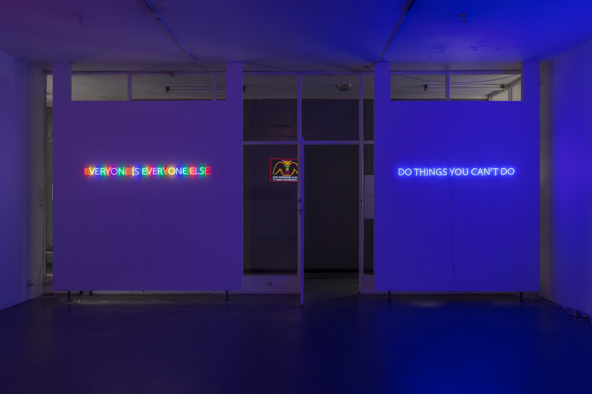
Chunxiao Qu’s recent exhibition at Trocadero in Footscray, titled the title is no longer relevant, contains seven editioned works in neon. Most of these feature static text: DO THINGS YOU CAN’T DO (2019) for example is a blue all-caps text stating the title, while KEEP YOUR INNOCENCE BY ALWAYS WONDERING WTF ??? (2020) continues likewise in pink. Some of the neons include variations in colour, such as EVERYONE IS EVERYONE ELSE (2019), still others use relay switches rotating through a set of changes and additions. These electrical sequences cycle through the options in LONELY OR HORNY (2020) as well as McDonald’s Work (2019), the latter being the only work in the show to contain an image.

Qu writes poetry alongside her art and has recently published a book called Popcorn, porn of poetry. (2021). The book, written in both English and Mandarin, contains poems by the artist. The English versions/translations form the basis for the works in this show. Qu is a “native Chinese speaker”, as the Trocadero website reminds us, and her poetry shows a playful, tinkering approach to English as an adopted language. The quirks of English as a non-primary language are sometimes mocked and ridiculed in a thinly veiled racism and bigotry, but I find that Qu has turned this apparent deficit into a positive attribute that works for her. The tactical, halting and amateur use of a language allows a flexible relation to its rules and regulations. Broken English is a feature of Qu’s poetry, not a bug. How else could the title of her book make the unlikely link between porn and popcorn? A connection is there in the combinations of letters jumbled up and rearranged.
There is a historical connection between Qu’s work and some electrified conceptual art, a connection made through writing as an artform as well as the use of neon to materialise that writing. Neon can be understood as a medium and the first recorded appearance of neon in the art context could establish something of a lineage for its use. Some people might claim to be the first users of neon in a Western art context, like Joseph Kosuth, who—according to himself—first wrote about using neon in conceptual art in 1965. Others might argue against this and claim that, in fact, other artists had used it before Kosuth. Perhaps a bit like the “noble” gas contained in the glass tubes themselves, these arguments are a bit atmospheric. Western art history loves to talk about who was first and when; however, I’m not sure if it’s very important here to do anything more than acknowledge that some people find this important. It’s a little like bragging about your high-score in a game no one plays anymore.
One of the big arguments about neon in the context of conceptual art is that it references some kind of commercial capitalistic everyday—some kind of reality outside the world of art. The language of capitalism is written in the form of neon itself through the way that it is a commercial sign-writing technique used in advertising. That may have been a faded truth in the 1960s, but in 2021, of course, this is bullshit. Neon signage today is an expression of handmade bespoke craft techniques similar to that traditional blacksmithing place down by the Maribyrnong River: while there is certainly a market for this kind of work, it is a long way from the everyday capitalism of, say, BHP, for example.

Old and anachronistic technologies might feed into new artistic materials, as Walter Benjamin would say, but Qu’s neons are different: they are LED neons, a contemporary interpretation of neon that is a different technology. Despite its lower power consumption and being easier to work with, the LED neon nevertheless gives off a very similar result. There’s a merging of nostalgic mimesis and anachronism here, and it is worth paying attention to how it makes you feel: on some level I’m disappointed that these works aren’t made by bending glass and injecting special gasses into it. But on a completely different level, I really like the use of mimicry and LED to create (or re-create) neon as an effect. It’s the same feeling you get when you spend heaps of money and use lots of chemicals to re-create traditional dark-room photography only to have it look indistinguishable from digitally processed images (I think we all know someone a bit too into this kind of thing).
Neon as an art medium, especially text-based neon, always leaves me feeling a bit cold inside. I’m not too sure why, but perhaps it is something to do with its relative conventionality in art: it’s a bit like the token potted ficus in installations, or the “so random” arrangements of construction pine (pinus radiata, the white-sliced bread of timber) that has adorned so much “edgy” installation work over the years. The question “why neon”, in this convention is self-answering: “Because that is the way to download an idea into an otherwise ‘meh’ installation”.
In one way, neon is a response to the old question emerging once conceptual art became completely viable as art (that is, since the beginning): How to develop and progress text-as-art? Where do we put the text, what language do we use, what typeface and what size does it have to be? Neon takes the dead end of modernistic reduction and adds atmosphere, electricity, movement and—quite literally it seems to me—aura. It animates the corpse of conceptual art, makes it pretty and decorative. Of course, that is only one argument about neon, one mired in the bitter positional struggles for relevance in the Western mode of contemporary art. The difficult thing I think is to have the neon without the art history.

Qu’s work doesn’t seem to enter into these claims for the unique. EVERYONE IS EVERYONE ELSE (2019) is the most multicoloured and auratic work in the show. The coloured letters all glow and clash and make the whole thing hard to focus on. Each letter or unit is unique insofar as it’s different from its neighbour. A bunch of individualised letters make up the logical claim of the title, which seems to stretch the limits of language: language allows us to conceive of a totality (EVERYONE) and then apply a logical claim of equivalence to it (IS) that is then applied to a totalisation of the other, the “not” self: EVERYONE ELSE. There is a concern here with the logical limits of the English language but also with a Boolean nature of grammar: the classical operators of Boolean processes being AND, OR and NOT.
I know I know, I’m starting to analyse Qu’s work as though it is conceptual art circa 1969: it’s grammatical, it’s logical, it’s information theory… These are kind of boring paths to tread today. As a person who is low-key obsessed with conceptual art (which is different from being in love with it), I’ve always found it fascinating how once language is introduced in art, a transparent path is opened up to that language. What it says, how it says it and who says it become instantly important. Is it philosophy, is it a joke, is it art or is it all three?
Qu is suggesting that it’s also poetry, which is the obvious truth anathema to most conceptual artists in the late 1960s. Too busy trying to define the logical limitations of the concept “art”, these earlier artists gave the other indefinable term (“poetry”) the cold-shoulder. The poetic impulse of conceptual art’s “analytic” self-understanding has been explored by the writing of Boris Groys and Jan Verwoert, who connected conceptualism to earlier ideas coming out of early German romanticism.
Issue No. 1
Grab a copy of Memo’s first glossy annual magazine issue, featuring an extended artist focus on Archie Moore, the 2024 Venice Biennale Australian Representative, with essays by Rex Butler, Tara Heffernan, Tristen Harwood, and Hilary Thurlow.
Issue 1 features articles by Audrey Schmidt, Philip Brophy, Helen Hughes, The Manhattan Art Review’s Sean Tatol, Cameron Hurst, Chelsea Hopper, among your favourite regular Memo contributors. There are reviews and articles, including on Melbourne design art, French literature’s ageing enfant terrible, Michel Houellebecq, Derek Jarman’s Blue (1993), the celebrated Spike magazine cultural critic, Dean Kissick, the local cult-favourite Jas H. Duke, and much, much more.
Memo Magazine, 256 pages, 16 x 25 cm

Consider the relation between logic and romantic thought in DREAMING IS FREE SO I AM A MILLIONAIRE (2020). At face value, this reads like the “live, laugh, love” kind of Insta-worthy affirmation: Dreaming is free, we are told, so you can add a silver lining of acceptance to your relative poverty. Dreaming is free, so if you are subject to systemic inter-generational poverty you can still dream. If you are poor, but don’t have a dream, then it’s your fault because dreaming is right there for the taking at zero cost to you. The “SO” of the work is a logical hinge, SO = therefore. Dreaming is free therefore I am a millionaire. But if free things cost $0, then a million times zero is still zero.

If dreaming was free for Qu in 2020, then by 2021 the real cost of things starts to emerge: DREAMING IS NO LONGER FREE WHEN I HAVE TO TAKE A SLEEPING PILL (2021) tallies up and invoices for each dream, the head becoming a coin-operated arcade game for dreaming. A reverse Pacman: insert new pill(s) to continue. The cost of time and delay, the spread of dates in Qu’s work here becomes important: “the title is no longer relevant” is actually a reformulation of Qu’s exhibition from March 2020. Already hung in the same room at Trocadero and with access cancelled due to COVID, Like Cures Like was an exhibition seen by no one. Again, the grammatical logic of the exhibition shows a poetic playfulness with language: like curing like is part homeopathy part vaccination, the principle being that to cure something you first have to be a little poisoned by it. The politics of curing is perhaps a bit of an overwhelming idea, one perhaps best not made too lightly in the last year, which may explain why this exhibit’s title is no longer relevant.

By way of a disclaimer, the title is no longer relevant was curated by Chelsea Hopper, who writes for Memo Review. While Chelsea wasn’t involved in Like Cures Like, she was asked by the artist to help with the new presentation in 2021. From what I can tell, this was more of a collaboration between artist and curator rather than a traditional arrangement. However, I think there’s an interesting point to raise about the flyer for the new show: the image, provided by the artist, has the name of the curator in a typeface larger than the artist’s, whose name is vertically printed off to the side. Conceptual art of course is all about font size and typeface, and the idea of putting the curator’s name more prominently that the artist seems unusual. Perhaps, and this is only my thought, Qu is messing and playing with the expectations of the exhibition, the particular language used and the way hierarchy is expressed. I feel like it is just another way that she is messing with or perhaps “hacking” the languages of art and the English language.

LONELY OR HORNY (2020) uses a relay switch to cycle through the options given by the title. It’s up to the reader/viewer I guess to decide whether these are options given to help decide how you feel in the present (are you A or B?). However, the electrical sequence lights up as though you might be lonely, then horny, then back again. Of course, I’m thinking about this perhaps a bit too much and we’re all always-already AB, BA, then A then B and back again.

Another amusing and strange work is the visually complex McDonald’s Work (2019). A set of the “Golden Arches” appears, then they become topped with nipple-like dots, then the arches become the tops of legs spread wide open, then some cartoonish genitals and an erect phallus appears ejaculating in the shape of a jester’s hat. Underneath, the words “THIS IS A MOUNTAIN YOU WILL NEVER GET OVER IT” are written in neon. Sexuality, fast-food and global corporations seem to intermingle in this piece, and it makes visual friends with pop art in a seemingly personal, psychological way. Sex jokes in art are great, of course, but who will never get over what here? Is the body of the woman/man/trans figure (Qu’s poetry when talking about other people in the third person often defaults to “he/she/it”) what we will never literally get over? Is sexuality in general something we can never “get over” figuratively? Or is McDonalds somehow a mountain that cannot be ascended?
All of the above, of course. Consider that McDonalds has its different meanings in different places. It’s a symbol of corporate US expansionism in some places, and in others it can be a scathing critique of an overly regulated economy. McDonald’s Work reminds me of the artist Wang Guangyi’s Great Criticism series (1990–2007), a merging of pop, communist social realism and brand recognition from a Chinese place of enunciation. Instead of social realism and the visual rhetoric of the Cultural Revolution mingled with brand names like Disney and Coca-Cola, Qu’s work places these icons of globalised capitalism next to a romantic-poetic system of public speech. Qu’s poems speak to a tradition of text on public walls like the anonymous hand-written dazibao posters, the large hand-painted posters pasted on public walls throughout recent Chinese history and especially connected to the Cultural Revolution. Perhaps instead of strategic political denunciations, poetry could adorn these public spaces?
These places of enunciation are, I think, central to Qu’s work. In being in some ways outside of the English language, she’s able to play with it. In coming from a place that is outside of the presumed homogeneneity of global capitalism, the attachment to international brands manifests differently. Neon and conceptual art fit into this place of enunciation as well. Boris Groys probably describes this situation best when analysing the difference between Anglo-American and Russian-Soviet conceptual art: the former tended toward dry, official and administrative language while the latter, already surrounded by a monolithic communist bureaucracy, tended more toward poetic lyricism.
Chunxiao Qu’s work participates in these discussions in a way that is a little bit personal and a little bit punk. Suspicion of the mainstream is an integral part of these works, and following and obeying rules in a language is just one aspect of conformity. One of Qu’s works, not included in the title is no longer relevant, is a pink neon stating: HOW CAN I REMAIN A PUNK WHEN I HAVE TO ANSWER A QUESTION. There is no question mark.
David Wlazlo is a writer, artist and farmer who lives and works on Gulidjan and Gadubanud country in South West Victoria.


