Catherine Clayton Smith’s Brimming is currently on show at Chalkhorse, the one-time artist-run space turned commercial gallery. It is a thoughtful, absorbing collection of new paintings. Following her riotously sensual 2020 show, After The Orgy, this exhibition expands Clayton Smith’s painterly language and gestures toward the transcendental. At times, her work shares a kinship with the pale washed canvases Agnes Martin made in the late 1990s. The layers of paint on large areas of ground have been rubbed back into the canvas, creating a dry, shimmering quality and the natural world seeps in as an abstraction. Another thread can be drawn between Clayton Smith and Amy Sillman—consider, for example, Sillman’s Southstreet (2021) or Dubstamp (7A Back) (2018). Both painters share a preoccupation with the language of the image and the moment when form slips into abstraction. They both resist the delineation of depth into a navigable arrangement (foreground, middle ground, background) while also avoiding the seduction of the flat plane. Instead, they shift depth around and through the surface of the painting.


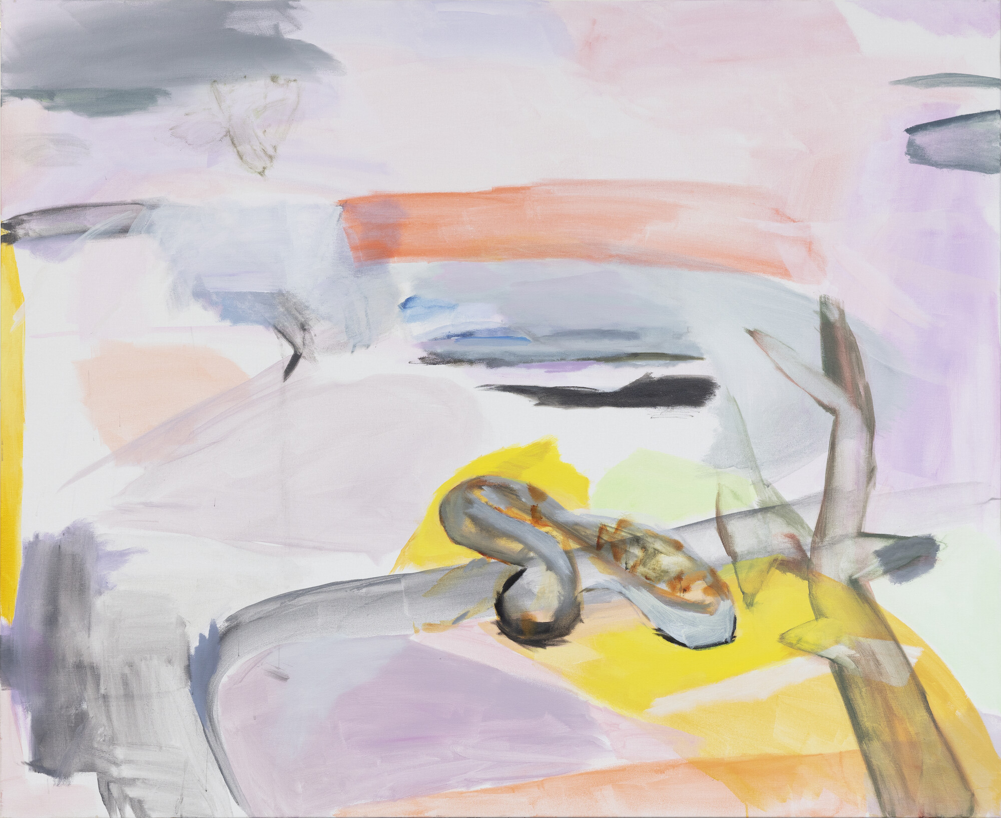
Across the show the natural world, light, and the feeling of being in it and of seeing it hovers between representation and pure abstraction. Prey (2022) is awash with pale blues, blue-greys and grey-purples, with traces of pale pink and green underneath. Below a gentle grey curve on the left side of the canvas are two stronger dashes of bubble-gum blue, the blue’s artificial brightness rubbed back and softened with a base of warmer grey. A vibrant yellow-orange smear tumbles behind a wash of white as if caught in motion, falling off the canvas. In the top left corner a network of thin white lines gestures toward the harbour—the bridge, the opera house—moving over and under the soft smudges of purple, grey, blue and green. The morphing, mixing, dripping marks come together to create the impression of some undone landscape, felt rather than represented.
In Possess (2022) the difference between a line and a patch is more distinct, the textures ranging from watery to sharp. The colours move from liquid grey to hard lime green and the canvas is marked with glints of glowing red and yellow. There were moments when I thought I saw mountains, before the shapes dissolved to become pure colour and stroke, the whole canvas rippling, moving, folding in and out and over itself. There are echoes of Sillman’s Split 2 (2020) here. Although Sillman’s figurative lines are more cartoonish, funnier (like Philip Guston’s), Clayton Smith’s are elegant and liquid, and there is a similar use of layers to create multiple, overlapping planes and an energetic, mobile collision of line and patch. Possess moves, but the flow is interrupted by a large blotch of pale, minty yellow-green, painted on thick to obscure whatever is underneath it. The shape creates rhythmic tension, pushing back against the clamour.
When I look at work like this, I start thinking of words to describe what I’m seeing. Words like collide, cascade, smudge, sweep and seep. I start thinking of the sounds of language and how sharp and soft sounds, accents and attacks might relate to sharp and soft strokes and patches. How to conjure up the timbre of the canvas in the mind’s ear, and to listen to the way the paint runs down in places and cuts upward in others? I start thinking of ways to describe a brush stroke, like a hard tender jittering glide.
In a lecture, Sillman told her students, “You’re looking for a structure by moving the parts around, but you’re building a new language, with just the signal-to-noise ratio with your body-knowing”. “Body-knowing” is a phrase that allows us to make sense of a work like Laid in Waiting (2022), where a puffy shape that looks like a life-raft hangs casually over a bend. The curve of dry, watered-down paint feels, to me, in my personal body-knowing, like the seawall that runs around Rushcutters Bay, or maybe it’s the one around the Botanic Gardens. A leafless shadow-tree juts up in the foreground. The expanse floats with patches of purple, pink, orange and yellow, cut with intrusions of blue and grey. In some areas, the paint has been rubbed back into the canvas leaving the fabric grain visible. The yellow at the edge of the canvas sings like a bolt of brass cutting through a bed of strings.

How quickly line becomes form is tested in Theyes Rap Rown (2022) and Chase (2022). A person’s head is positioned at the centre of Theyes Rap Rown. Arms stretch into the lower third of the canvas, over or around a patch of sky blue that drops away. There are sketches of bare arses, bristling, wet and alive. The lines are minimal but we read them clearly. In Chase leaves cluster in the upper left corner. The green daubs are wet and murky. Shuttled brown branches bend across the surface of the canvas, turning into an inky red-brown smear at the top edge. At the bottom a cluster of sharp, darting, brown, grey and green shapes collide with smudgy patches of soft purple. As Sillman observes, “(s)hape is the fruit of a certain kind of compositional labor and attention”. The compositional choices in Chase feel earned in this way. Things hover somewhere “between linguistic structures and random outlines”, slipping both ways in different parts of the canvas. Unfinished figurative elements are pushed to the edges of an underlying grid while, in the middle, an empty shadow interrupts the grid’s balance.
Issue No. 1
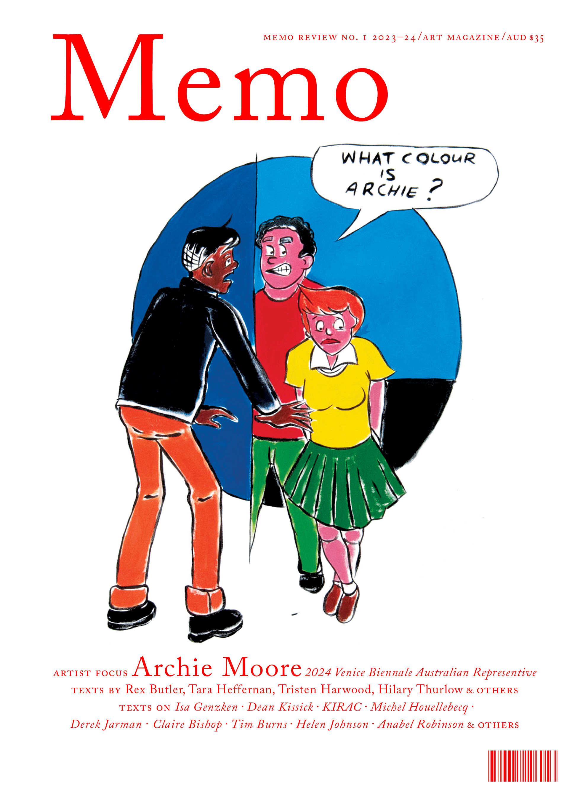
Grab a copy of Memo’s first glossy annual magazine issue, featuring an extended artist focus on Archie Moore, the 2024 Venice Biennale Australian Representative, with essays by Rex Butler, Tara Heffernan, Tristen Harwood, and Hilary Thurlow.
Issue 1 features articles by Audrey Schmidt, Philip Brophy, Helen Hughes, The Manhattan Art Review’s Sean Tatol, Cameron Hurst, Chelsea Hopper, among your favourite regular Memo contributors. There are reviews and articles, including on Melbourne design art, French literature’s ageing enfant terrible, Michel Houellebecq, Derek Jarman’s Blue (1993), the celebrated Spike magazine cultural critic, Dean Kissick, the local cult-favourite Jas H. Duke, and much, much more.
Memo Magazine, 256 pages, 16 x 25 cm

Water, plant matter and the hazy, just-mimetic shapes of animal life recur throughout the collection. In Remedy (2022), a body of water rushes through the middle of the work, flanked by two grey columns. The upper part of the ground has been rubbed back, washed over, and rubbed back again to create a feeling of dryness, even as the trails of a drip remain visible. A smudgy black crow sits above a rush of ice-blue water. The painting turns on the bolt of brilliant pink at the very edge of the image, pinging under a slash of muddy dashes. If you look closely at the bottom right corner, you can see dense layers of colour glinting behind the grey topcoat.
For a broader perspective, I turn again to Sillman speaking about the works she curated into her Artist’s Choice exhibition at MoMA in 2019, titled The Shape of Shape. Gathering works from the museum’s collection, most of which were in storage, Sillman wondered: “Why is there such a gulf between what painters love and what you see and read about all the time in art history?” For that exhibition, Sillman was particularly interested in artists who had continued to explore shape during a period when the grid, with its disruptive avant-garde sensibility, dominated conversations about painting. Right now, the painting that’s at the centre of the conversation is that which offers a direct commentary on the tension of contemporary life. It addresses historicism and politics head on, and often references the digital world. It’s work that can be solved in language: disseminated, unpacked and discussed. I love this kind of painting, but the narrow focus of creating art history as it’s happening means painting that has other preoccupations tends to fall out of the discourse.
What are Brimming’s preoccupations? Primarily, sight and sensation—the feeling of being in the world—and material questions of colour, line, shape and space. The exhibition also asks: How do we see? In asking that question it does something very valuable: it reawakens our response to the ordinary world. As painter and thinker Helen Johnson puts it, “painting is implicitly to be beheld, but it is also implicitly predisposed to fall open in the face of being beheld, to lead us beyond thought, only to place us back into our own context with a shifted perspective”. And in our current small screen era, with its flattened perspective and sharply separated colour, to behold images of variable depth, where murky edges cavort with patches of light, is to redirect our perspective to the sensation of sight and the image of the material world around us. What a joy it is to look at these paintings and to carry them afterward. To have the pleasure.
Sarinah Masukor is a screenwriter living in Sydney on Wangal land.


